 Culture
Our work
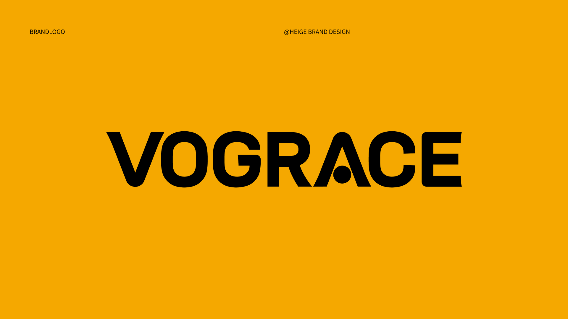
VOGRACE
世赞 SHIZAN
Three Squirrels 3D Promotional Film
Didi Double Eleven Red Packet Campaign
Data Visualization Display Design
Didi One-Yuan Designated Driving
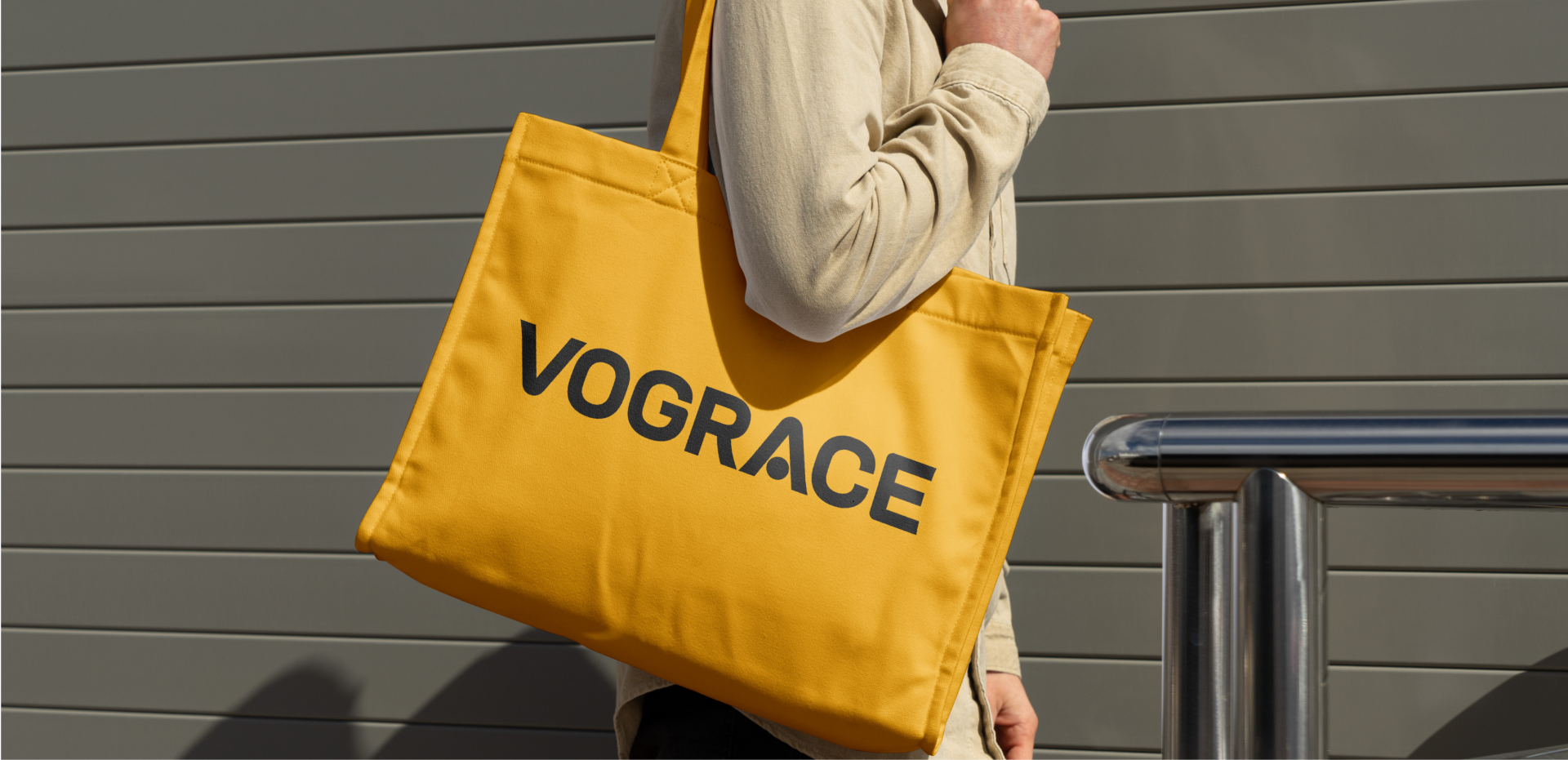
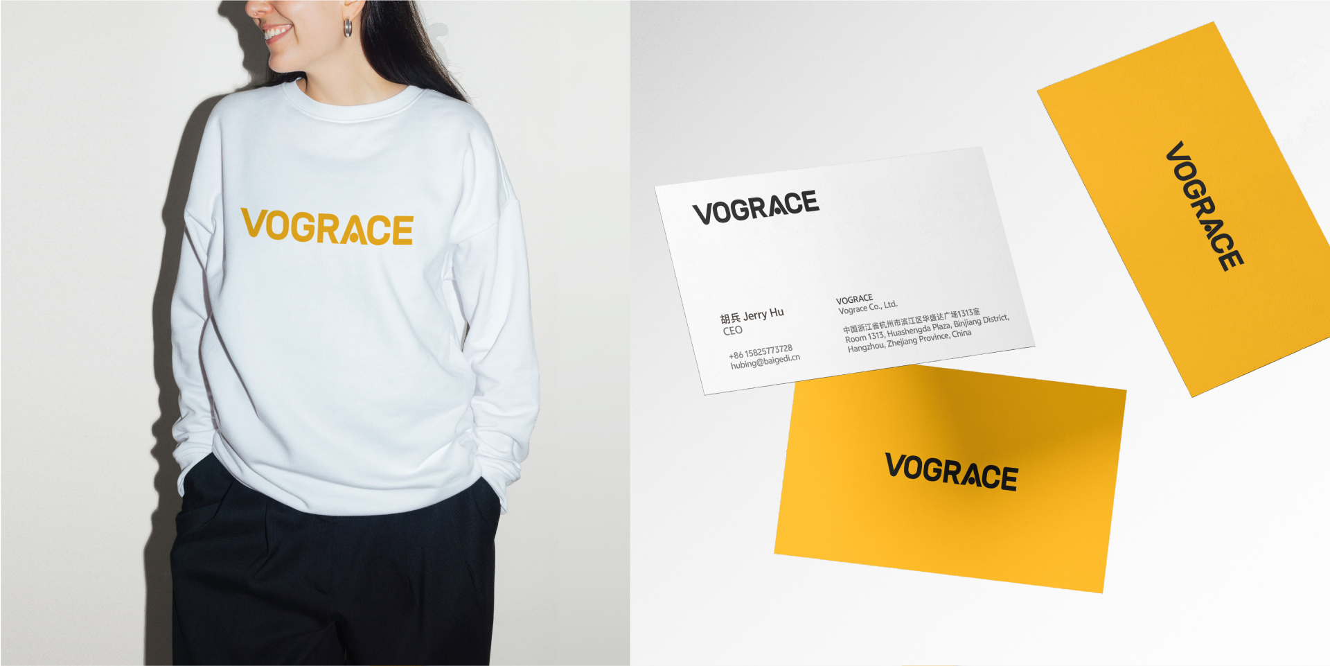
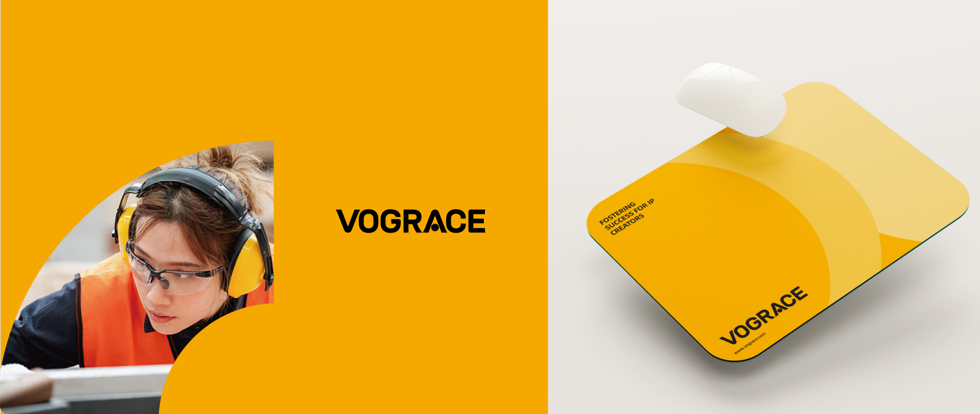
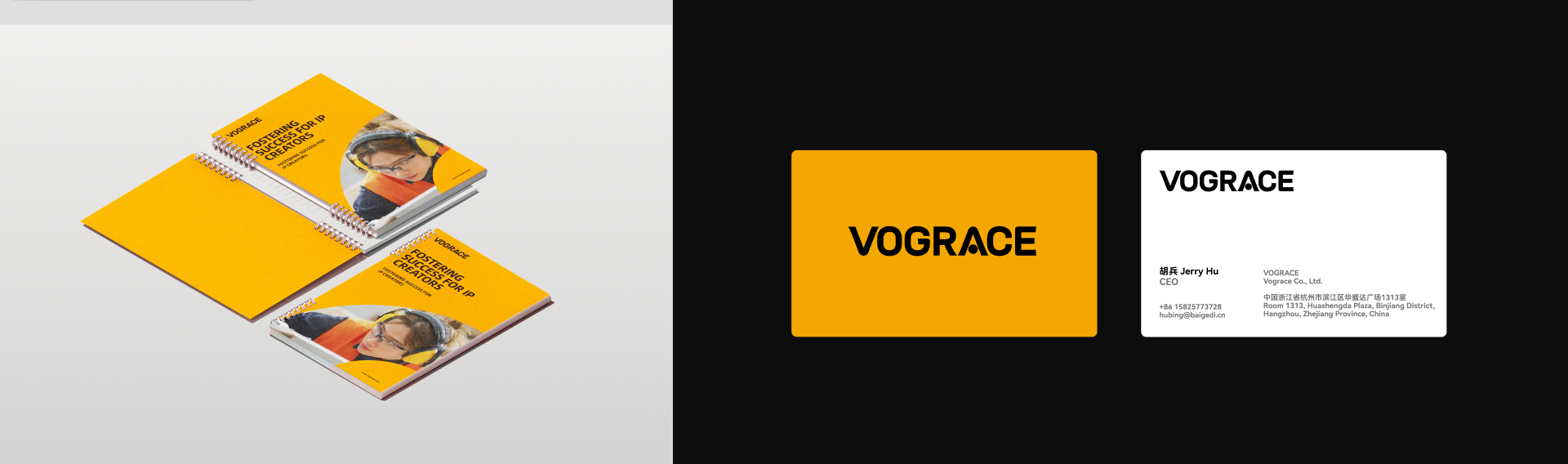
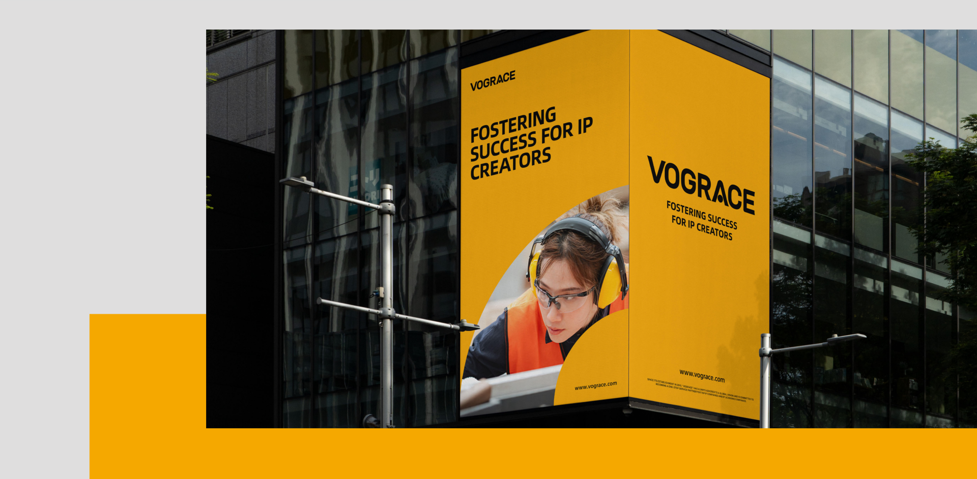
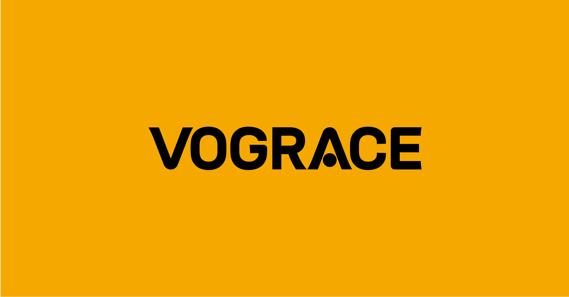
From community memory to global recognition. HEIGE upgraded the VOGRACE English logo and visual system with a cleaner wordmark, a memorable “A” detail and a high-contrast black-yellow palette for a young, professional brand image serving global IP creator
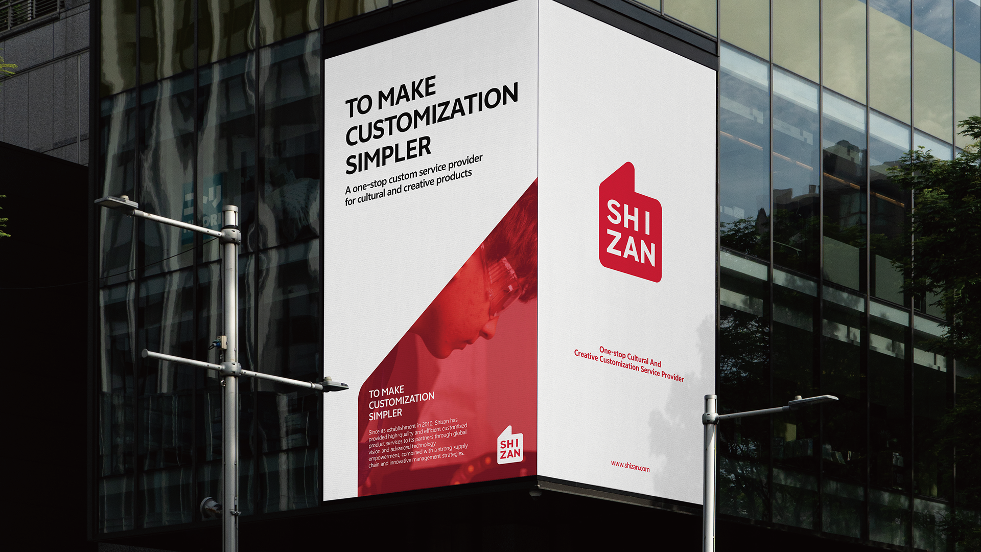
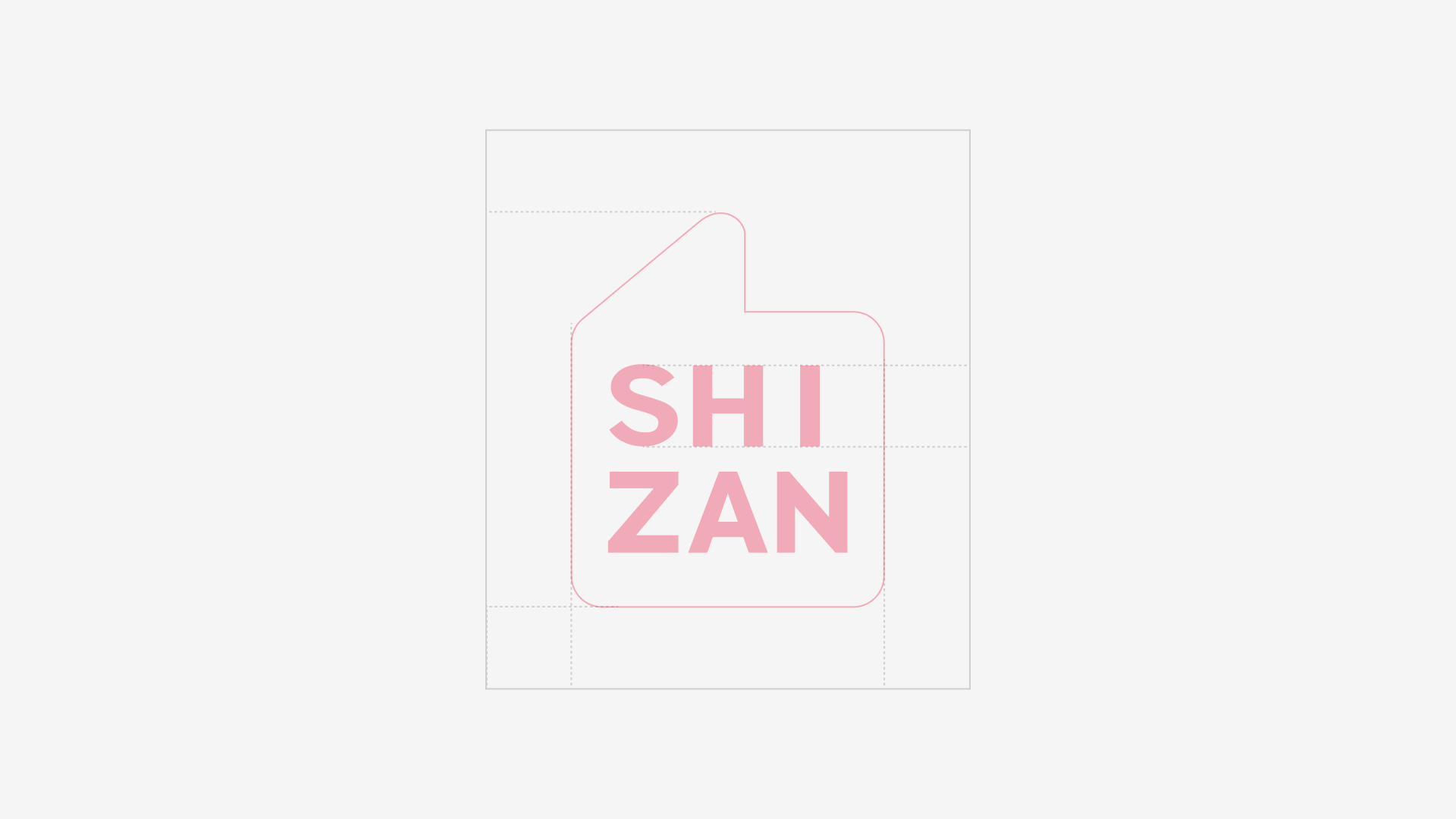
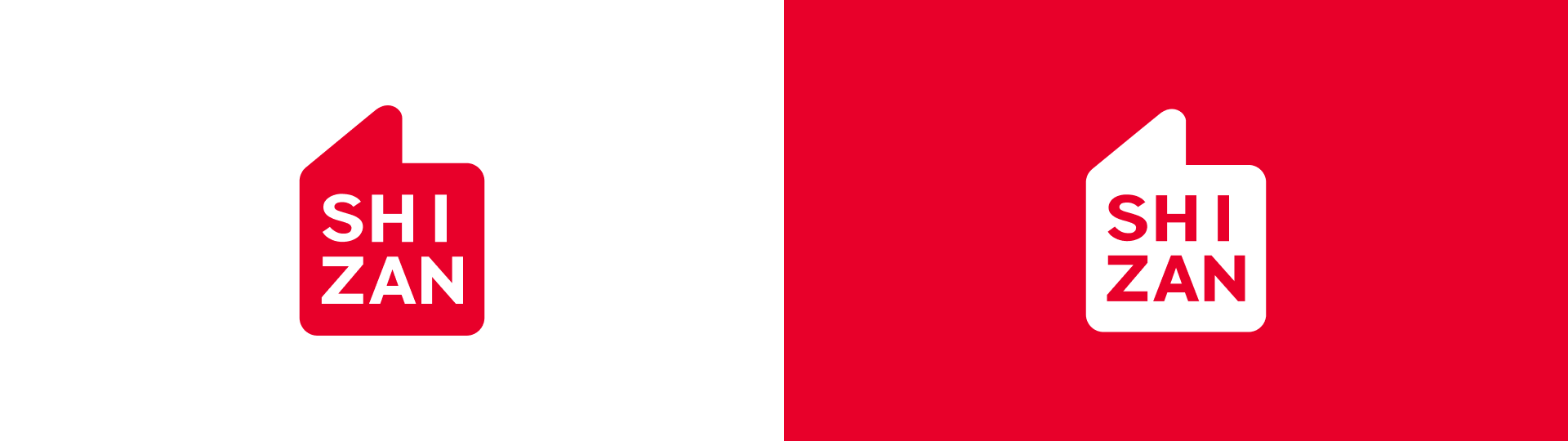
HEIGE turned the idea of praise into a globally legible brand symbol for SHIZAN, building a VIS system around the thumbs-up gesture so supply-chain service, flexible customization and creator support can be seen in one visual language.
3D animated promotional film for Three Squirrels snacks
Online and offline red packet campaign
Mobility data visualization design
Didi one-yuan designated driving campaign design
VOGRACE2026 / IP Creator Brand Identity
世赞 SHIZAN2026 / VIS Brand Identity
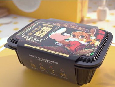
Three Squirrels 3D Promotional FilmSelected work
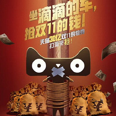
Didi Double Eleven Red Packet CampaignSelected work
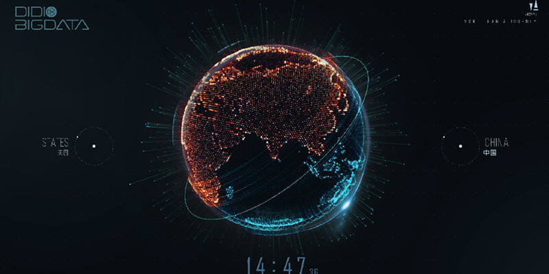
Data Visualization Display DesignSelected work
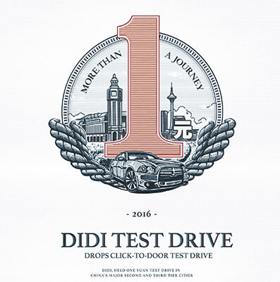
Didi One-Yuan Designated DrivingSelected work
Our work
VOGRACE
From community memory to global recognition. HEIGE upgraded the VOGRACE English logo and visual system with a cleaner wordmark, a memorable “A” detail and a high-contrast black-yellow palette for a young, professional brand image serving global IP creator
2026 / IP Creator Brand Identity
Our work
世赞 SHIZAN
HEIGE turned the idea of praise into a globally legible brand symbol for SHIZAN, building a VIS system around the thumbs-up gesture so supply-chain service, flexible customization and creator support can be seen in one visual language.
2026 / VIS Brand Identity
Our work
Three Squirrels 3D Promotional Film
3D animated promotional film for Three Squirrels snacks
Selected work
Our work
Didi Double Eleven Red Packet Campaign
Online and offline red packet campaign
Selected work
Our work
Data Visualization Display Design
Mobility data visualization design
Selected work
Our work
Didi One-Yuan Designated Driving
Didi one-yuan designated driving campaign design
Selected workOur work / 2026 / IP Creator Brand Identity
VOGRACE
From community memory to global recognition. HEIGE upgraded the VOGRACE English logo and visual system with a cleaner wordmark, a memorable “A” detail and a high-contrast black-yellow palette for a young, professional brand image serving global IP creator
From Community Memory to Global Recognition
Scope: brand understanding, logo upgrade, symbolic typography, brand color, communication layout and visual application direction.
VOGRACE serves a highly visual, community-driven and fast-moving market. It connects creators, fan culture and custom production, turning illustrations, characters, fan works and IP content into cultural products that can be collected, purchased and shared. The brand upgrade needed to answer two directions: keeping the friendliness and playfulness needed by anime and fan communities, while presenting a more professional, reliable and mature business image for a broader global market.
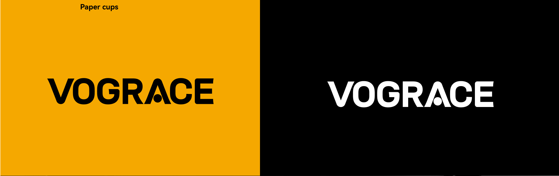
HEIGE did not replace the existing brand memory. Instead, the upgrade focused on clarity and symbolization. The new VOGRACE logo keeps the English name as the core identity asset and translates its community warmth into a simpler, bolder and more modern sans-serif form. This keeps the brand readable across websites, e-commerce, packaging, exhibitions, social media and product merchandise.
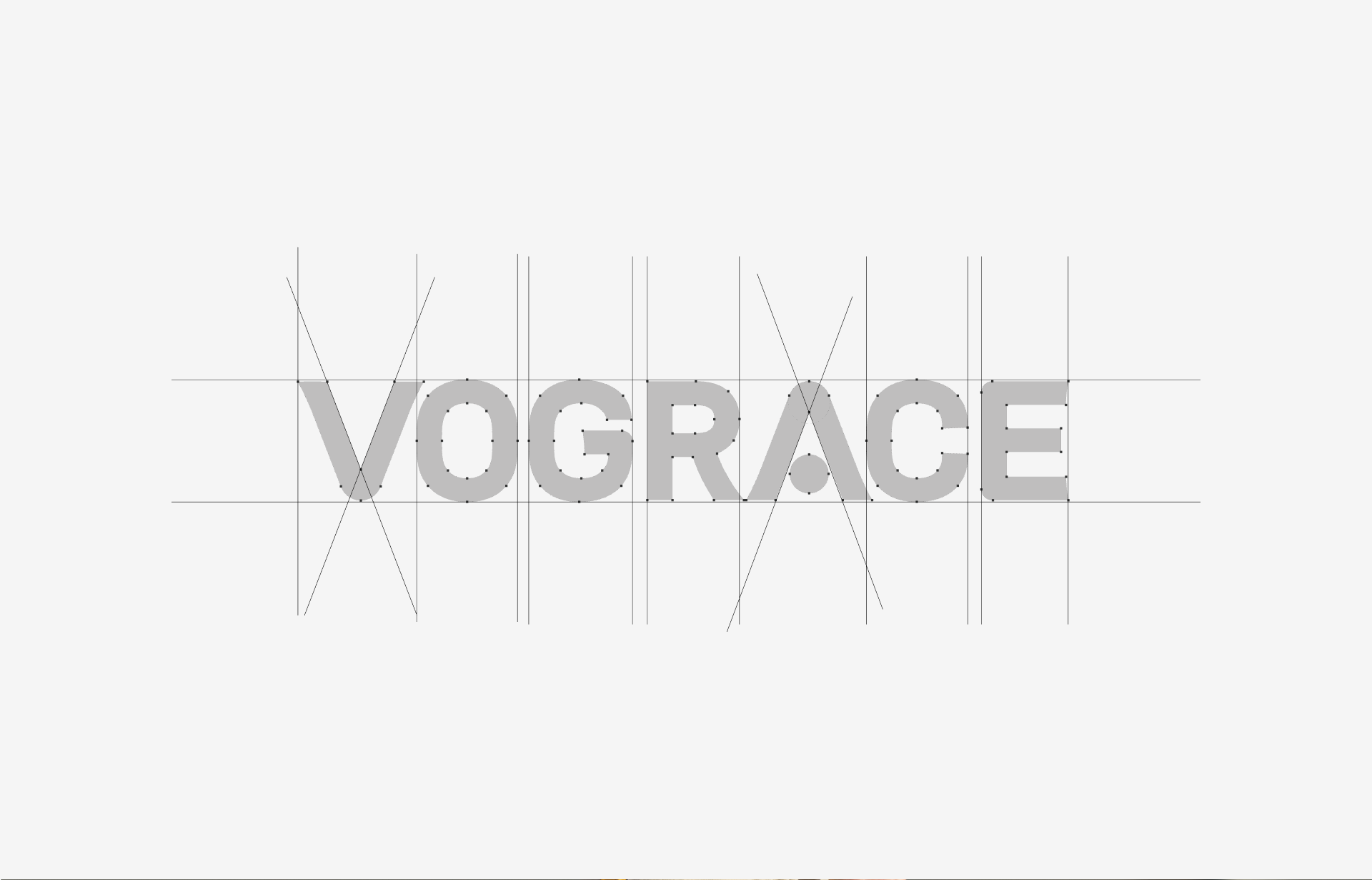
Turning the Letter A Into a Memorable Brand Detail
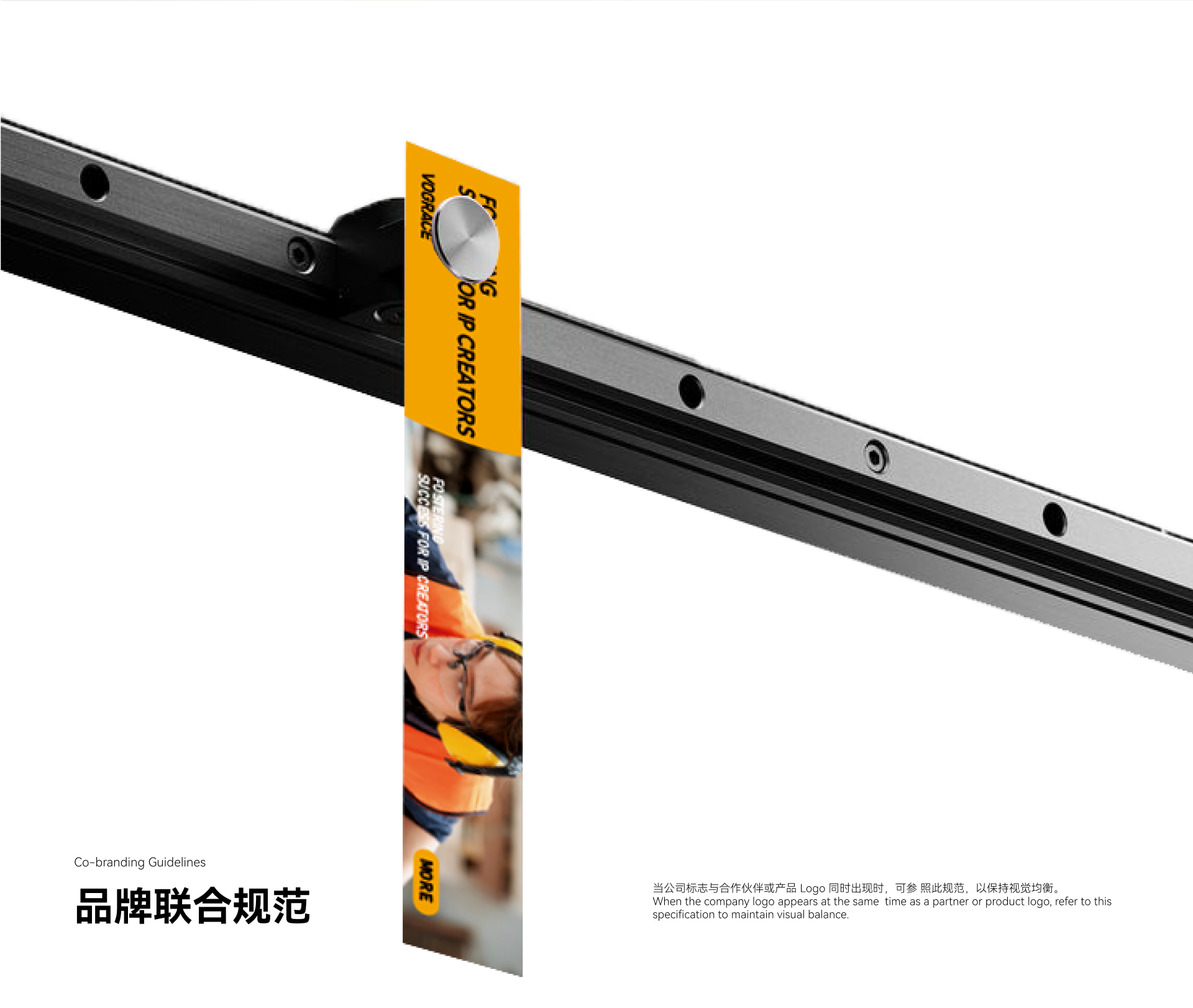
The key memory point comes from the letter “A”. We turned it into a visual focus with symbolic meaning, using a dot and letter structure to create a more distinctive detail. It echoes the symbolic and anthropomorphic language often found in anime culture without sacrificing the simplicity of the whole logo. It helps VOGRACE become more memorable among custom-production brands and gives users a clear brand association during quick browsing.
A Black and Yellow System for Youth and Trust
The color system uses a high-contrast black and yellow relationship. Yellow communicates youth, innovation and openness, while black provides professionalism, stability and international recognition. Together they give the brand energy for creator communities and trust for global customers and business partners. Compared with more complex cartoon expressions, the new identity is more suitable for long-term use across languages, platforms and product categories.
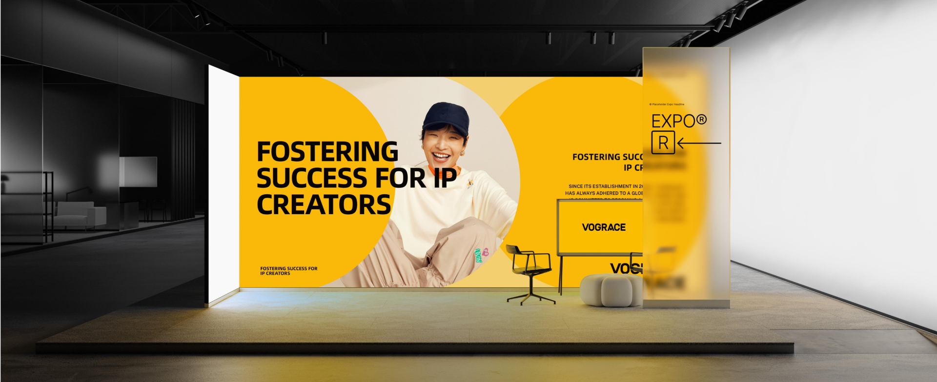
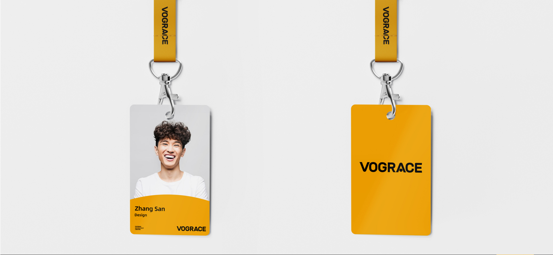
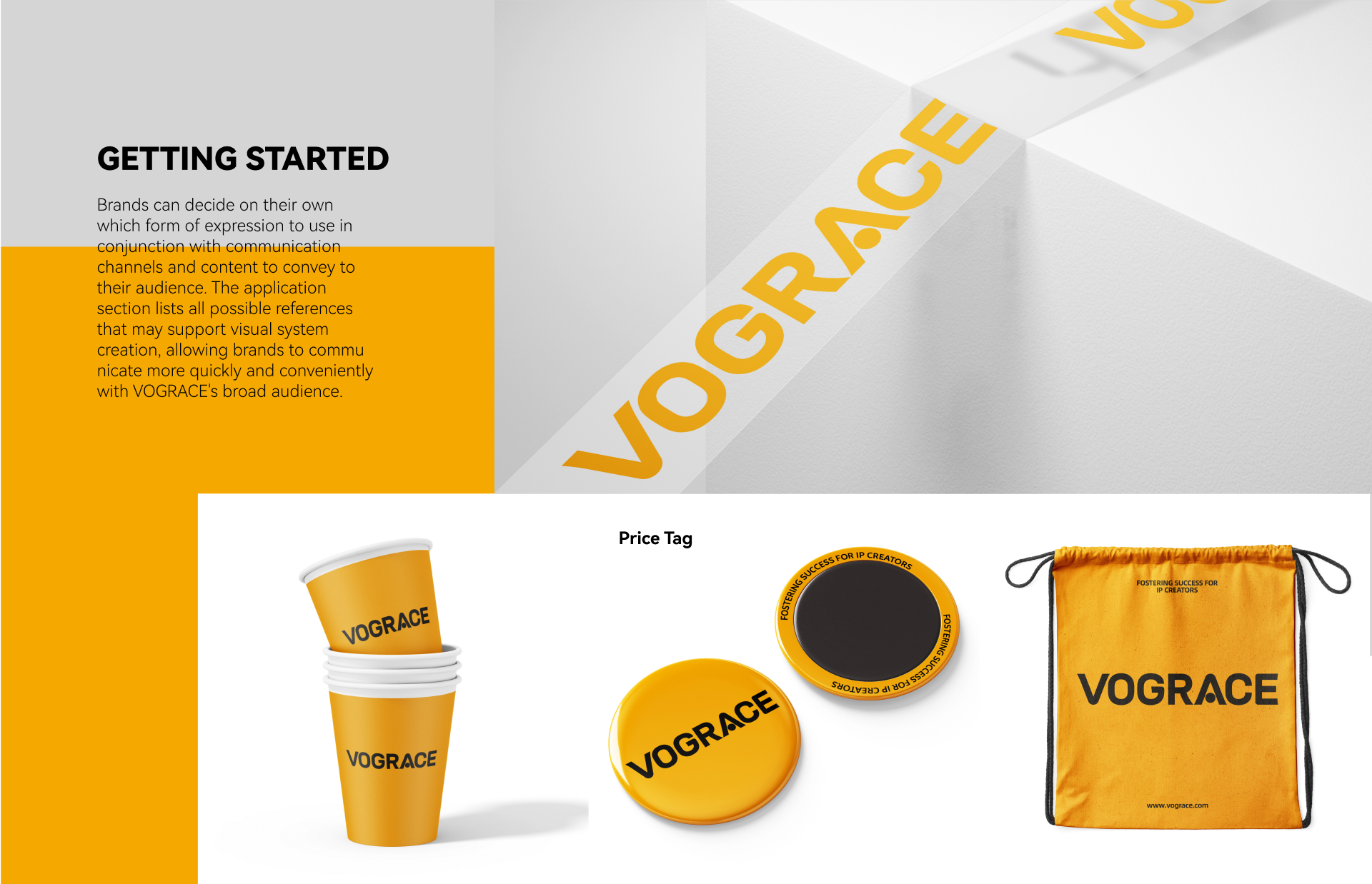
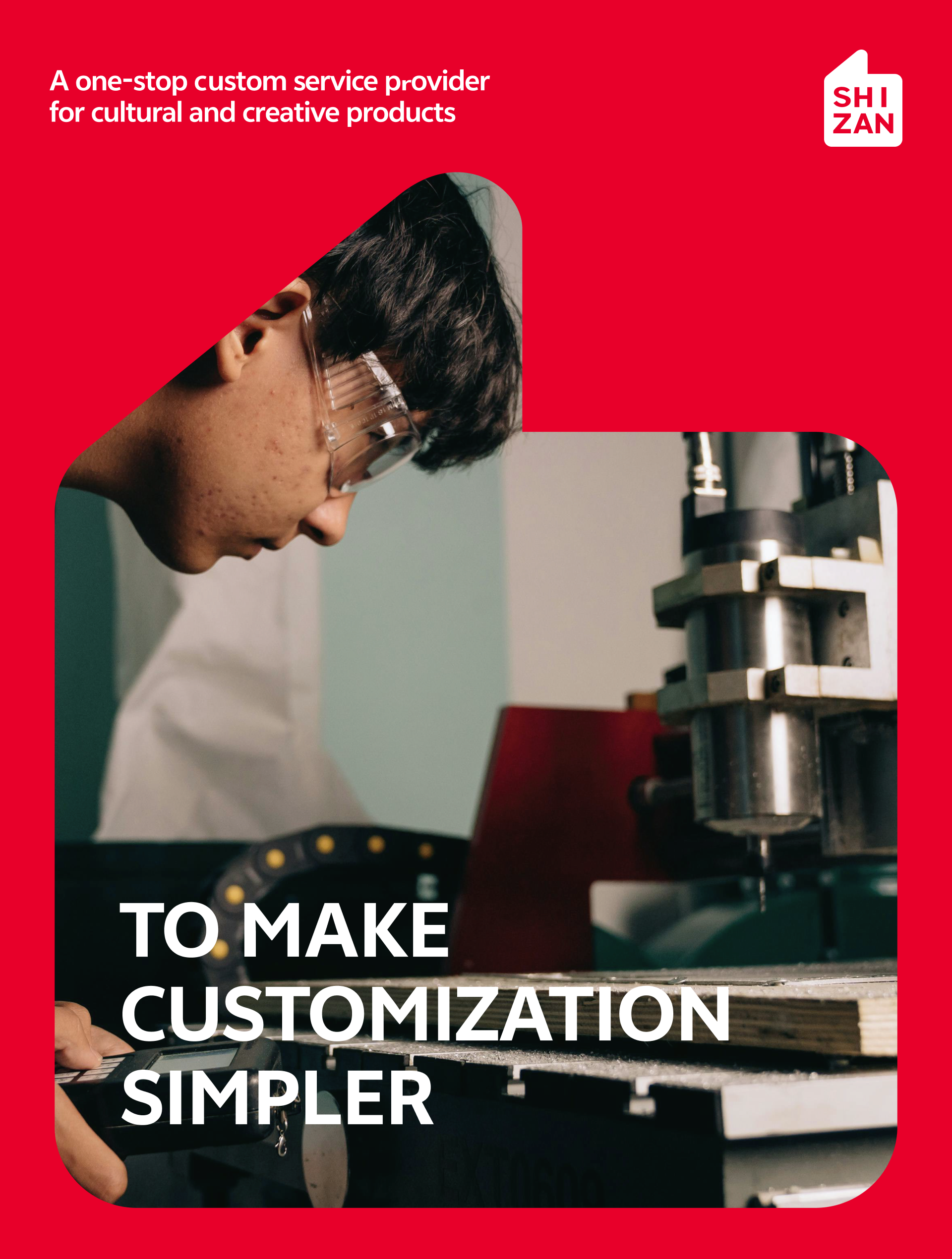
The communication layout centers on “Fostering Success for IP Creators.” It moves the brand from being only a production customizer to being a supporter of creator success. VOGRACE does not simply manufacture products; it helps creators move from artwork to merchandise, and from interest to business opportunity. The proposition aligns with the broader direction of supporting IP creators, while giving VOGRACE a younger and more direct visual voice.
Keeping High-Frequency Touchpoints Consistent
The new VIS system gives VOGRACE a more stable visual foundation for long-term growth. It keeps the brand close to anime culture, more mature in international markets and easier to recognize in high-frequency communication. For a custom brand serving global creators and fan communities, the value is not only a logo update, but a brand language that can continuously carry creative passion, product trust and business expansion.
Our work / 2026 / VIS Brand Identity
世赞 SHIZAN
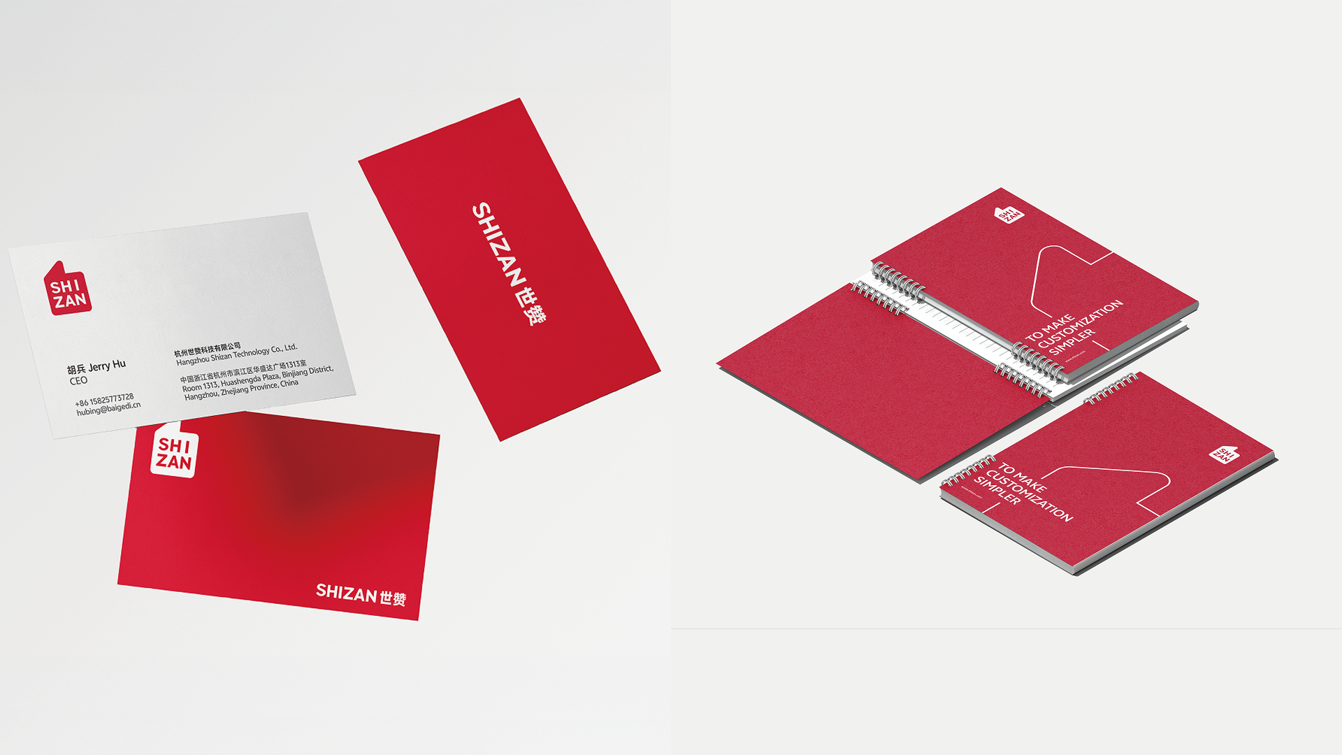
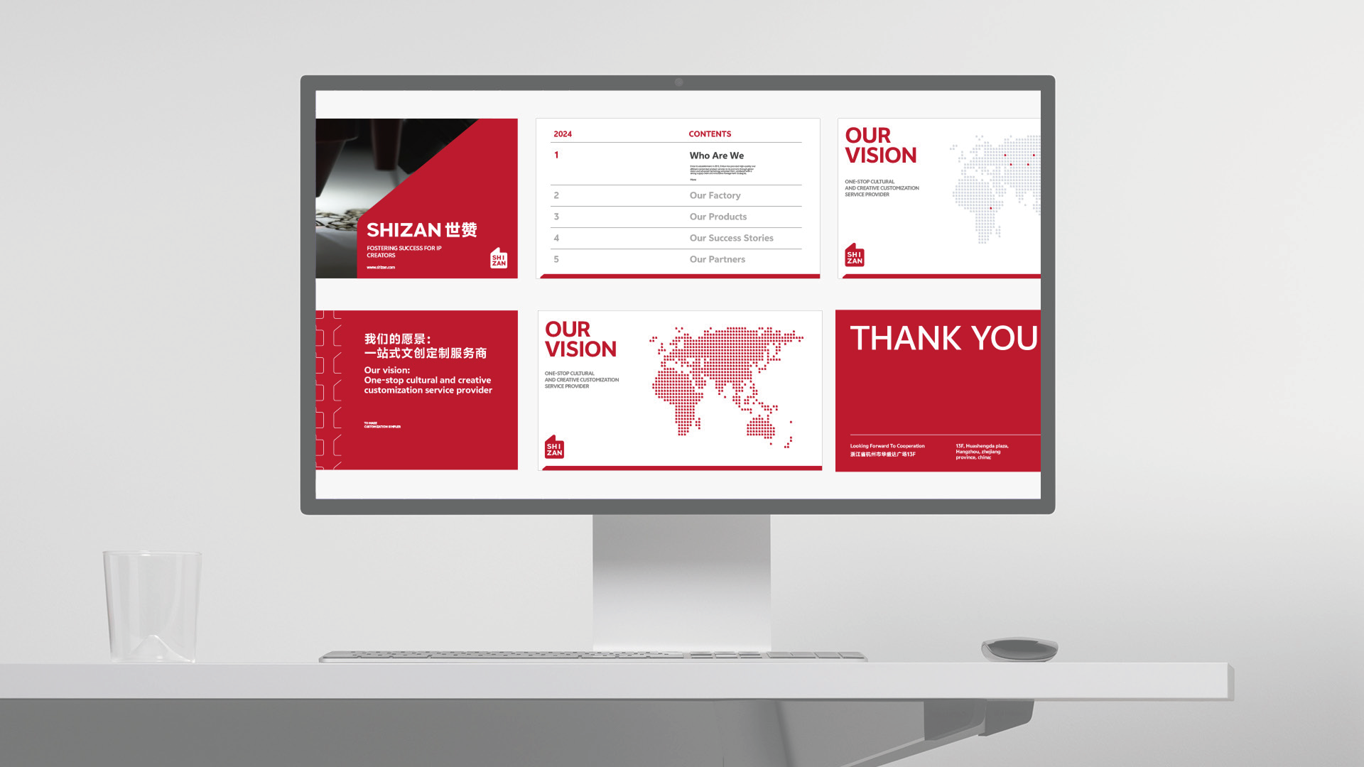
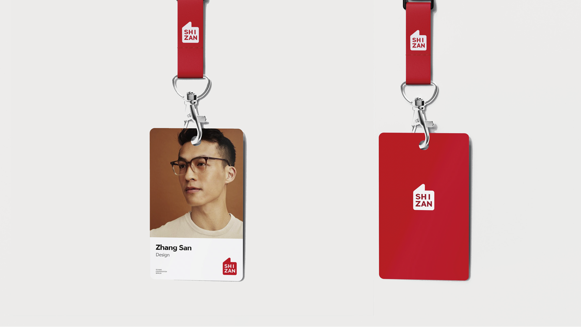
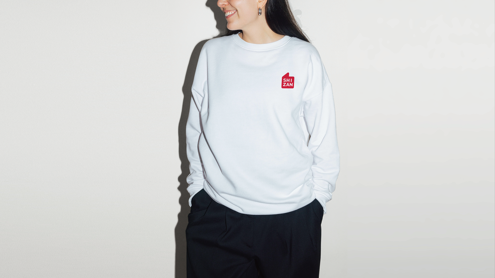
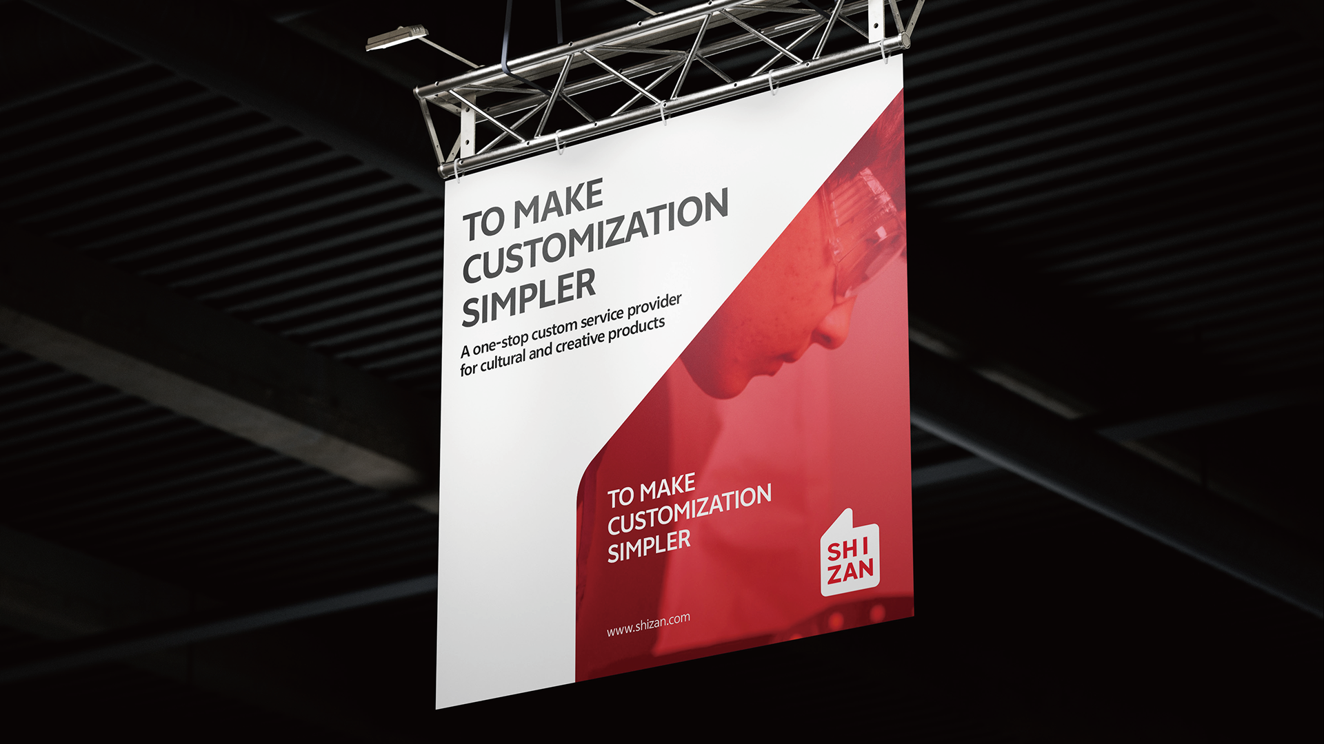
HEIGE turned the idea of praise into a globally legible brand symbol for SHIZAN, building a VIS system around the thumbs-up gesture so supply-chain service, flexible customization and creator support can be seen in one visual language.

Project Context and Design Logic
Scope: brand understanding, brand prototype, logo design, color system, typography, basic identity and application rollout.
SHIZAN connects creator imagination, IP commercialization and a cross-border cultural-products supply chain. The brand upgrade was not about making a prettier mark; it was about making every encounter explain what SHIZAN does: helping creators turn ideas into products and helping their work receive recognition.
During strategy, HEIGE returned to the internal logic of the brand. SHIZAN needed the credibility of a supply-chain service provider, the flexibility of custom production, the creative support required by the IP market and the international perspective of a global partner. We summarized this personality as a creator: a brand role that turns imagination into real commercial outcomes.

Turning Praise Into a Shared Symbol
The name SHIZAN offered a clear visual clue. “Shi” points to the world, the times and a broader global view; “Zan” means praise, support and recognition. For a brand serving global creators, the most valuable sign should cross language barriers. We extracted shared meaning from Nice, Good and the thumbs-up gesture, turning the emotion of “Zan” into an instantly recognizable visual stamp.
The new logo combines the thumbs-up gesture with the SHIZAN name. It is not decorative graphics, but the first contact point between the brand and its clients. When a product is shipped, work is delivered or a creator receives customized merchandise, the mark represents SHIZAN’s recognition of creative outcomes and its support for client success.
Building a Scalable VIS System
The identity system uses a highly recognizable red as the primary color. PANTONE 185 C brings active, warm and direct visual energy, allowing the brand to stand out quickly across exhibitions, packaging, digital communication and spatial signage. Black, white and gray balance the energy of red and keep the system professional, concise and scalable.
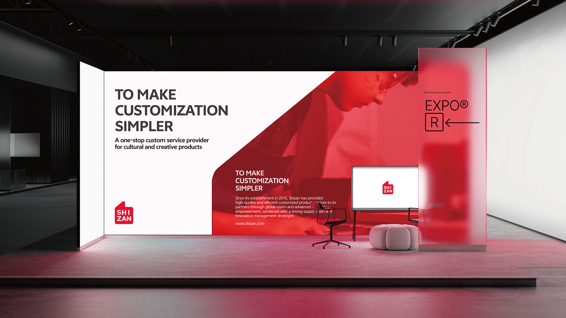
The typography uses a clean, modern and globally legible sans-serif language. It reduces friction across languages and keeps Chinese, English, numerals, icons and layouts consistent. Together with a minimal icon system, color proportions and application rules, SHIZAN becomes more than a logo: it becomes a brand language that can work continuously across touchpoints.
Bringing the Brand Into Real Touchpoints
The system extends into brand guidelines, business materials, exhibition spaces, digital screens, outdoor advertising, building signage, badges, apparel and hanging flags. Whether clients meet SHIZAN on the website, at an exhibition or through packaging, the experience points to the same judgement: a professional, reliable and creator-focused global customization service brand.
The new VIS turns custom-service capability from a backstage strength into a frontstage identity. It condenses supply chain, creative support and client achievement into a simple symbol with emotion, giving SHIZAN a clearer memory point in the competitive IP cultural-products market and a stable visual foundation for future international growth.
Our work / Selected work
Three Squirrels 3D Promotional Film
3D animated promotional film for Three Squirrels snacks
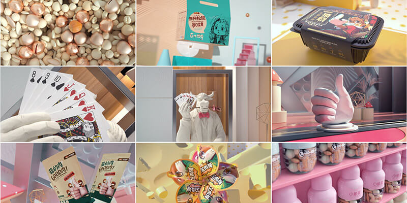
3D promotional animation for Three Squirrels, combining product character, motion rhythm and campaign communication into video assets.
Our work / Selected work
Didi Double Eleven Red Packet Campaign
Online and offline red packet campaign
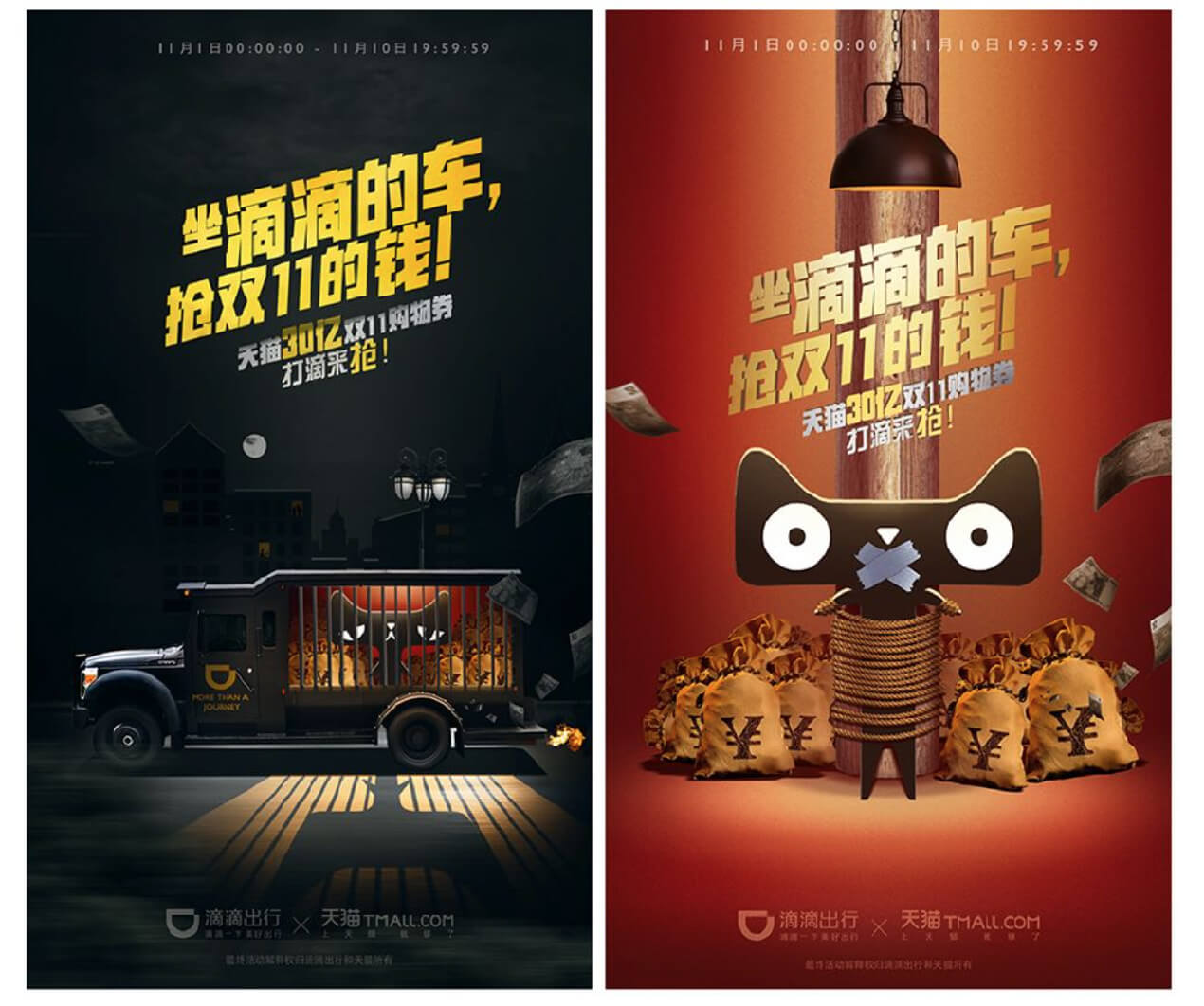
Online and offline campaign visual design for Didi Double Eleven red packet promotion, covering activity communication and cross-channel execution.
Our work / Selected work
Data Visualization Display Design
Mobility data visualization design
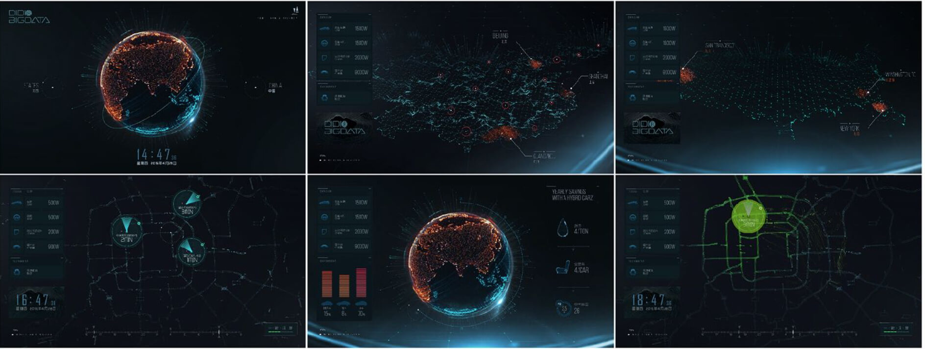
Data visualization and display design for travel scenarios, turning complex information into clearer visual narratives and presentation assets.
Our work / Selected work
Didi One-Yuan Designated Driving
Didi one-yuan designated driving campaign design
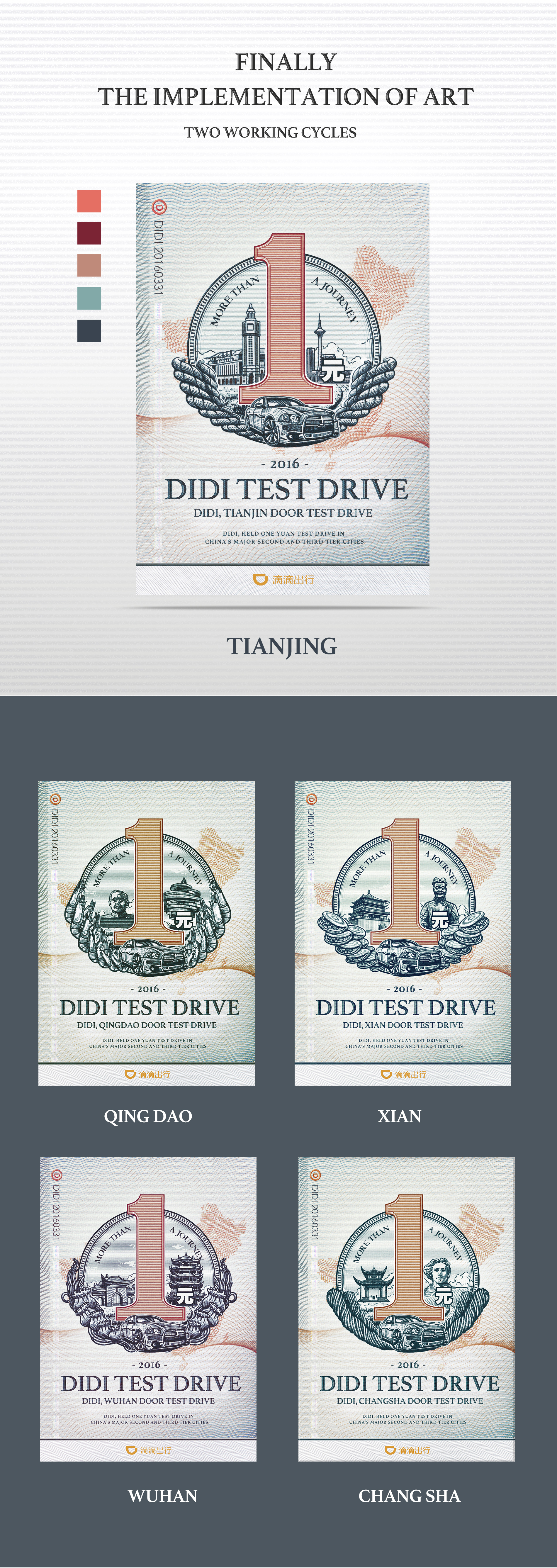
Campaign visual design for Didi designated driving, covering communication assets, activity visuals and touchpoint extension for a one-yuan promotion.
Project method
How projects move
Every project starts with a business goal, then moves through strategy, visual system, applications and rollout support.
Diagnosis
Define the brand stage, audience perception, competitors and priority business problem.
System Design
Turn strategy into identity, graphics, layouts, image direction and usage rules.
Rollout
Extend the system into web, packaging, sales materials, campaigns and social content.
Maintenance
Provide templates, guidelines and a maintainable update workflow.
Collaborations
Representative project types
From visual systems and creative campaigns to ongoing design support, we build practical and expandable assets for clients at different stages. Some collaborations are listed by name only for confidentiality.
Creative Marketing Visual System
A creative marketing visual system for brand communication.
Creative Marketing Design
Creative marketing visuals built around campaign and sales scenarios.
Brand Maintenance System
A maintainable visual system and long-term content assets.
Automotive and mobility
Automotive and mobility brand collaboration.
Content and entertainment
Content and entertainment brand collaboration.
Mobility technology
Mobility technology brand collaboration.
Clients
Selected brand collaborations
Selected clients across visual systems, campaigns, digital experience and ongoing design support. Some projects are listed by brand name only for confidentiality.

bilibili
Creative Marketing Visual System

Tesla
Creative Marketing Design

Marshall
Brand Maintenance System

Audi
Automotive and mobility
iQIYI
Content and entertainment

Didi
Mobility technology

Kuaishou
Content platform

National Geographic
Culture and publishing

Mercedes-Benz
Automotive and lifestyle