 Culture
We’re HEIGE The Brand Design Company
We build ambitious brand systems for ambitious companies.
From strategy to identity, from websites to campaigns,
we create design systems that help brands grow with clarity and craft.
Our work
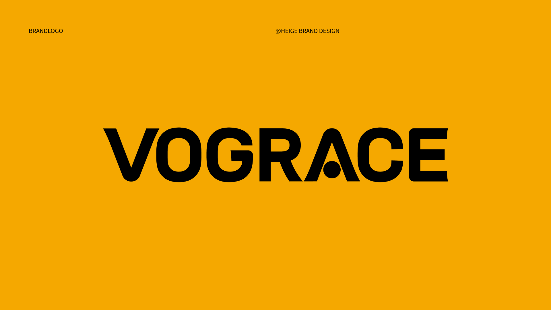
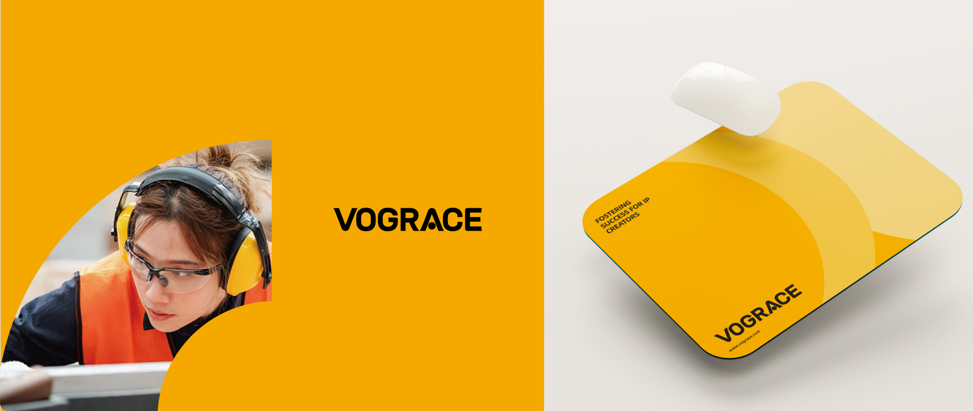
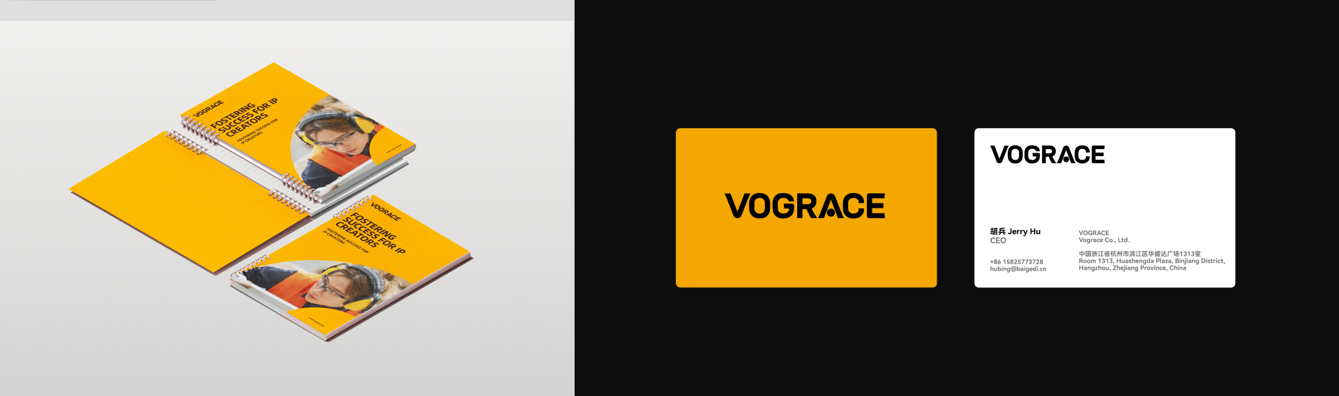
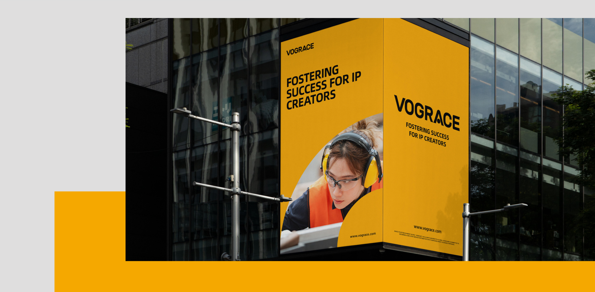
VOGRACE
世赞 SHIZAN
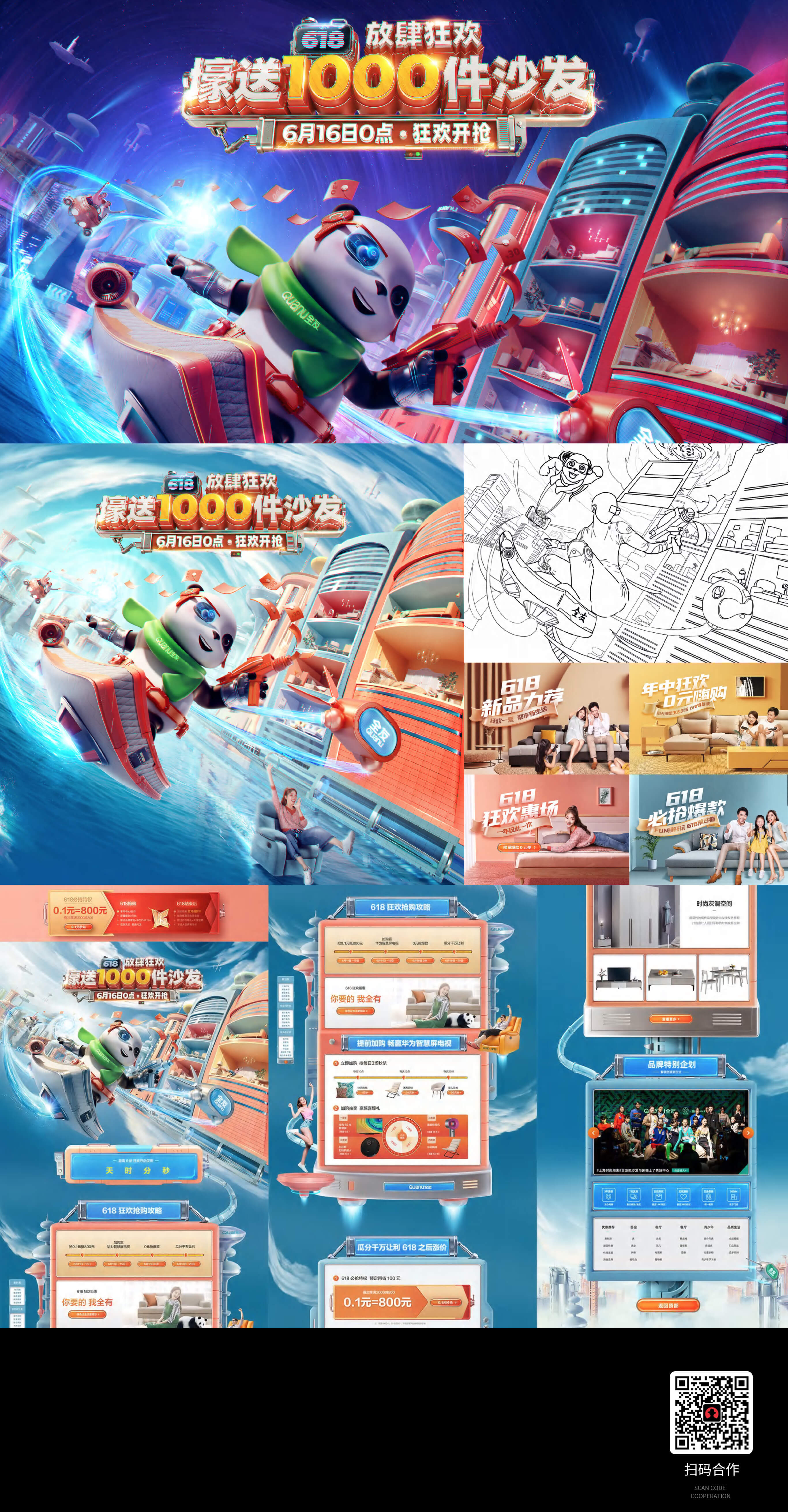
Campaign content system
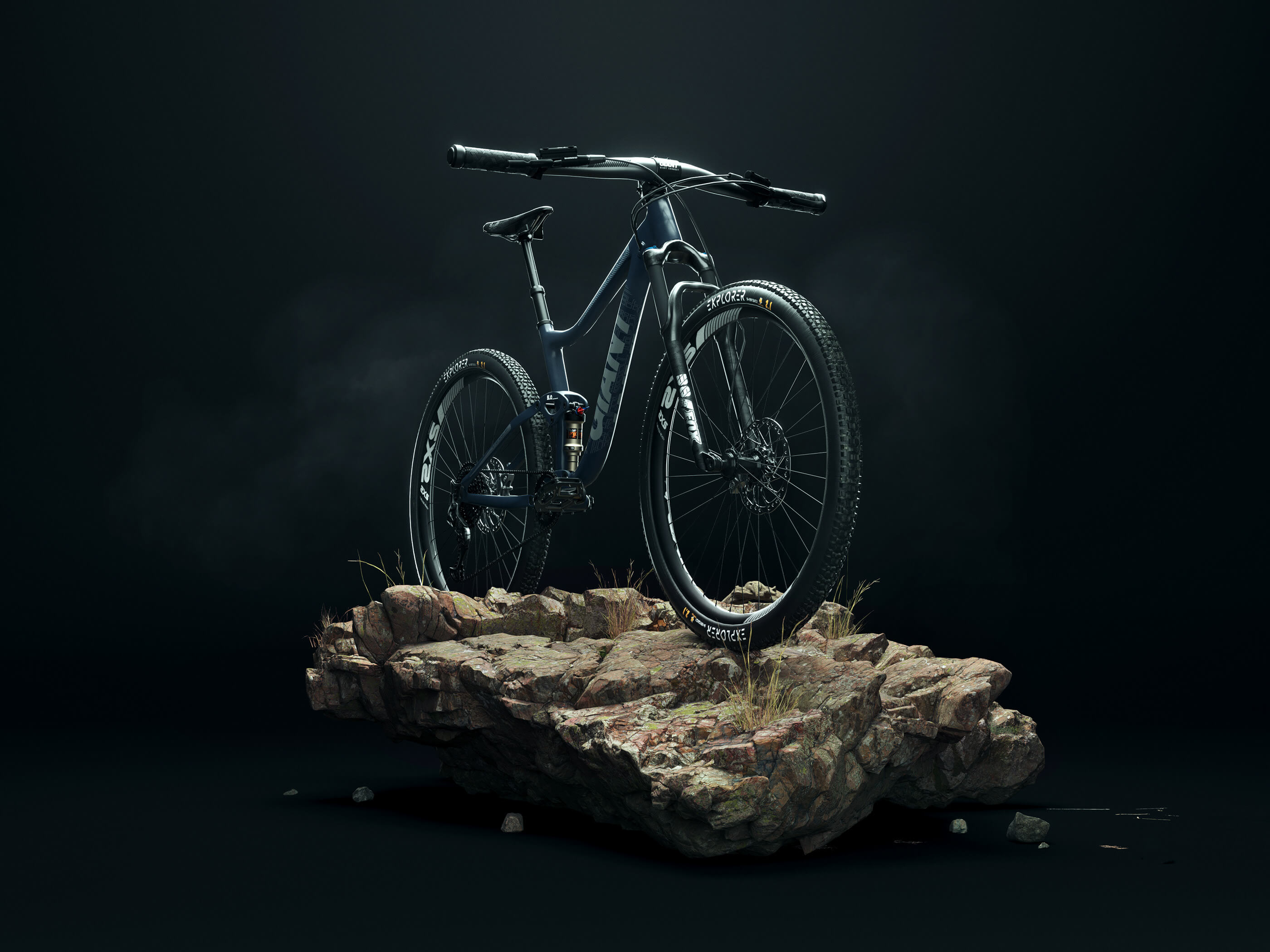
Website Conversion System
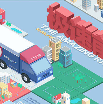
Packaging and Retail Experience
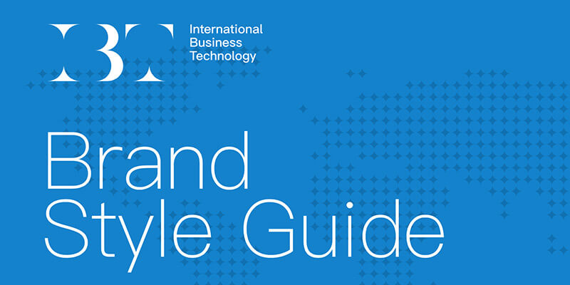
Brand Visual System Upgrade
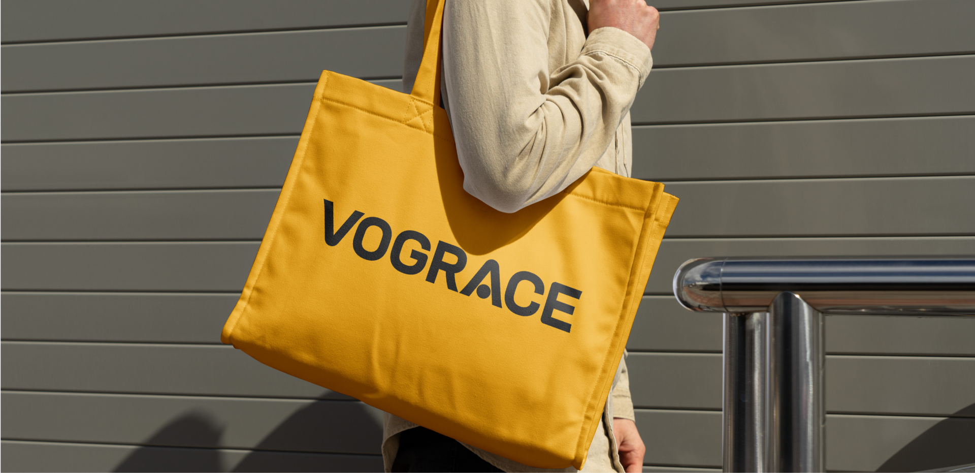
From community memory to global recognition. HEIGE upgraded the VOGRACE English logo and visual system with a cleaner wordmark, a memorable “A” detail and a high-contrast black-yellow palette for a young, professional brand image serving global IP creator
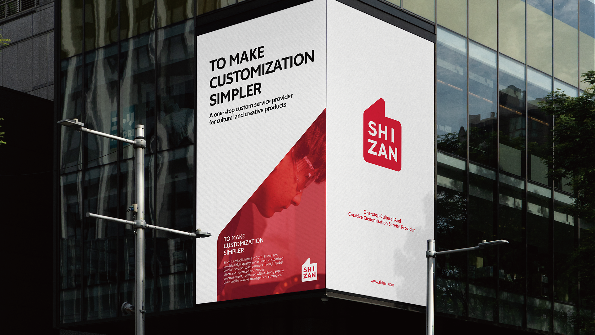
HEIGE turned the idea of praise into a globally legible brand symbol for SHIZAN, building a VIS system around the thumbs-up gesture so supply-chain service, flexible customization and creator support can be seen in one visual language.
Campaign
Bicycle rendering design
Brand visual system design
RRS Express Delivery Mini Game
VOGRACE2026 / IP Creator Brand Identity
世赞 SHIZAN2026 / VIS Brand Identity
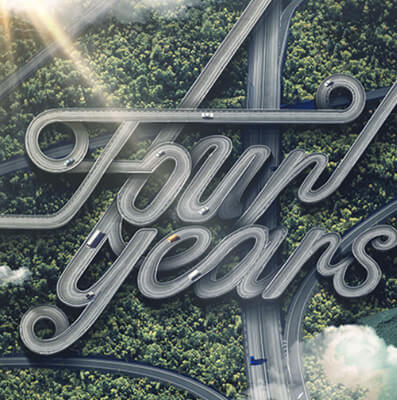
Campaign content system2026 / Content
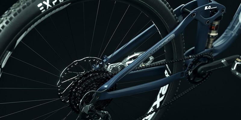
Website Conversion System2026 / Website
Packaging and Retail Experience2026 / Packaging
Brand Visual System Upgrade2026 / Brand identity
Our work
VOGRACE
From community memory to global recognition. HEIGE upgraded the VOGRACE English logo and visual system with a cleaner wordmark, a memorable “A” detail and a high-contrast black-yellow palette for a young, professional brand image serving global IP creator
2026 / IP Creator Brand Identity
Our work
世赞 SHIZAN
HEIGE turned the idea of praise into a globally legible brand symbol for SHIZAN, building a VIS system around the thumbs-up gesture so supply-chain service, flexible customization and creator support can be seen in one visual language.
2026 / VIS Brand Identity
Our work
Campaign content system
Campaign
2026 / Content
Our work
Website Conversion System
Bicycle rendering design
2026 / Website
Our work
Packaging and Retail Experience
Brand visual system design
2026 / Packaging
Our work
Brand Visual System Upgrade
RRS Express Delivery Mini Game
2026 / Brand identityOur work / 2026 / IP Creator Brand Identity
VOGRACE
From community memory to global recognition. HEIGE upgraded the VOGRACE English logo and visual system with a cleaner wordmark, a memorable “A” detail and a high-contrast black-yellow palette for a young, professional brand image serving global IP creator
From Community Memory to Global Recognition
Scope: brand understanding, logo upgrade, symbolic typography, brand color, communication layout and visual application direction.
VOGRACE serves a highly visual, community-driven and fast-moving market. It connects creators, fan culture and custom production, turning illustrations, characters, fan works and IP content into cultural products that can be collected, purchased and shared. The brand upgrade needed to answer two directions: keeping the friendliness and playfulness needed by anime and fan communities, while presenting a more professional, reliable and mature business image for a broader global market.
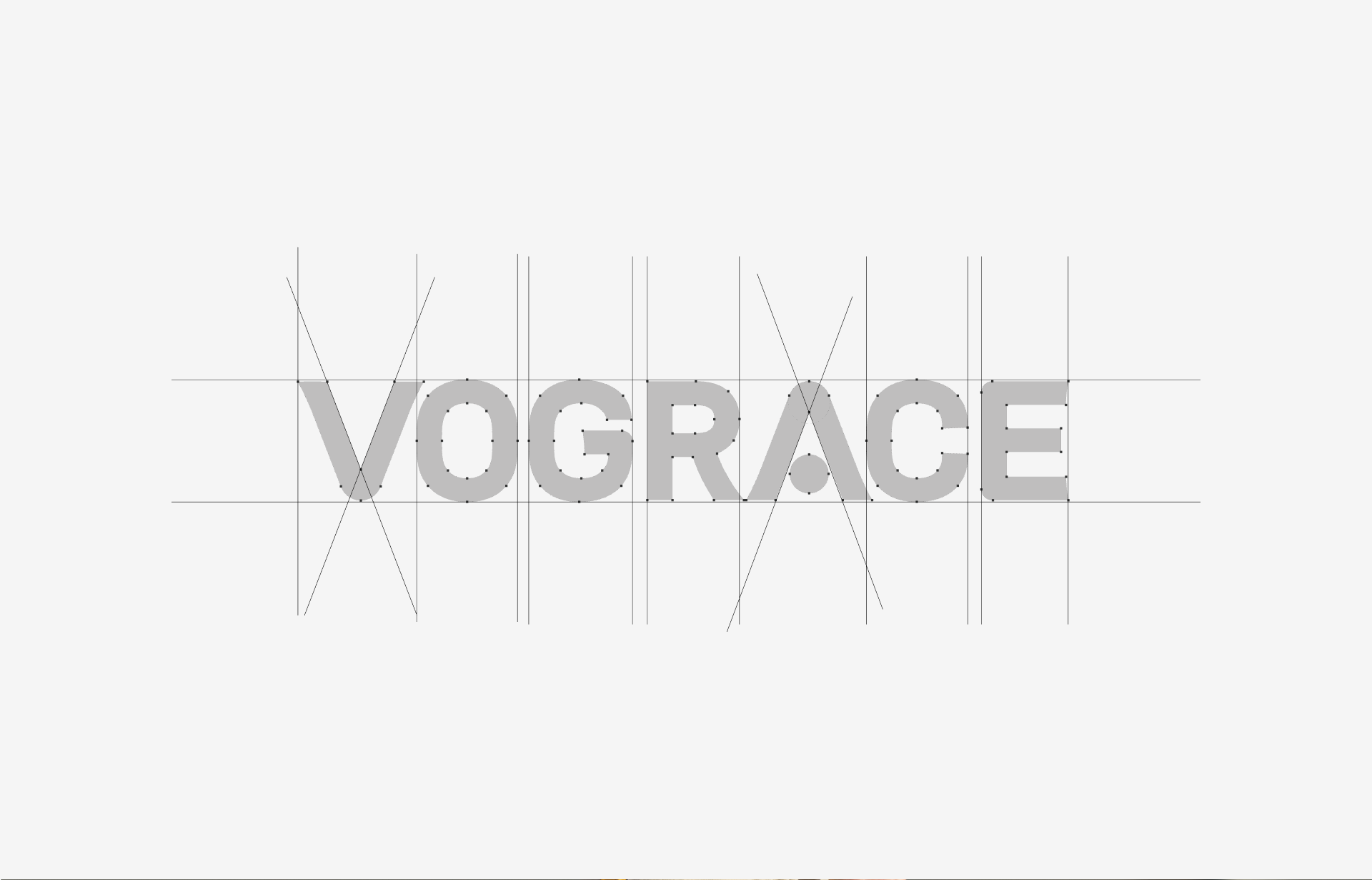
HEIGE did not replace the existing brand memory. Instead, the upgrade focused on clarity and symbolization. The new VOGRACE logo keeps the English name as the core identity asset and translates its community warmth into a simpler, bolder and more modern sans-serif form. This keeps the brand readable across websites, e-commerce, packaging, exhibitions, social media and product merchandise.
Turning the Letter A Into a Memorable Brand Detail
The key memory point comes from the letter “A”. We turned it into a visual focus with symbolic meaning, using a dot and letter structure to create a more distinctive detail. It echoes the symbolic and anthropomorphic language often found in anime culture without sacrificing the simplicity of the whole logo. It helps VOGRACE become more memorable among custom-production brands and gives users a clear brand association during quick browsing.
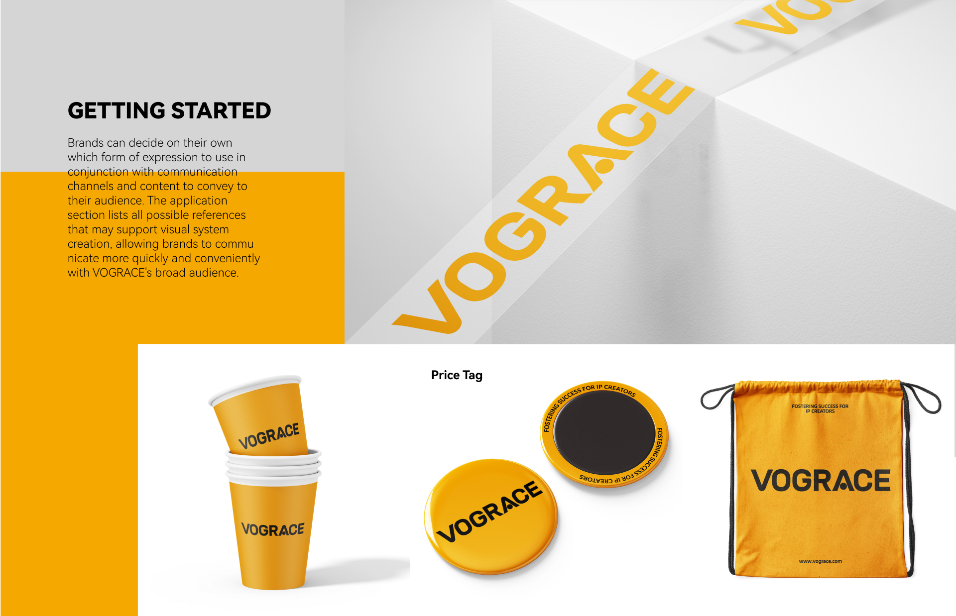
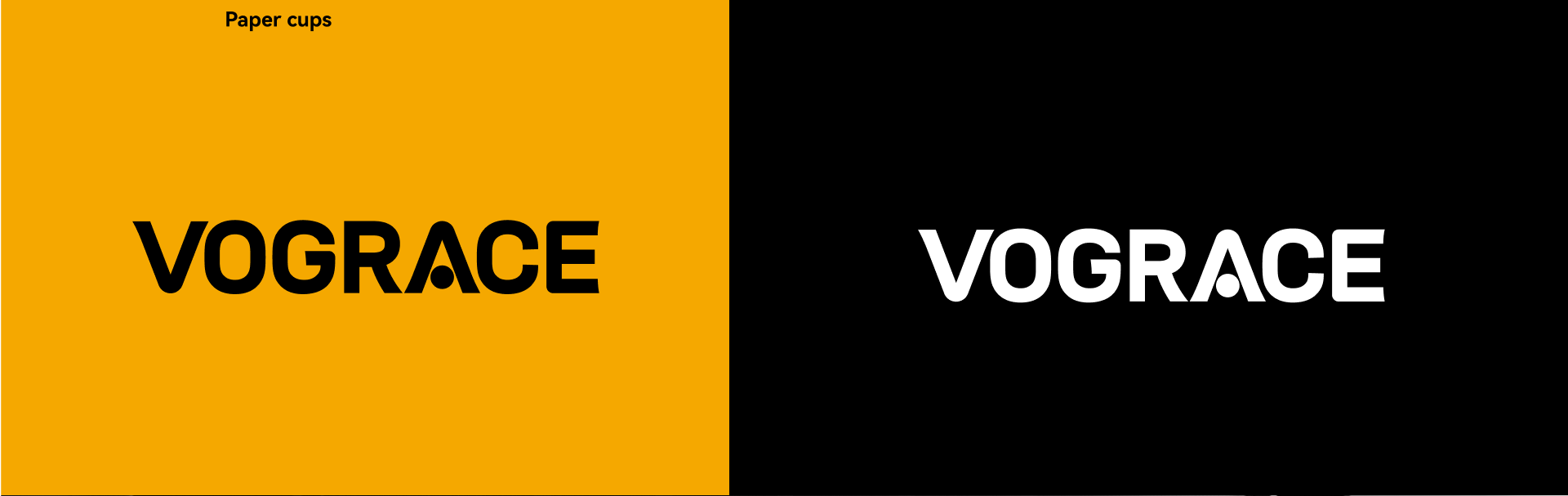
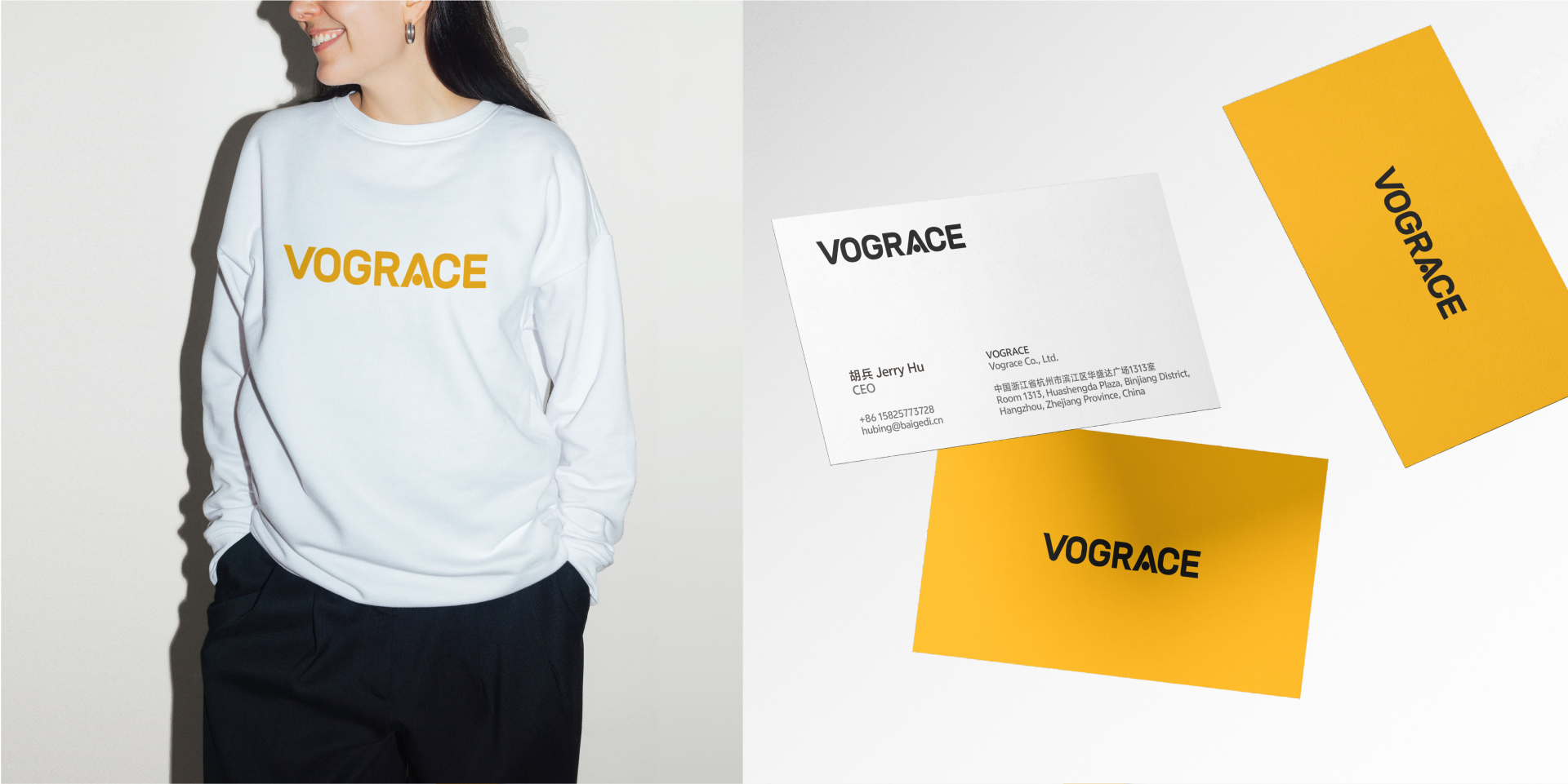
A Black and Yellow System for Youth and Trust
The color system uses a high-contrast black and yellow relationship. Yellow communicates youth, innovation and openness, while black provides professionalism, stability and international recognition. Together they give the brand energy for creator communities and trust for global customers and business partners. Compared with more complex cartoon expressions, the new identity is more suitable for long-term use across languages, platforms and product categories.
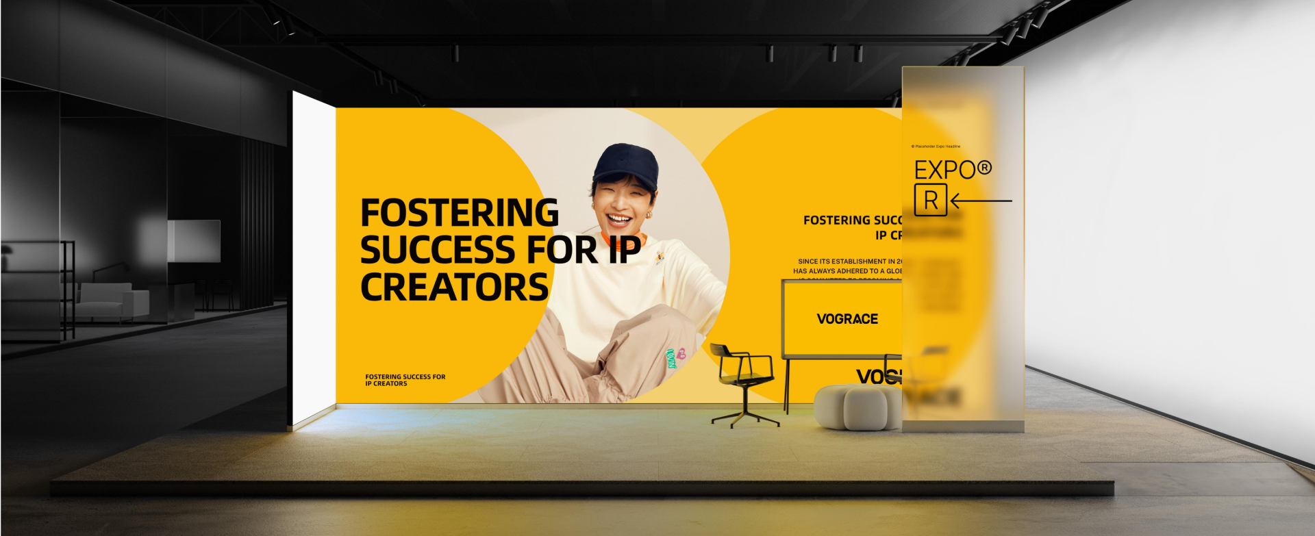
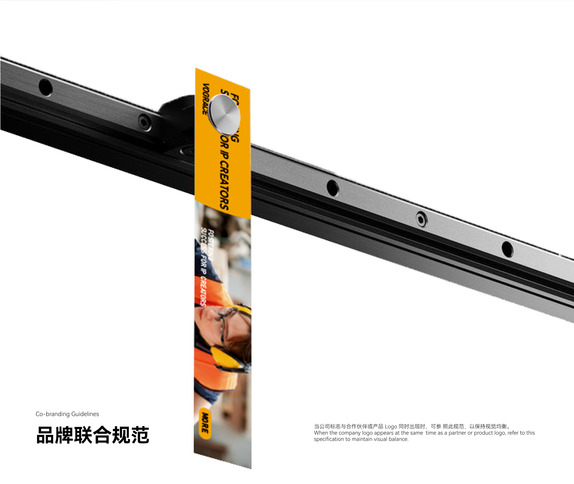
The communication layout centers on “Fostering Success for IP Creators.” It moves the brand from being only a production customizer to being a supporter of creator success. VOGRACE does not simply manufacture products; it helps creators move from artwork to merchandise, and from interest to business opportunity. The proposition aligns with the broader direction of supporting IP creators, while giving VOGRACE a younger and more direct visual voice.
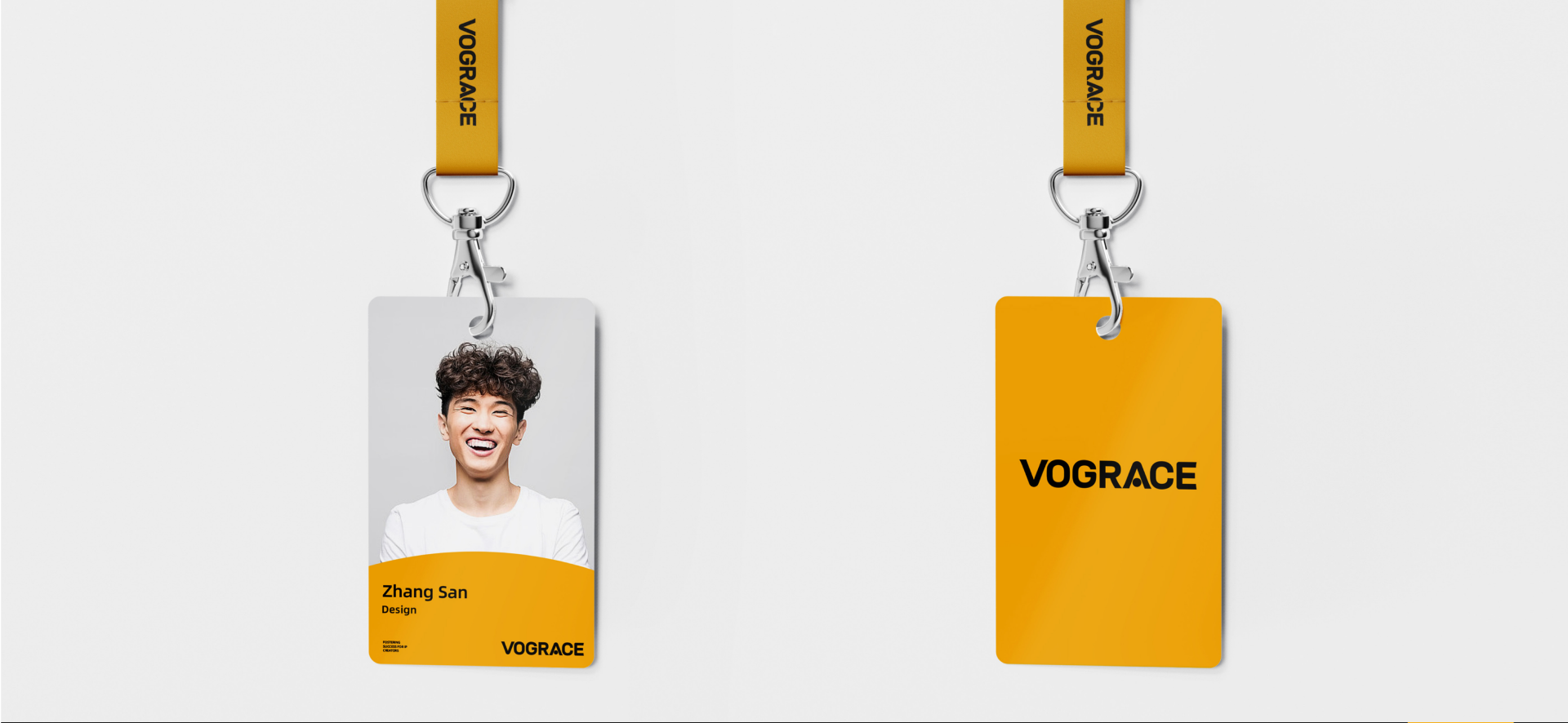
Keeping High-Frequency Touchpoints Consistent
The new VIS system gives VOGRACE a more stable visual foundation for long-term growth. It keeps the brand close to anime culture, more mature in international markets and easier to recognize in high-frequency communication. For a custom brand serving global creators and fan communities, the value is not only a logo update, but a brand language that can continuously carry creative passion, product trust and business expansion.
Our work / 2026 / VIS Brand Identity
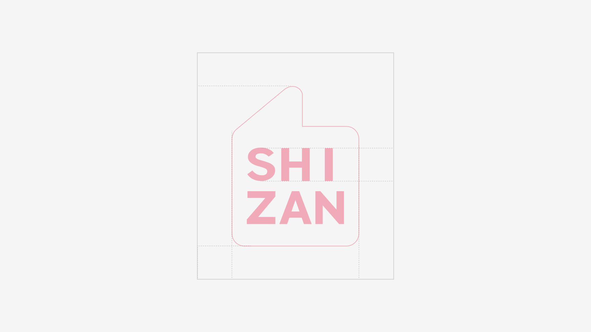
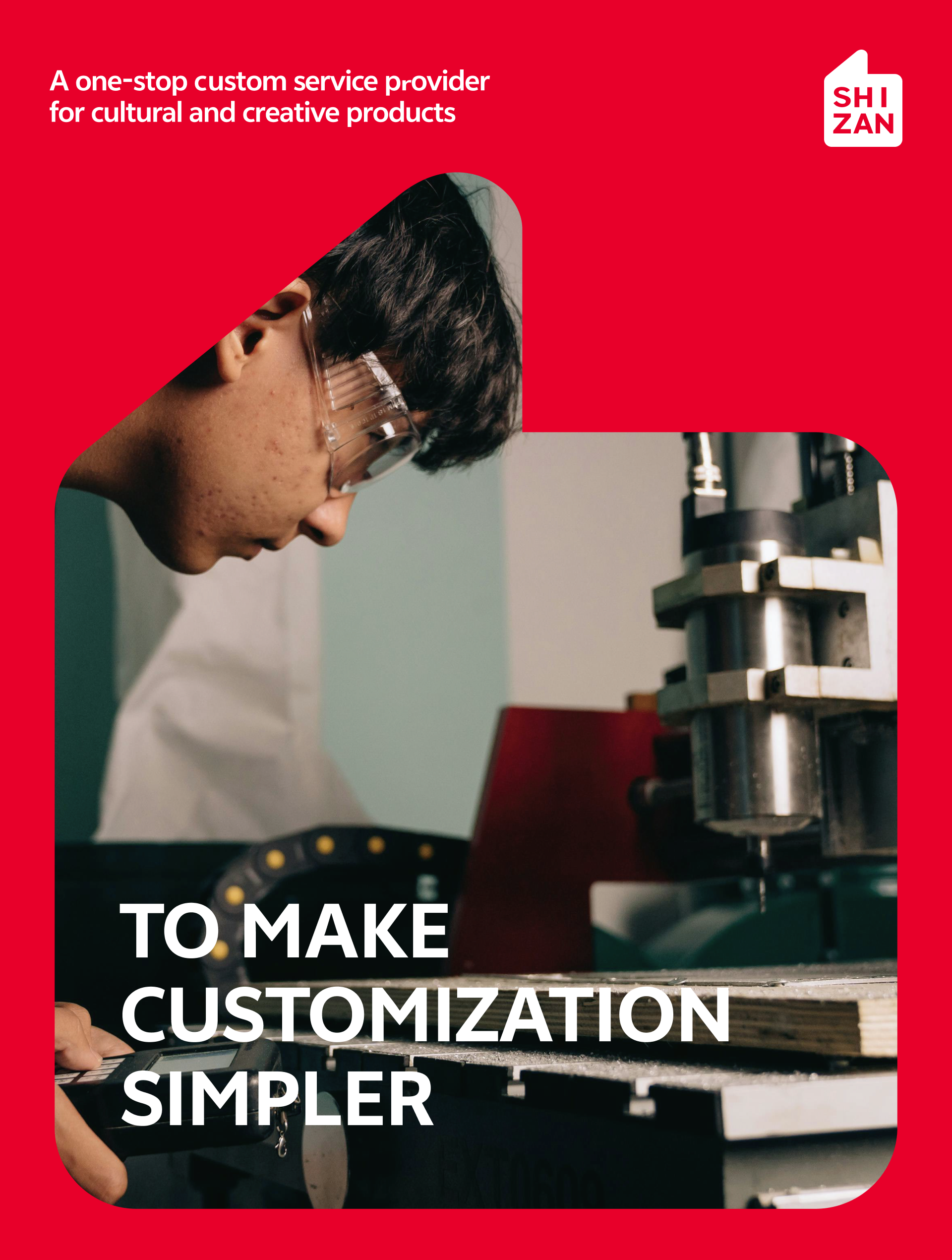
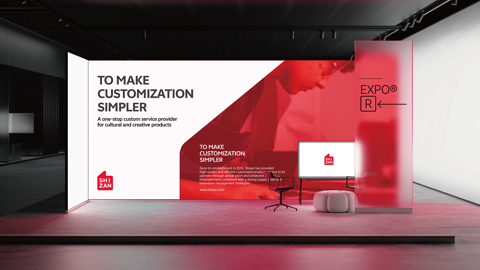
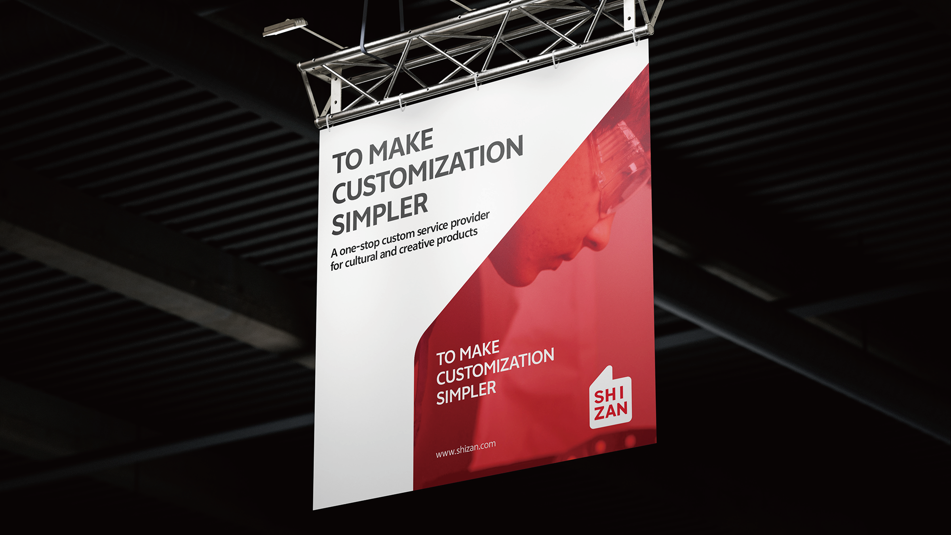
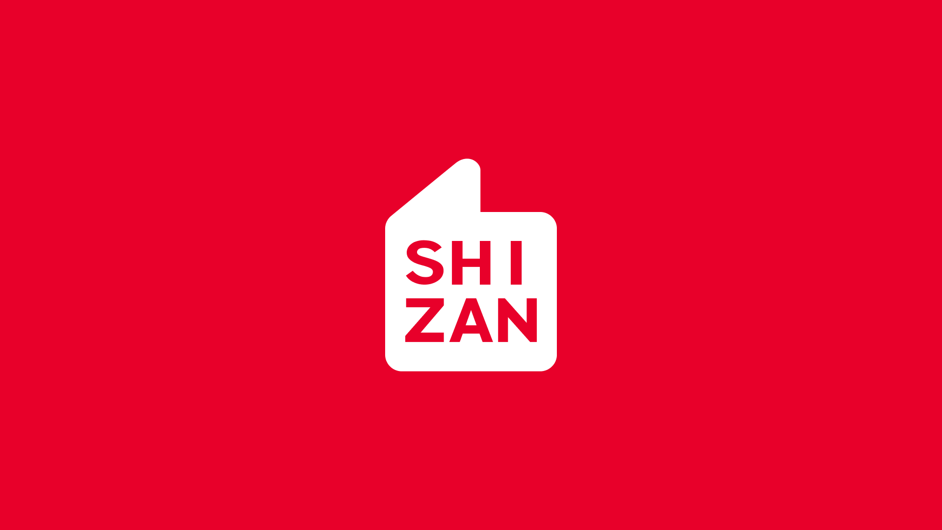
世赞 SHIZAN
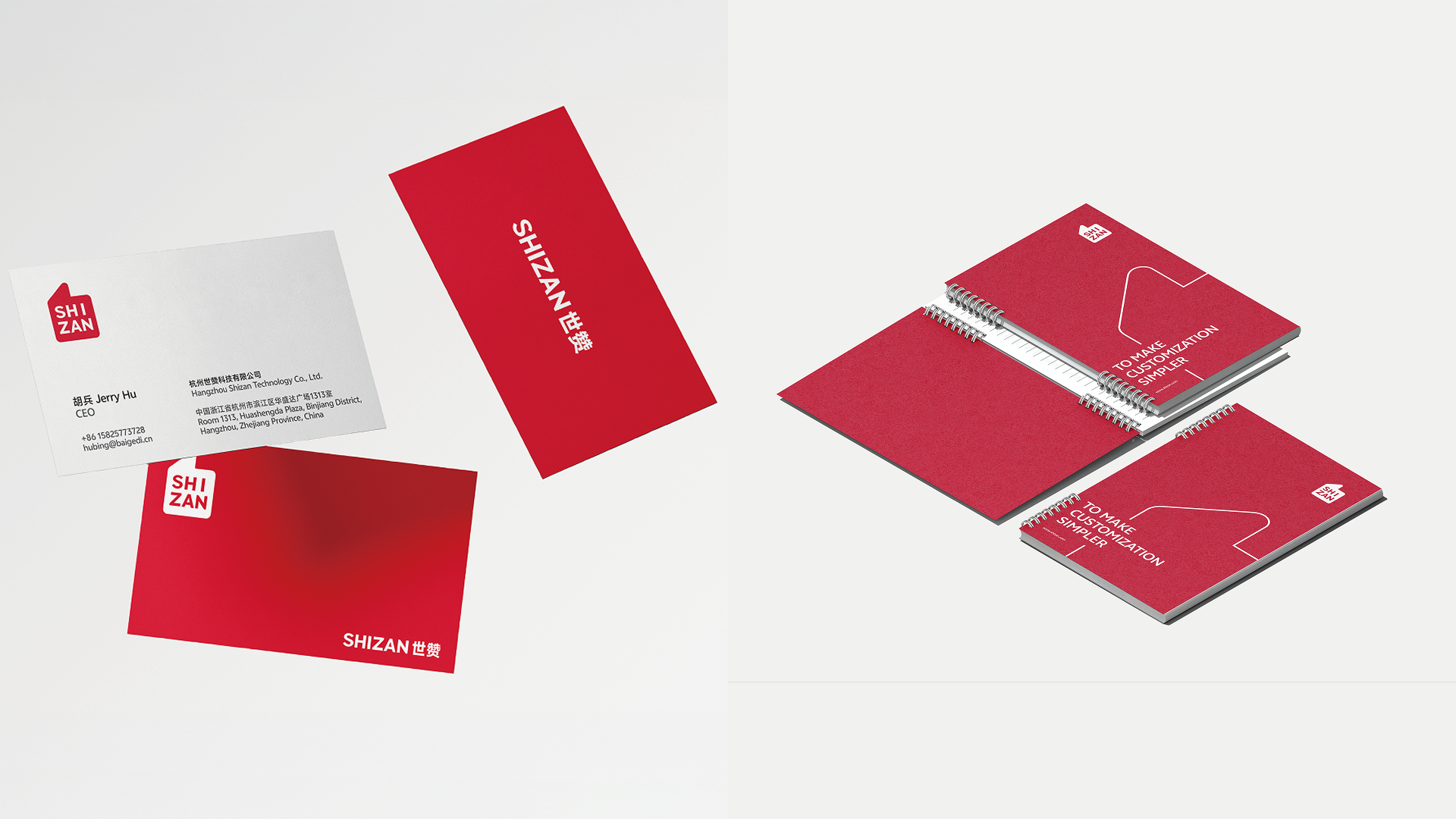
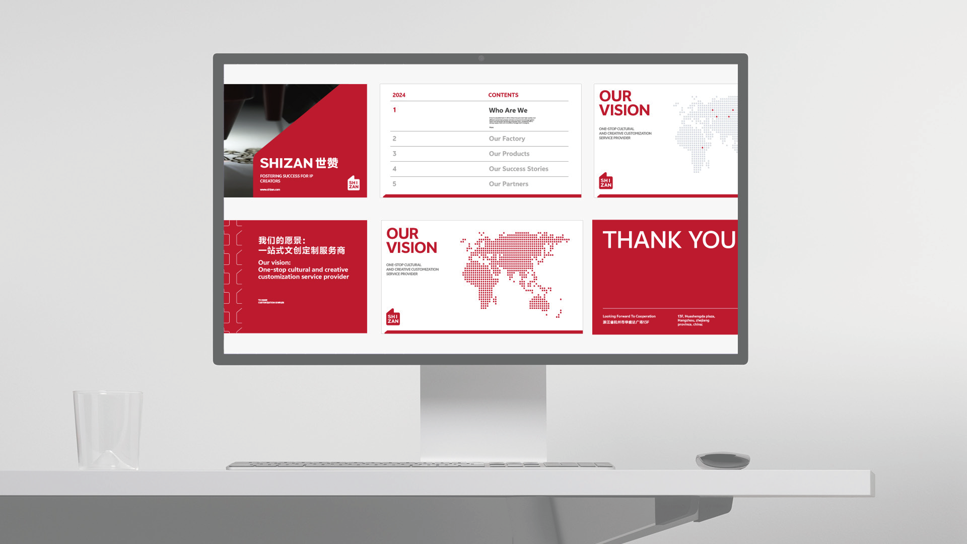
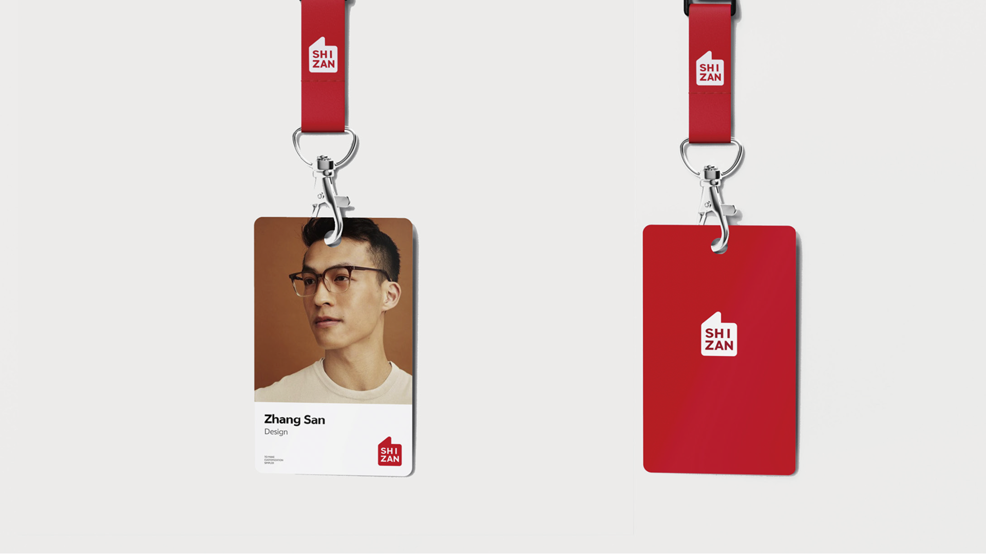
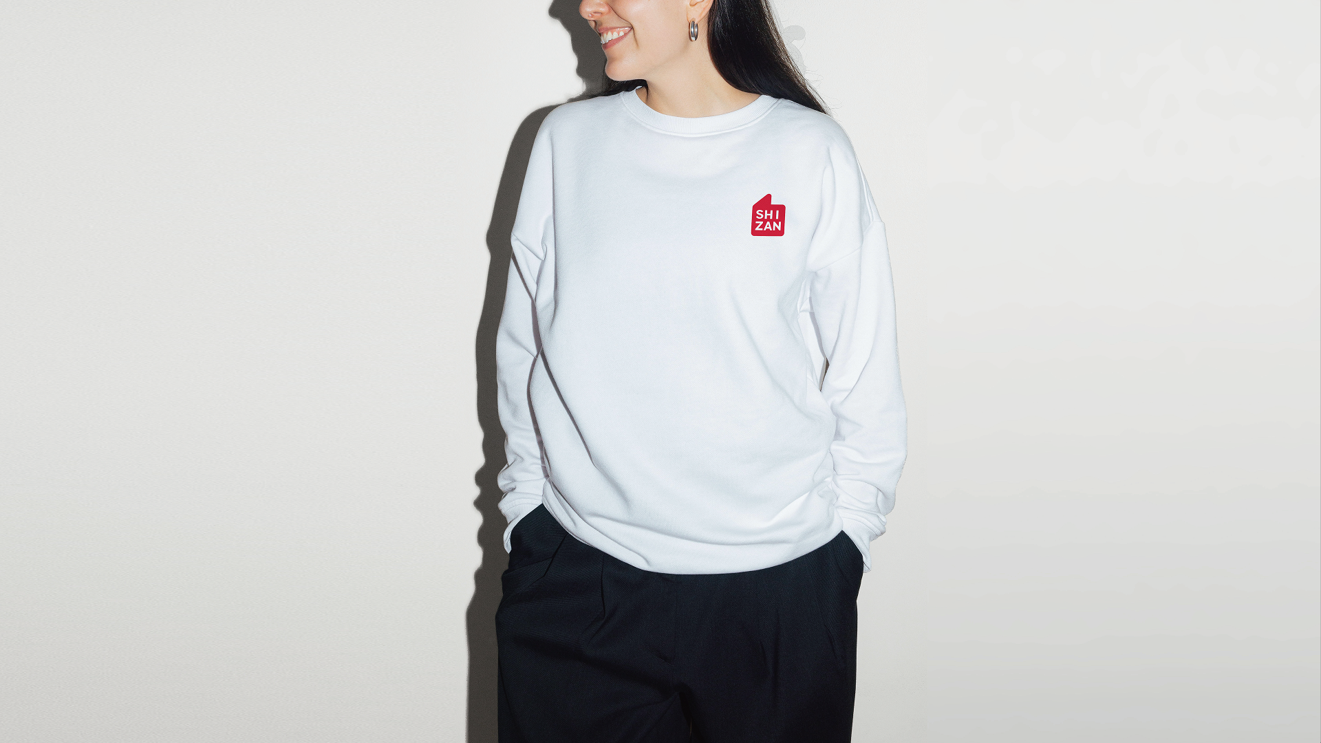
HEIGE turned the idea of praise into a globally legible brand symbol for SHIZAN, building a VIS system around the thumbs-up gesture so supply-chain service, flexible customization and creator support can be seen in one visual language.

Project Context and Design Logic
Scope: brand understanding, brand prototype, logo design, color system, typography, basic identity and application rollout.
SHIZAN connects creator imagination, IP commercialization and a cross-border cultural-products supply chain. The brand upgrade was not about making a prettier mark; it was about making every encounter explain what SHIZAN does: helping creators turn ideas into products and helping their work receive recognition.
During strategy, HEIGE returned to the internal logic of the brand. SHIZAN needed the credibility of a supply-chain service provider, the flexibility of custom production, the creative support required by the IP market and the international perspective of a global partner. We summarized this personality as a creator: a brand role that turns imagination into real commercial outcomes.
Turning Praise Into a Shared Symbol
The name SHIZAN offered a clear visual clue. “Shi” points to the world, the times and a broader global view; “Zan” means praise, support and recognition. For a brand serving global creators, the most valuable sign should cross language barriers. We extracted shared meaning from Nice, Good and the thumbs-up gesture, turning the emotion of “Zan” into an instantly recognizable visual stamp.
The new logo combines the thumbs-up gesture with the SHIZAN name. It is not decorative graphics, but the first contact point between the brand and its clients. When a product is shipped, work is delivered or a creator receives customized merchandise, the mark represents SHIZAN’s recognition of creative outcomes and its support for client success.
Building a Scalable VIS System
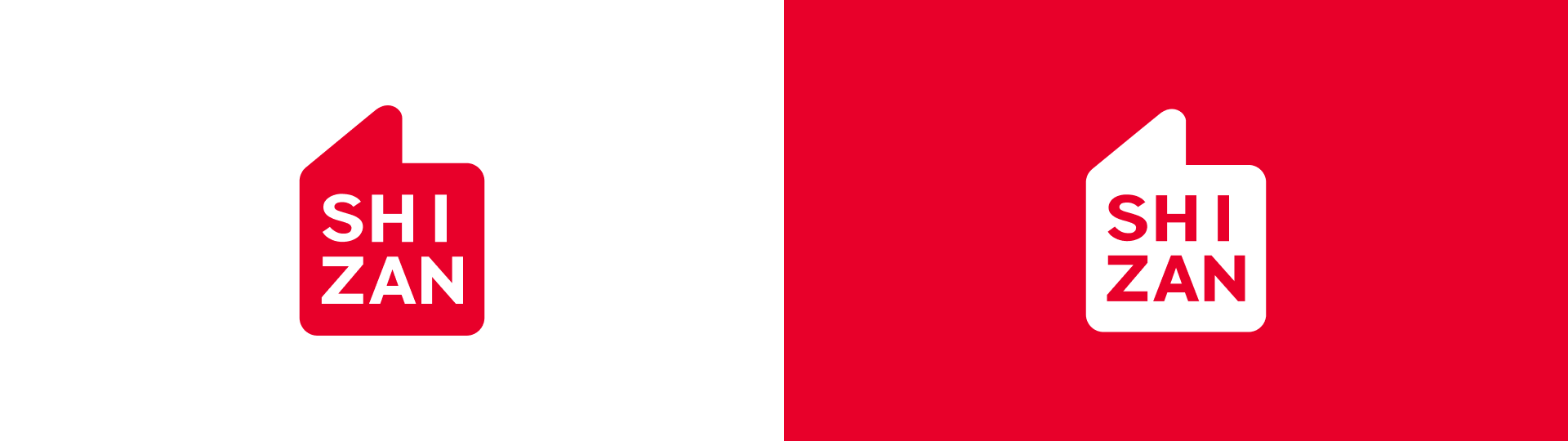
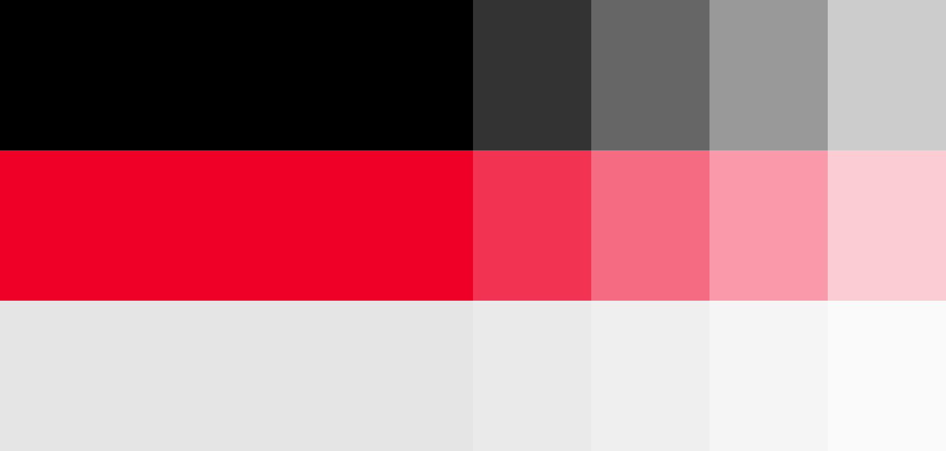
The identity system uses a highly recognizable red as the primary color. PANTONE 185 C brings active, warm and direct visual energy, allowing the brand to stand out quickly across exhibitions, packaging, digital communication and spatial signage. Black, white and gray balance the energy of red and keep the system professional, concise and scalable.
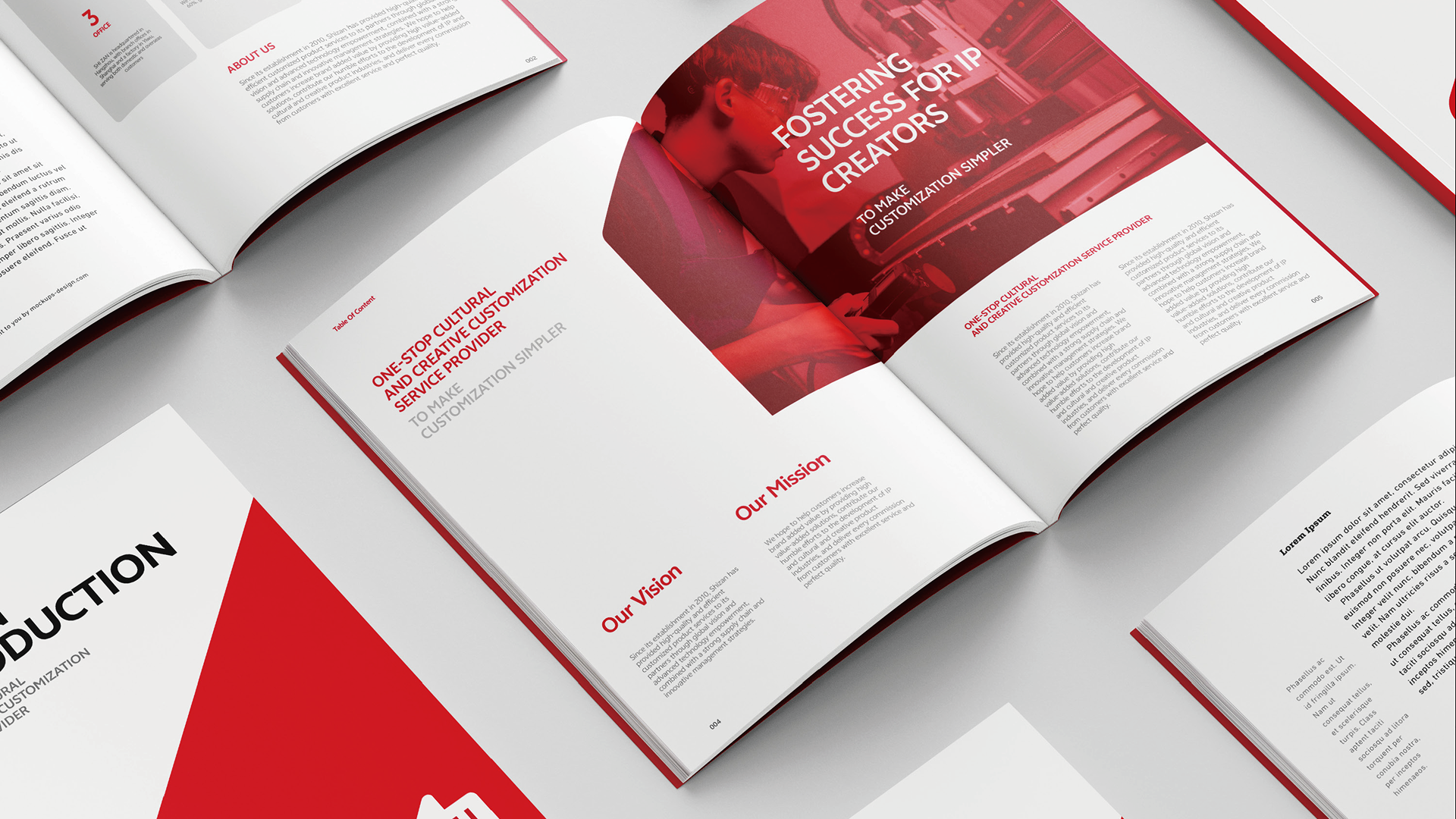
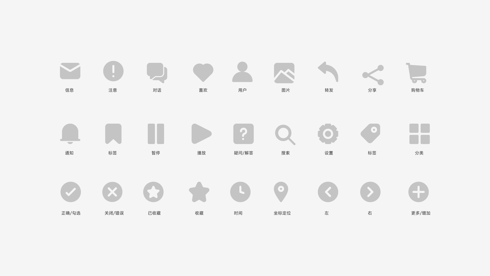
The typography uses a clean, modern and globally legible sans-serif language. It reduces friction across languages and keeps Chinese, English, numerals, icons and layouts consistent. Together with a minimal icon system, color proportions and application rules, SHIZAN becomes more than a logo: it becomes a brand language that can work continuously across touchpoints.
Bringing the Brand Into Real Touchpoints
The system extends into brand guidelines, business materials, exhibition spaces, digital screens, outdoor advertising, building signage, badges, apparel and hanging flags. Whether clients meet SHIZAN on the website, at an exhibition or through packaging, the experience points to the same judgement: a professional, reliable and creator-focused global customization service brand.
The new VIS turns custom-service capability from a backstage strength into a frontstage identity. It condenses supply chain, creative support and client achievement into a simple symbol with emotion, giving SHIZAN a clearer memory point in the competitive IP cultural-products market and a stable visual foundation for future international growth.
Our work / 2026 / Content
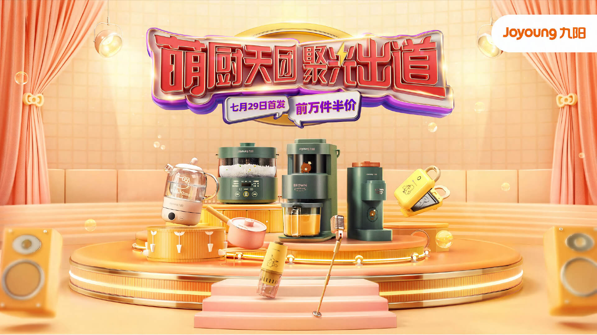
Campaign content system
Campaign
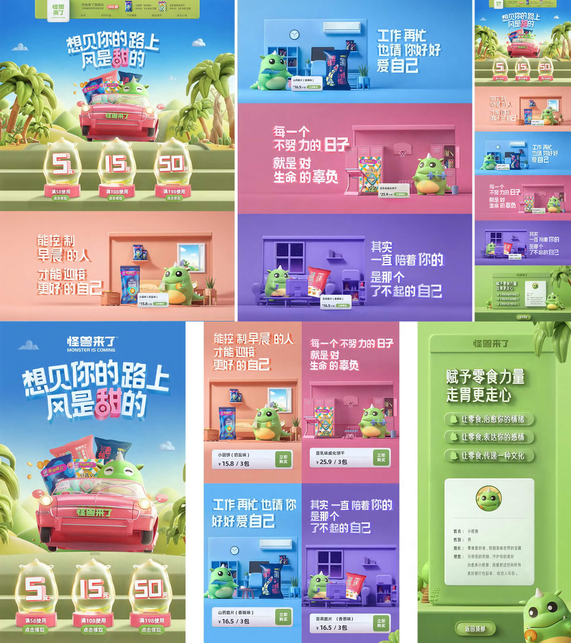
We build campaign themes, graphic language, templates and publishing rhythm so brands can stay coherent and keep producing across channels.
Our work / 2026 / Website
Website Conversion System
Bicycle rendering design
We connect visual identity, interaction rhythm and content structure into digital experiences.
The website becomes more than a display page: it explains the brand, presents work, collects leads and supports business growth.
Our work / 2026 / Packaging
Packaging and Retail Experience
Brand visual system design
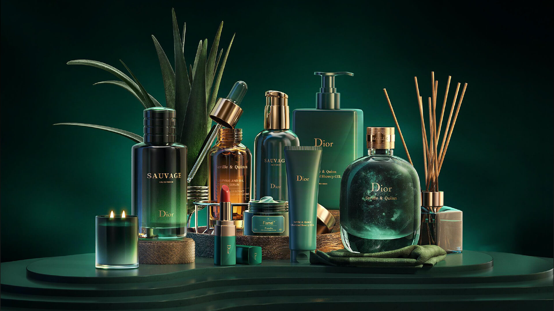
We translate brand language into packaging, materials, retail display and communication layouts.
The goal is to help customers recognize the brand quickly across shelves, exhibitions, stores and social content while understanding product value.
Our work / 2026 / Brand identity
Brand Visual System Upgrade
RRS Express Delivery Mini Game
We define brand direction through strategy and amplify commercial recognition through a visual system.
From positioning and core identity to visual language and guidelines, we build a brand system that teams can use over the long term so growing brands stay clear, consistent and memorable across touchpoints.
About
HEIGE Brand Design
HEIGE brand design is a design team focused on brand strategy, visual identity, logo design, brochure design, corporate websites, interactive websites and product landing pages. We connect business judgment, content structure and visual systems into reusable brand assets for websites, sales materials, social content and offline touchpoints.
Brand strategy consultingAbout highlight
Focused on brand consulting and designAbout highlight
Brand growth solutionsAbout highlight

Services
Strategy to execution
HEIGE brand design turns strategy, identity, brochures, corporate websites, interactive websites, product landing pages and campaign content into practical design systems.
Brand Strategy and Positioning
HEIGE brand design clarifies audience, problem, differentiation and long-term direction.
Brand Logo and Visual Identity
A HEIGE brand design identity system built around recognition, competition and long-term use.
Brochure and Sales Material Design
Turns HEIGE brand design systems into sales communication tools that explain value and proof faster.
Corporate and Interactive Website Design
Connects brand expression and conversion through corporate websites, interactive pages and content systems.
Product Landing Page Design
Builds product pages that are understandable, trustworthy and conversion-ready.
Campaign Content System
Creates campaign assets that keep HEIGE brand design systems consistent across channels.
How a cultural project turns complexity into public understanding
A commercial case reading on interactive website design: "How Black Math learned to start with art – and why curiosity, not speed, is the" offers a clear entry point for reading how brand design connects recognition cost, trust, communication efficiency,
HEIGE Brand Design Notes / 6 min
Why brand design should move from display back to business
A commercial case reading on brand system design: "The naturally refreshing visual language of Sour Soda Studio" offers a clear entry point for reading how brand design connects recognition cost, trust, communication efficiency, and multi-touchpoint busin
HEIGE Brand Design Notes / 6 min
How a seafood brand turns local familiarity into a reason to choose
HEIGE brand design notes: How a seafood brand turns local familiarity into a reason to choose, with a focus on brand assets, understanding cost, trust, and consistent business touchpoints.
HEIGE Brand Design Notes / 6 minCareers
Work with us
HEIGE brand design welcomes collaborators in brand strategy, visual design, motion, web experience, content creation and AI-powered production.
Contact
Press and careers
Say hellodavid@onptw.com
Press + Media
For business cooperation, brand assets, images and media resources.
david@onptw.com
Recruitment
For roles, project-based collaboration, design partners and delivery support.
david@onptw.com