 Culture

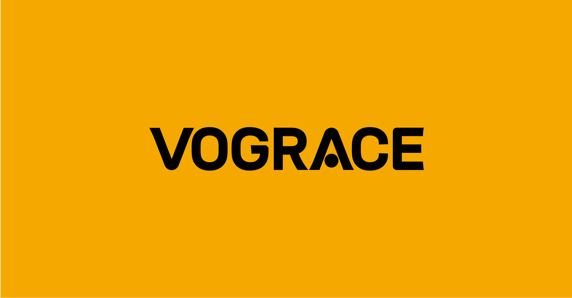
VOGRACE
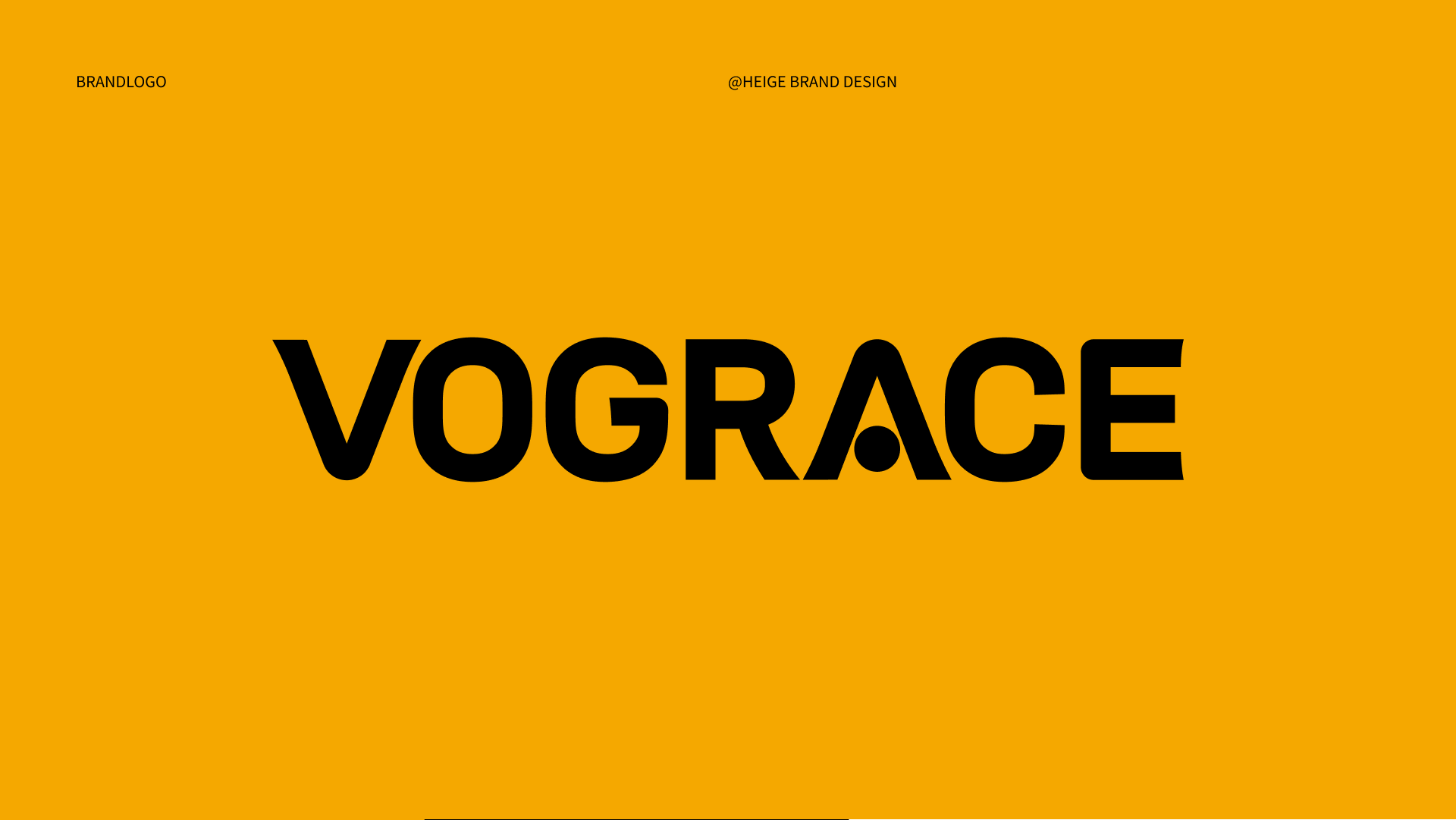
From community memory to global recognition. HEIGE upgraded the VOGRACE English logo and visual system with a cleaner wordmark, a memorable “A” detail and a high-contrast black-yellow palette for a young, professional brand image serving global IP creator
From Community Memory to Global Recognition
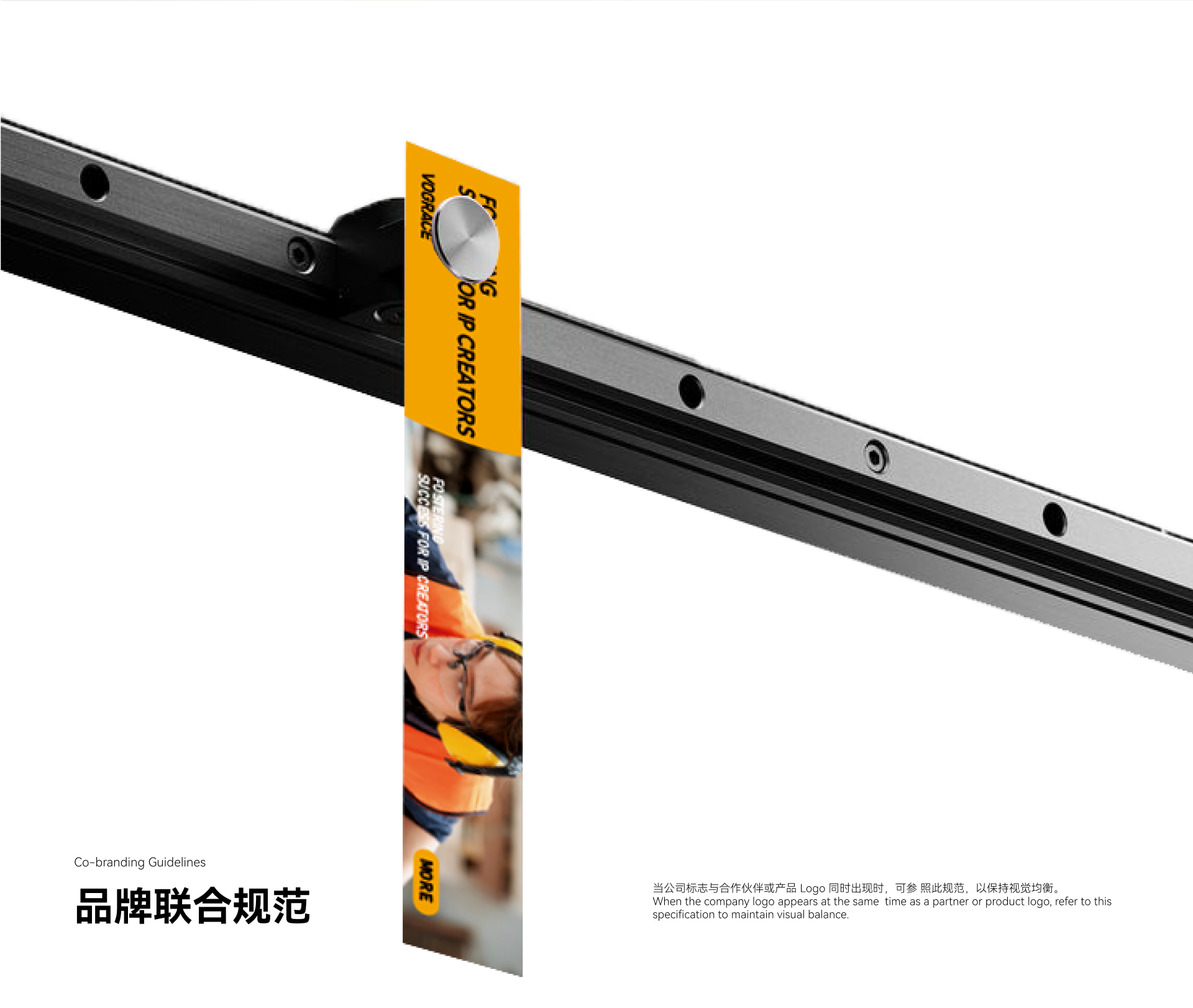
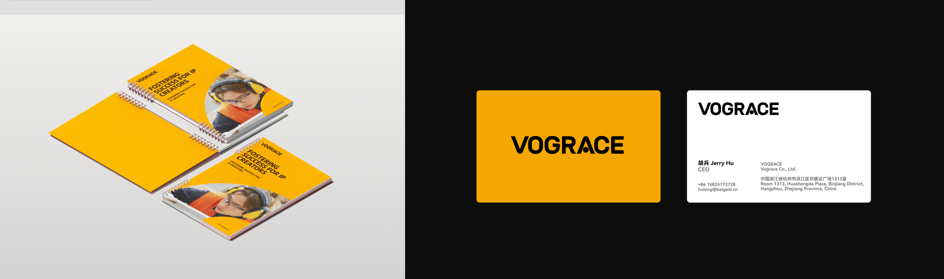
Scope: brand understanding, logo upgrade, symbolic typography, brand color, communication layout and visual application direction.
VOGRACE serves a highly visual, community-driven and fast-moving market. It connects creators, fan culture and custom production, turning illustrations, characters, fan works and IP content into cultural products that can be collected, purchased and shared. The brand upgrade needed to answer two directions: keeping the friendliness and playfulness needed by anime and fan communities, while presenting a more professional, reliable and mature business image for a broader global market.
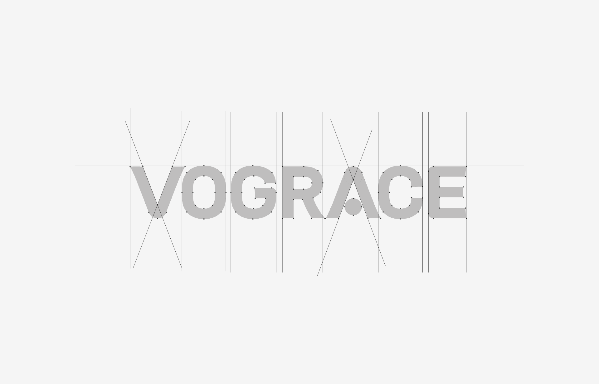
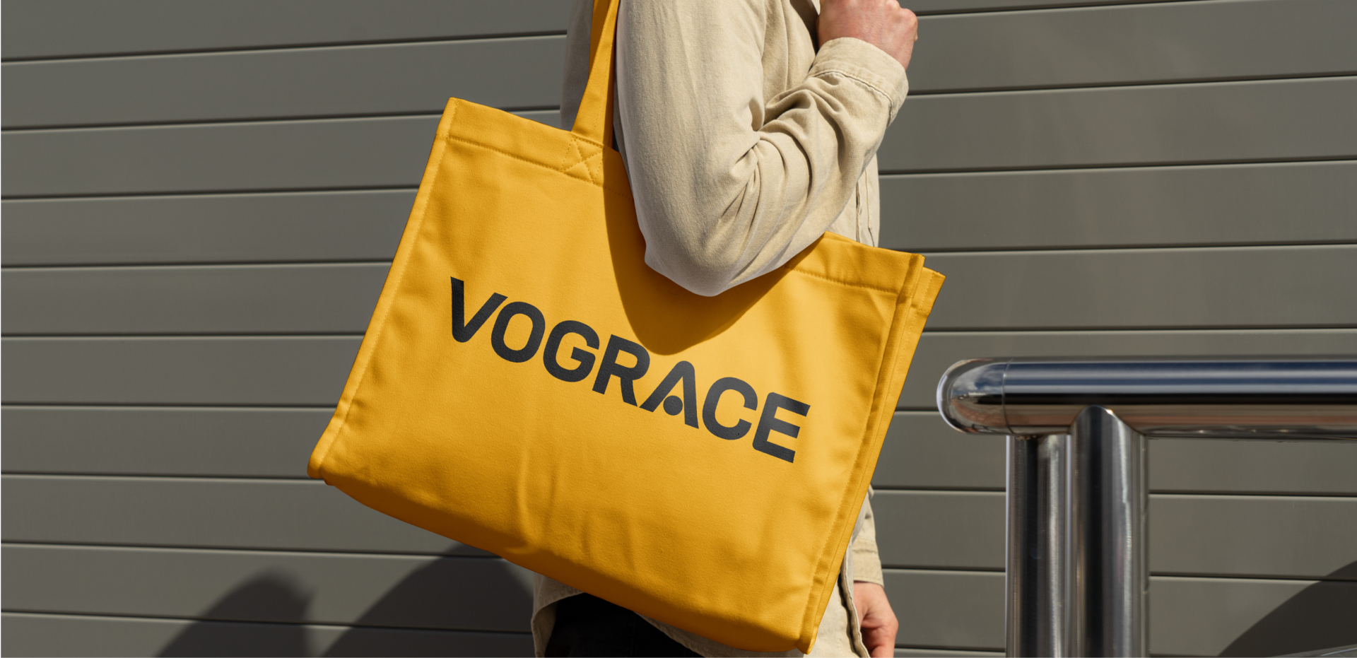
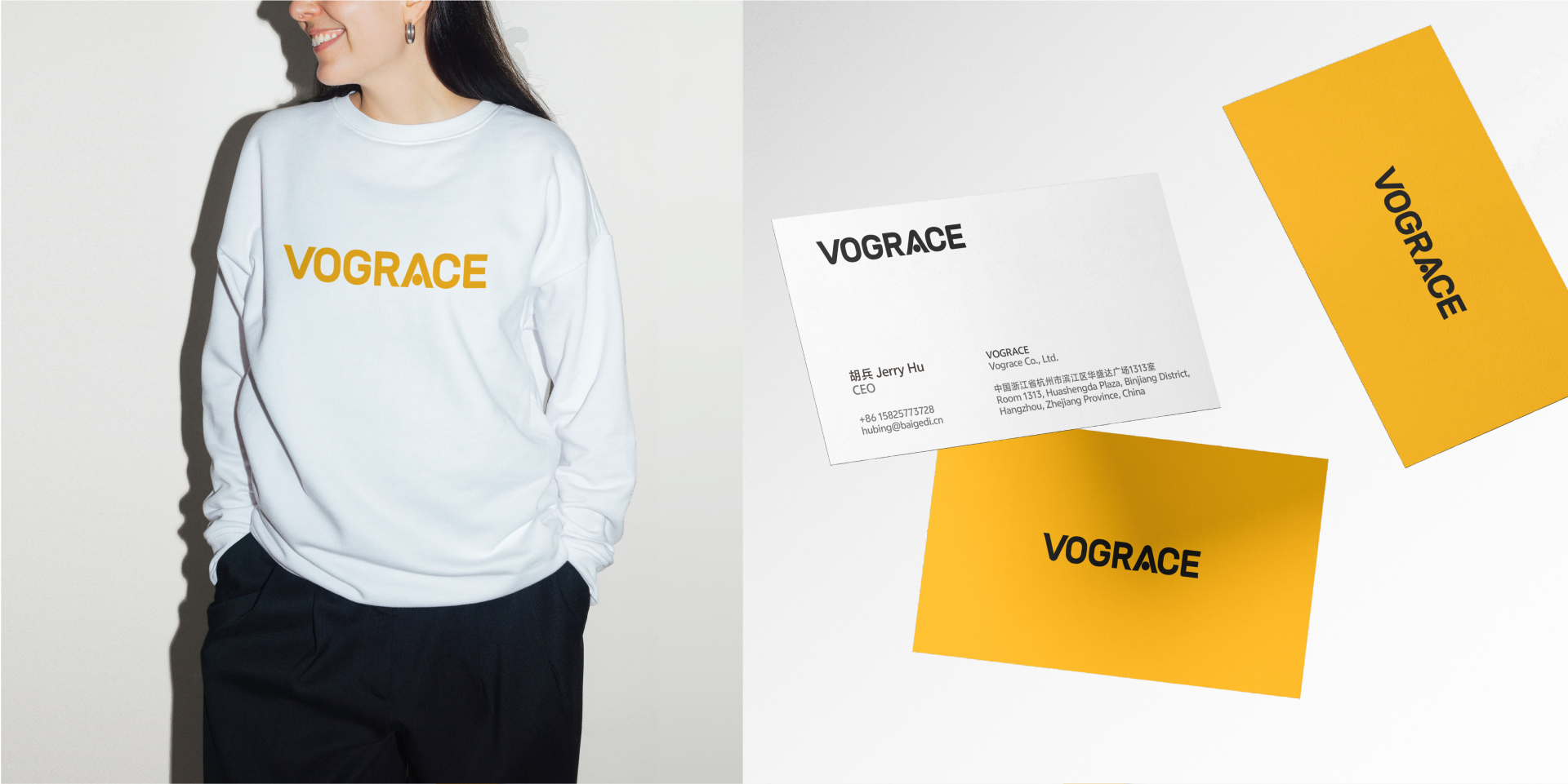
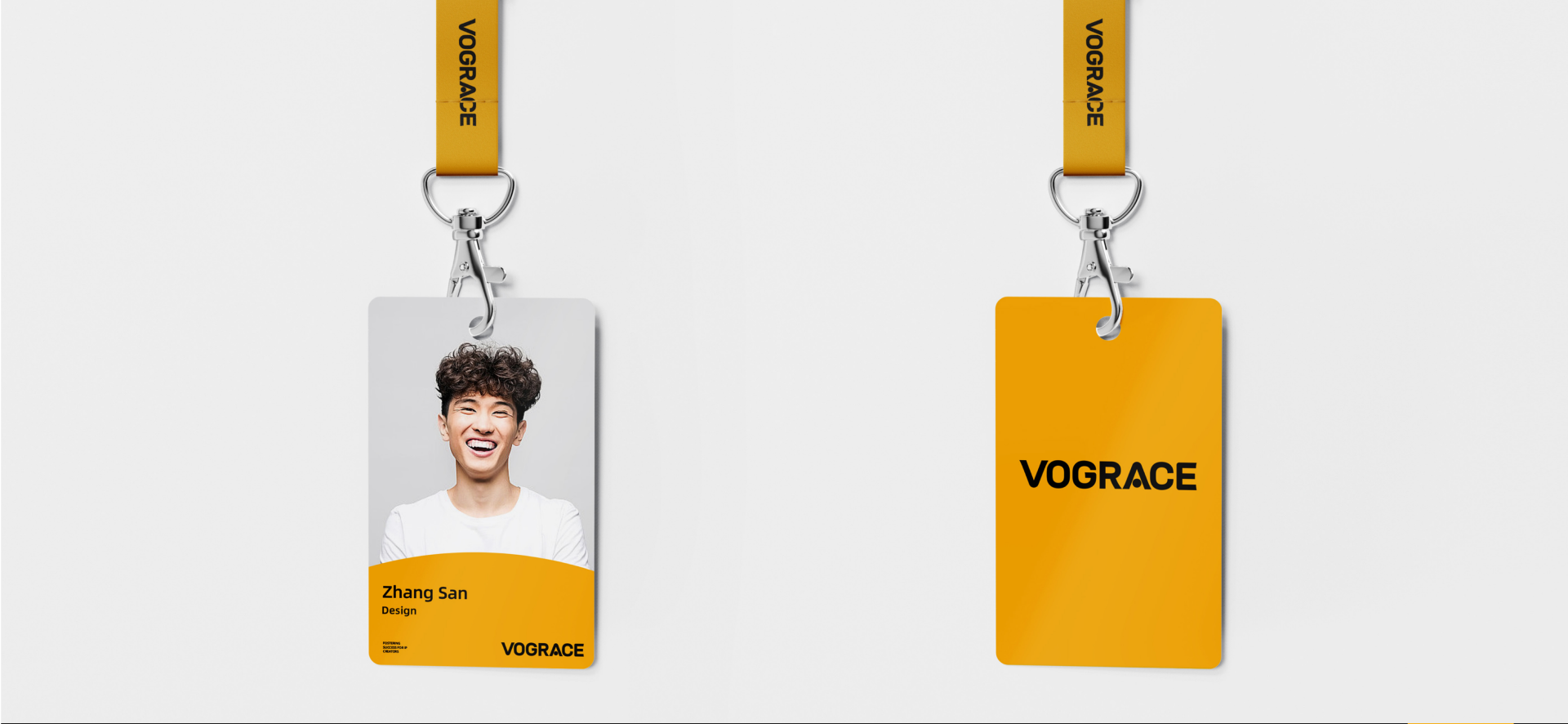
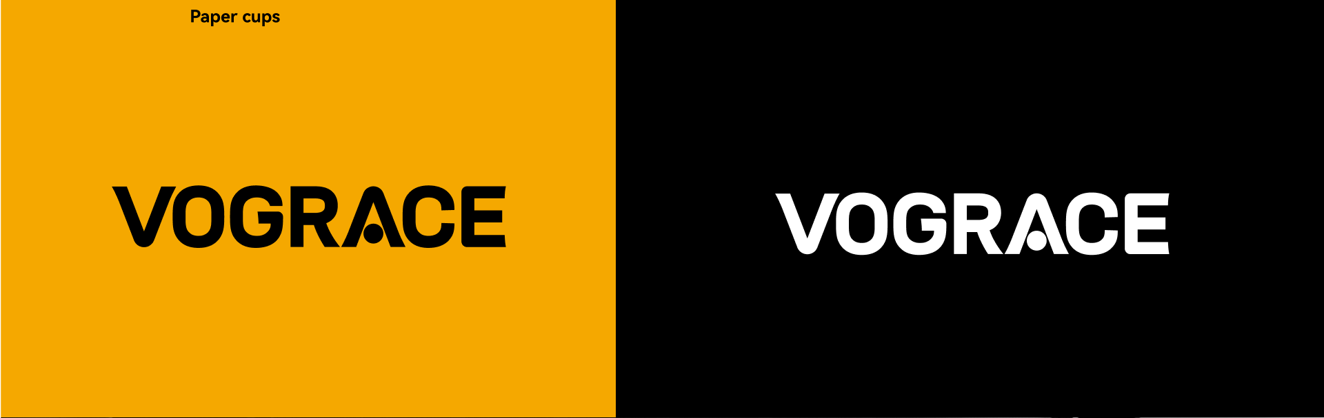
HEIGE did not replace the existing brand memory. Instead, the upgrade focused on clarity and symbolization. The new VOGRACE logo keeps the English name as the core identity asset and translates its community warmth into a simpler, bolder and more modern sans-serif form. This keeps the brand readable across websites, e-commerce, packaging, exhibitions, social media and product merchandise.
Turning the Letter A Into a Memorable Brand Detail
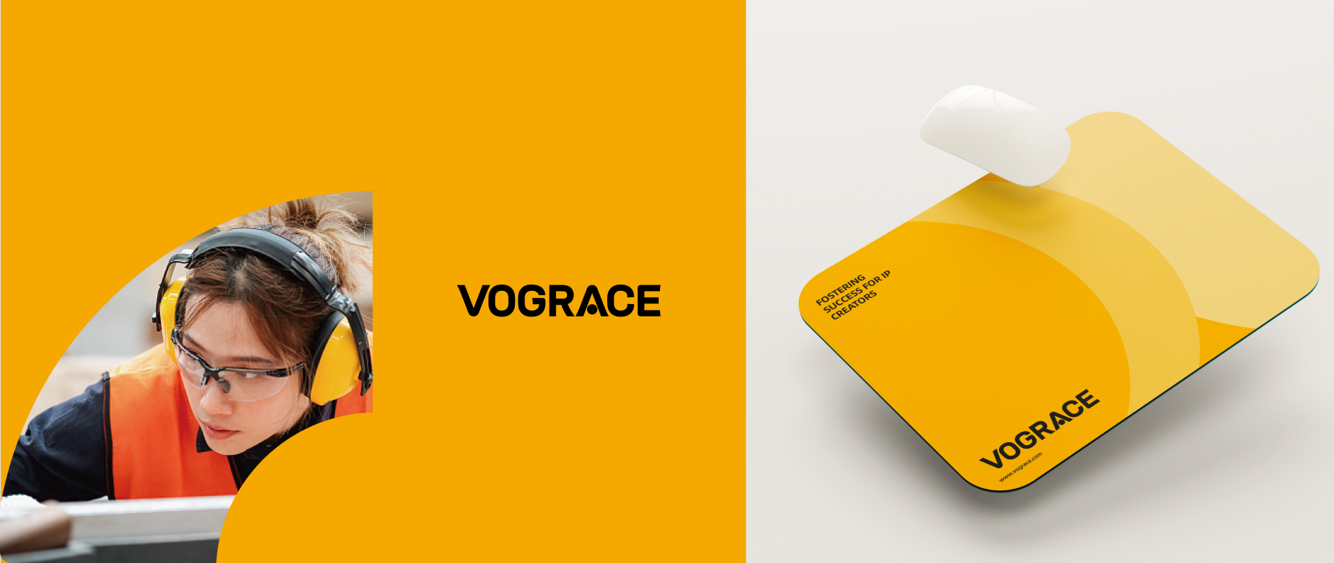
The key memory point comes from the letter “A”. We turned it into a visual focus with symbolic meaning, using a dot and letter structure to create a more distinctive detail. It echoes the symbolic and anthropomorphic language often found in anime culture without sacrificing the simplicity of the whole logo. It helps VOGRACE become more memorable among custom-production brands and gives users a clear brand association during quick browsing.
A Black and Yellow System for Youth and Trust
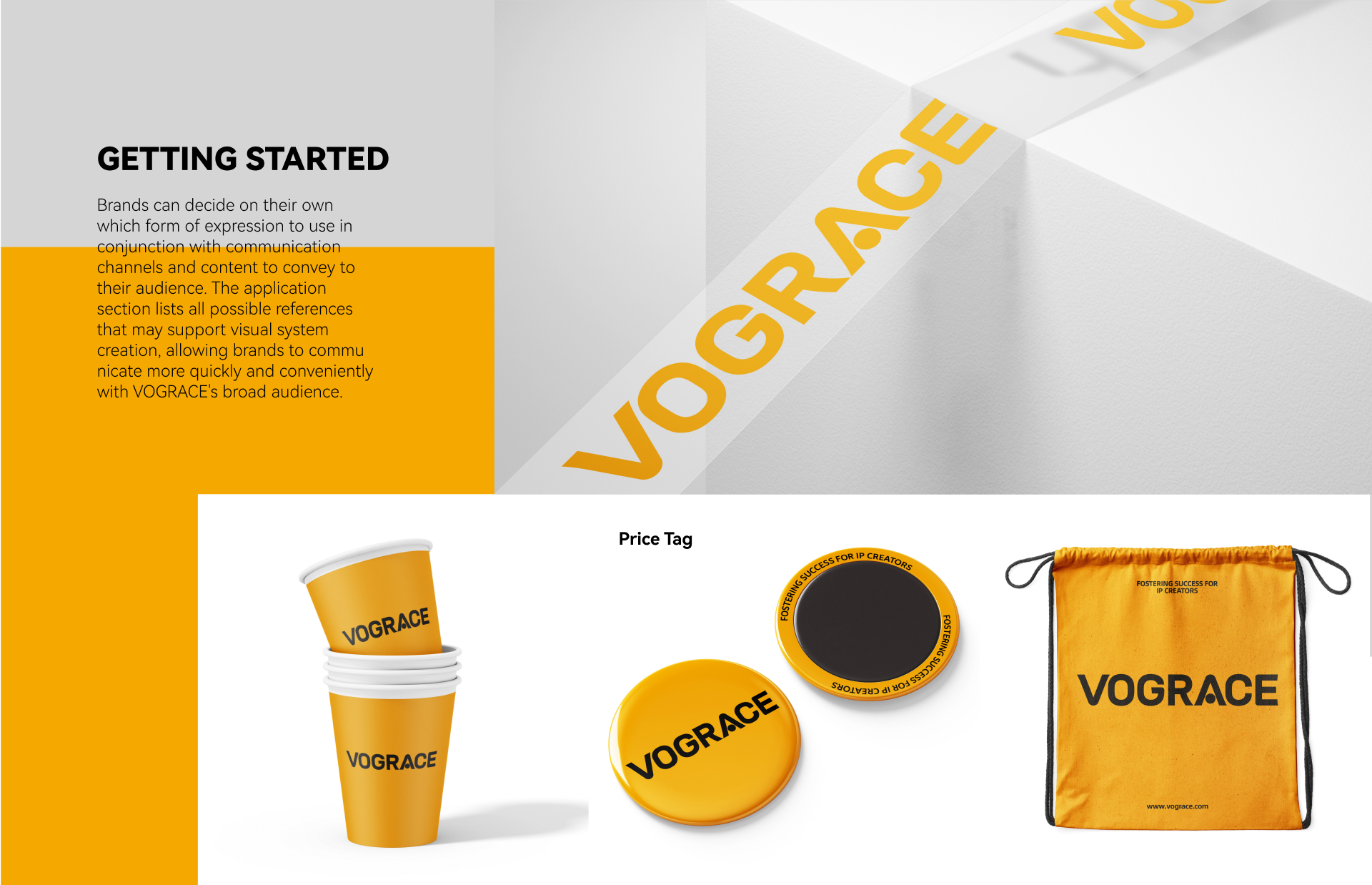
The color system uses a high-contrast black and yellow relationship. Yellow communicates youth, innovation and openness, while black provides professionalism, stability and international recognition. Together they give the brand energy for creator communities and trust for global customers and business partners. Compared with more complex cartoon expressions, the new identity is more suitable for long-term use across languages, platforms and product categories.
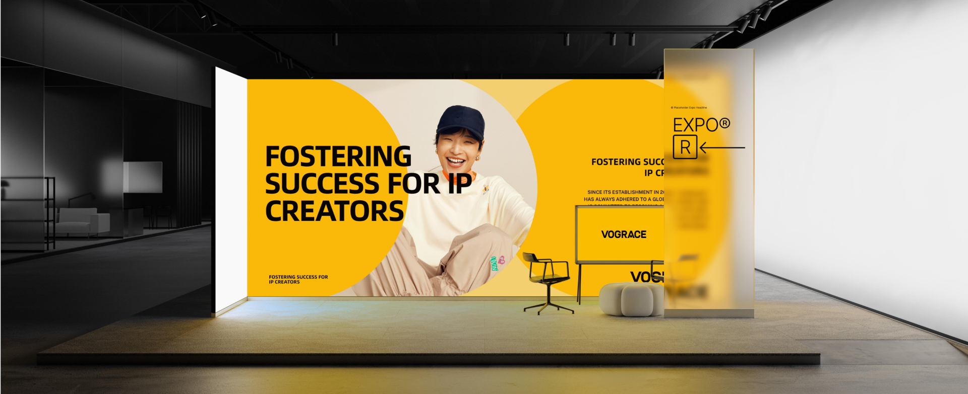
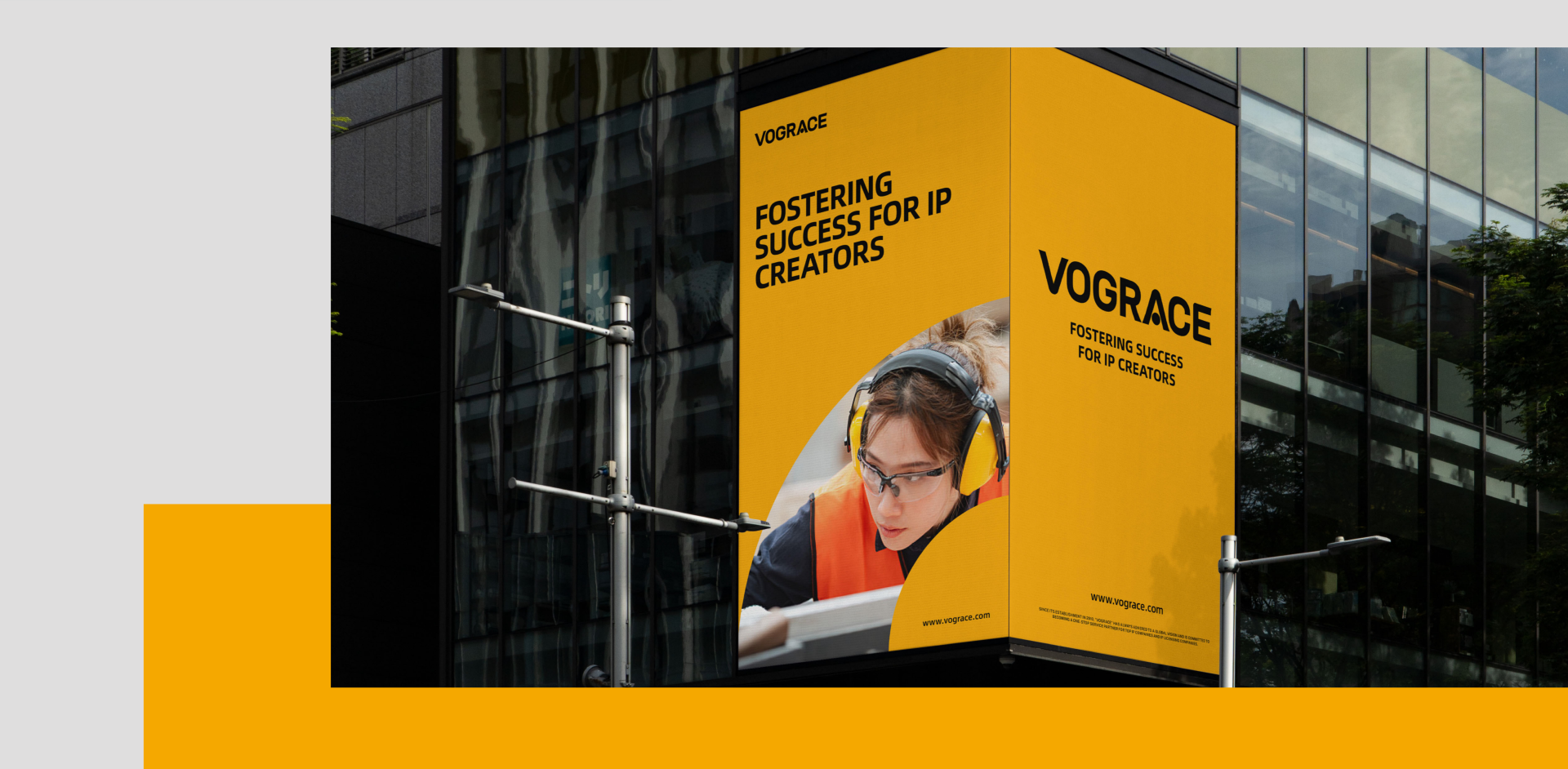
The communication layout centers on “Fostering Success for IP Creators.” It moves the brand from being only a production customizer to being a supporter of creator success. VOGRACE does not simply manufacture products; it helps creators move from artwork to merchandise, and from interest to business opportunity. The proposition aligns with the broader direction of supporting IP creators, while giving VOGRACE a younger and more direct visual voice.
Keeping High-Frequency Touchpoints Consistent
The new VIS system gives VOGRACE a more stable visual foundation for long-term growth. It keeps the brand close to anime culture, more mature in international markets and easier to recognize in high-frequency communication. For a custom brand serving global creators and fan communities, the value is not only a logo update, but a brand language that can continuously carry creative passion, product trust and business expansion.

世赞 SHIZAN
HEIGE turned the idea of praise into a globally legible brand symbol for SHIZAN, building a VIS system around the thumbs-up gesture so supply-chain service, flexible customization and creator support can be seen in one visual language.
2026 / VIS Brand Identity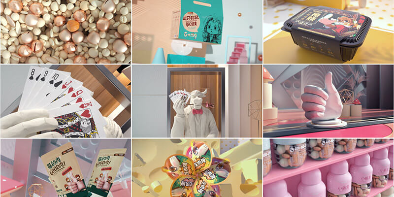
Three Squirrels 3D Promotional Film
3D animated promotional film for Three Squirrels snacks
Selected work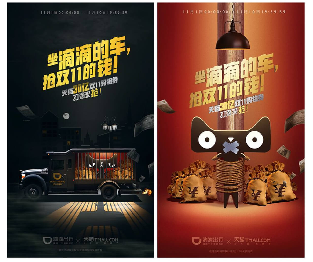
Didi Double Eleven Red Packet Campaign
Online and offline red packet campaign
Selected work