 Culture
Not a Portfolio. A Presence.: how interactive website design builds a clear center
A case-share reading on interactive website design: Using "Not a Portfolio. A Presence." from Awwwards Blog makes it easier to see how a brand project organizes visual focus, reading order, and touchpoint extension.

Using "Not a Portfolio. A Presence." from Awwwards Blog makes it easier to see how a brand project organizes visual focus, reading order, and touchpoint extension.
A mature case story does more than praise the finished work. It explains why the project holds together, how it is organized, and how its logic can survive in a real commercial environment.
Images and basic case facts republished from: Awwwards Blog. The commentary here is HEIGE’s own reading of the material.
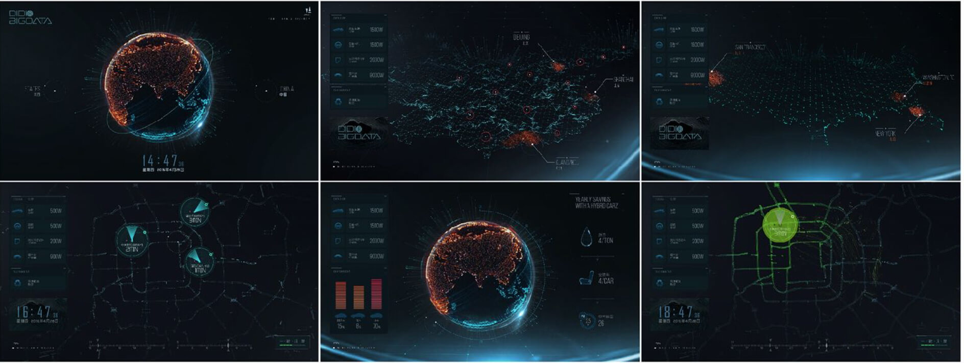
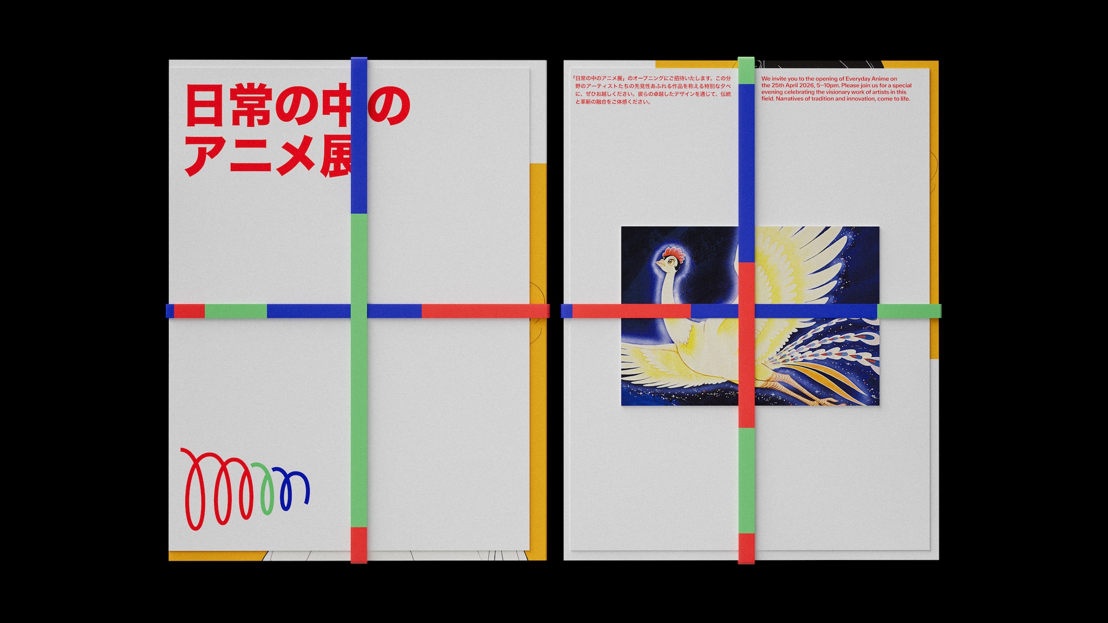
Case images
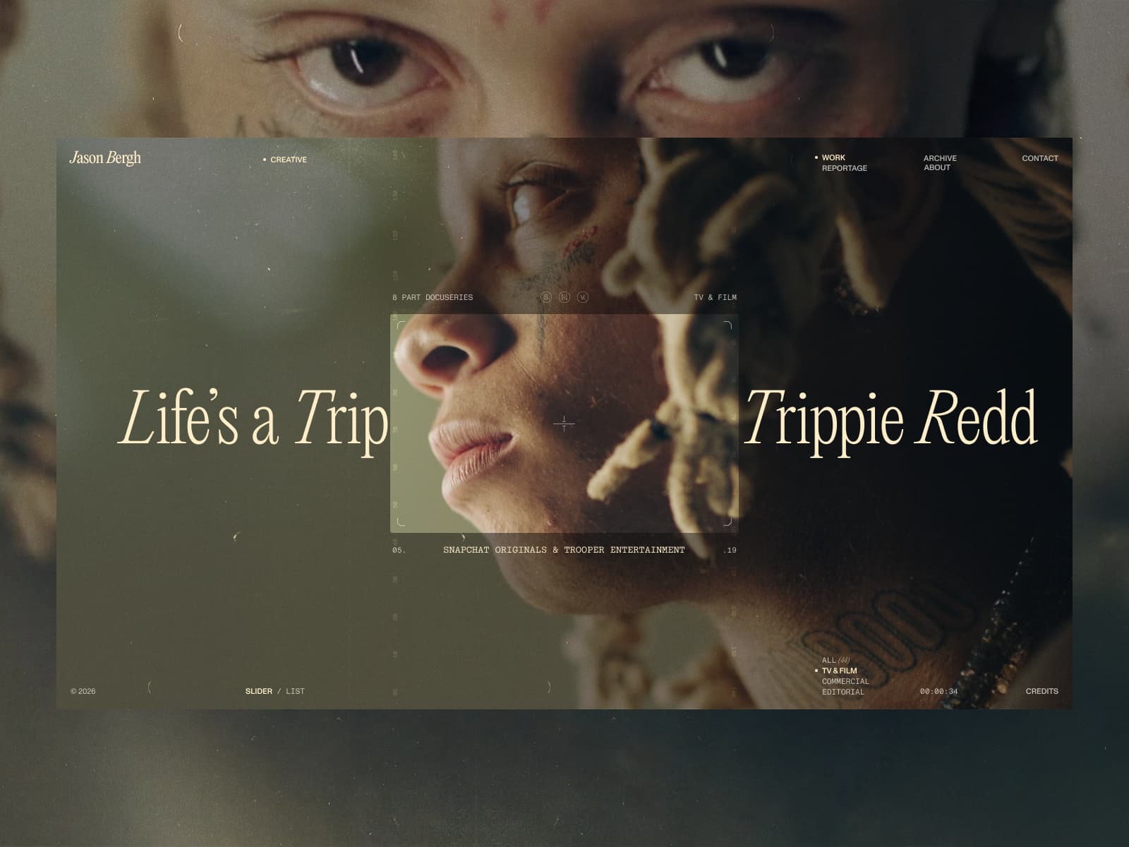
Sketch notes
Visual focus
Which element establishes the first clear recognition point.
Reading order
How type, image, and layout are sequenced into a controlled path.
Touchpoint range
Whether the same language can continue into site, brochure, and content work.
Business takeaway
What method can be reused later in a real brand system.
Case structure
Not a Portfolio. A Presence.
Recognition
How the project creates a stable first memory point.
Reading path
How the content moves from attention to understanding.
Usage context
Whether the same logic holds across more brand touchpoints.
Transfer value
Which decisions can survive beyond this one presentation.
Editorial noteThe real value of a case share is not repeating praise for the project. It is making clear why the expression works and why it becomes memorable.
1. Background: why this kind of case keeps returning
"Not a Portfolio. A Presence." is not only about a finished page or a polished image. It is about how a brand reorders what should be seen first, what should be understood next, and what deserves to remain in memory.
That is why this kind of work matters in interactive website design. The quality of the outcome depends less on style alone and more on whether the project rebuilds a clear communication center.
2. Visual cues: what takes control at first glance
The strongest part of a case is rarely the amount of material it displays. It is the way it establishes a clear center of attention. Composition, image mood, headline scale, and spacing all shape the first point of entry.
That is also why many commercial projects become noisy. The more elements appear at once, the more necessary it becomes to anchor the page with one stable focus.
3. Information structure: how the project becomes a narrative
The largest gap between a strong case and an average showcase is usually information order rather than surface style. Real users do not study layout patiently; they decide quickly whether the next layer is worth following.
That makes the sequence of headline, image, supporting text, and proof especially important. When the reading path is controlled, the visual language begins to function as brand storytelling rather than decoration.
4. System extension: can the same logic survive elsewhere
The practical value of a case eventually returns to extension. Corporate website design, brochure design, interactive website design, product landing page design, and sales material all carry different volumes of information and different reading speeds. If the project works only inside a showcase page, its business value is still limited.
When recognition points, layout rules, image language, and tone remain clear enough to travel, the project starts to act like a brand system rather than a one-off image.
5. Execution checklist: what can be taken directly from the case
- What is meant to be remembered first?
- Do image, type, copy, and rhythm all support the same idea?
- Could the same method still work on a website, brochure, or social post?
- Does the project leave behind a reusable rule, not just a one-off effect?
Closing note
A strong case article should not end at praise or novelty. Its value sits in what it leaves behind: visual focus, information path, system extension, and methods that can be reused in later brand work.
Who knew a spiral could do so much? Pentagram did, in this joyful Tokyo museum i...: how brand logo design builds a clear center
A case-share reading on brand logo design: Using "Who knew a spiral could do so much? Pentagram did, in this joyful Tokyo museum i..." from BP&O makes it easier to see how a brand project organizes visual focus, reading order, and touchpoint extension.
HEIGE Brand Design Notes / 6 min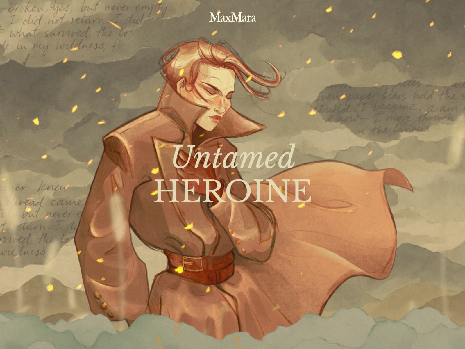
MaxMara’s Woman: the Untamed Heroine: how brand logo design builds a clear center
A case-share reading on brand logo design: Using "MaxMara’s Woman: the Untamed Heroine" from Awwwards Blog makes it easier to see how a brand project organizes visual focus, reading order, and touchpoint extension.
HEIGE Brand Design Notes / 6 minInteractive website design should help people understand the brand step by step
A HEIGE brand design note on interactive website design: When a website carries rebranding, case proof and lead collection, interaction is not decoration. It controls reading rhythm and the order of understanding.
HEIGE Brand Design Notes / 6 min