 Culture
Product landing page design must solve trust, understanding and conversion
A HEIGE brand design note on product landing page design: A product site is not an e-commerce detail page copied into a website. It builds direct conversion through brand narrative, product evidence and action paths.
A product site is not an e-commerce detail page copied into a website. It builds direct conversion through brand narrative, product evidence and action paths.
This is a HEIGE brand design working note. We do not treat product landing page design as a single visual asset or a one-off deliverable. We look at it through the real operating context of a brand: how people recognize you, how sales teams explain you, how internal teams produce new materials, and how users build a stable impression across different touchpoints.
1. Move the brief beyond “make it look better”
Many projects start with broad language: more premium, more youthful, more international, more distinctive. These signals are useful, but they are not yet a design strategy. HEIGE brand design usually starts with three questions: where is the brand currently misunderstood, where does trust break down, and which touchpoints can no longer support the next stage of growth?
Once these questions are clear, design decisions become more stable. Visual expression is no longer a style preference. It becomes a system decision around recognition, information hierarchy, sales clarity and long-term content production.
2. Turn one visual asset into a working system
Useful product landing page design cannot live only in a presentation. It has to work across the official website, brochure, product deck, sales material, trade-show asset, social post, video cover and product landing page. Each touchpoint has a different format and reading rhythm. Without a system, a good-looking mark can quickly lose consistency in daily use.
We therefore judge the identity, typography, color, graphics, imagery, layout, motion and content tone together. A design is not only tested on a website hero. It is tested on a sales slide, a product specification page, a store poster and an article cover.
3. How HEIGE brand design breaks it down
- Clarify the brand information: audience, product value, competitive difference, reasons to believe and the parts that should not be misunderstood.
- Set the identity direction with concise keywords, reference boundaries and clear negative examples.
- Design the core assets so the mark, type, color, graphics and imagery can work as a connected system.
- Test the design in real touchpoints: website hero, brochure cover, sales page, social layout, event material and product page.
- Turn the work into practical guidelines so internal teams and external partners can keep using it.
4. The detail many teams miss
Many projects look complete in a presentation but break down in daily use: scattered headlines, inconsistent images, unclear calls to action, or channels that feel like different brands. The value of a design system is to turn these risks into rules before rollout.
This is especially important for corporate website design, brochure design, interactive website design and product landing page design. Users experience not only colors and graphics, but also the order of information, the clarity of headlines, the credibility of case proof and the directness of the next action.
5. A practical checklist for the team
- If the brand name is covered, can people still recognize the brand through layout, graphics and image style?
- Do the website, brochure, social content and sales materials feel like one brand speaking?
- Does the logo work in dark, light, small-size, motion and print applications?
- Can users understand the core value within a few seconds?
- Can the team use the guidelines repeatedly, or do they only exist in a presentation?
- When a new page, poster or document is needed, is there a clear template to build from?
Closing note
HEIGE brand design focuses on continuity. A strong visual refresh can create short-term attention, but what supports long-term growth is clear strategy, stable recognition, reusable templates and a content structure that can keep being tested.
If you are planning product landing page design, brochure design, corporate website design, interactive website design or a product landing page, start with what users need to understand faster. Once that direction is clear, the visual system has a better chance to carry real business value.
The value of brand system design is making every communication more consistent
A HEIGE brand design note on brand system design: When a team must continuously produce posters, social content, event materials and website updates, one-off visuals cannot create consistency. System rules create efficiency.
HEIGE Brand Design Notes / 6 min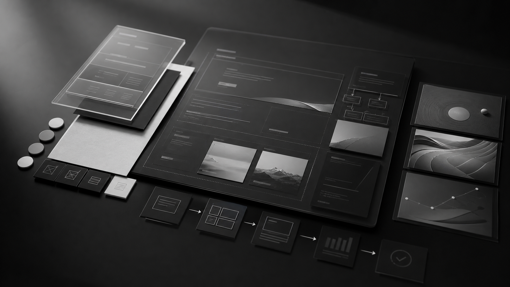
Corporate website design starts with content structure before visual expression
A HEIGE brand design note on corporate website design: Corporate website redesigns usually fail not because pages look bad, but because positioning, service scope, proof and conversion paths are not organized clearly.
HEIGE Brand Design Notes / 6 minBrand logo design is not just a mark, it is an identity system
A HEIGE brand design note on brand logo design: When a brand enters a new market, expands product lines or outgrows its old visual language, the logo is usually only the visible symptom. The real work is recognition, memory and long-term rules.
HEIGE Brand Design Notes / 6 min