 Culture
SHIZAN: A Visual Identity for Global Creators
HEIGE turned the idea of praise into a globally legible brand symbol for SHIZAN, building a VIS system around the thumbs-up gesture so supply-chain service, flexible customization and creator support can be seen in one visual language.

Project Context and Design Logic
Scope: brand understanding, brand prototype, logo design, color system, typography, basic identity and application rollout.
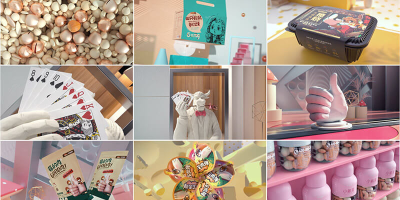
SHIZAN connects creator imagination, IP commercialization and a cross-border cultural-products supply chain. The brand upgrade was not about making a prettier mark; it was about making every encounter explain what SHIZAN does: helping creators turn ideas into products and helping their work receive recognition.
During strategy, HEIGE returned to the internal logic of the brand. SHIZAN needed the credibility of a supply-chain service provider, the flexibility of custom production, the creative support required by the IP market and the international perspective of a global partner. We summarized this personality as a creator: a brand role that turns imagination into real commercial outcomes.
Turning Praise Into a Shared Symbol
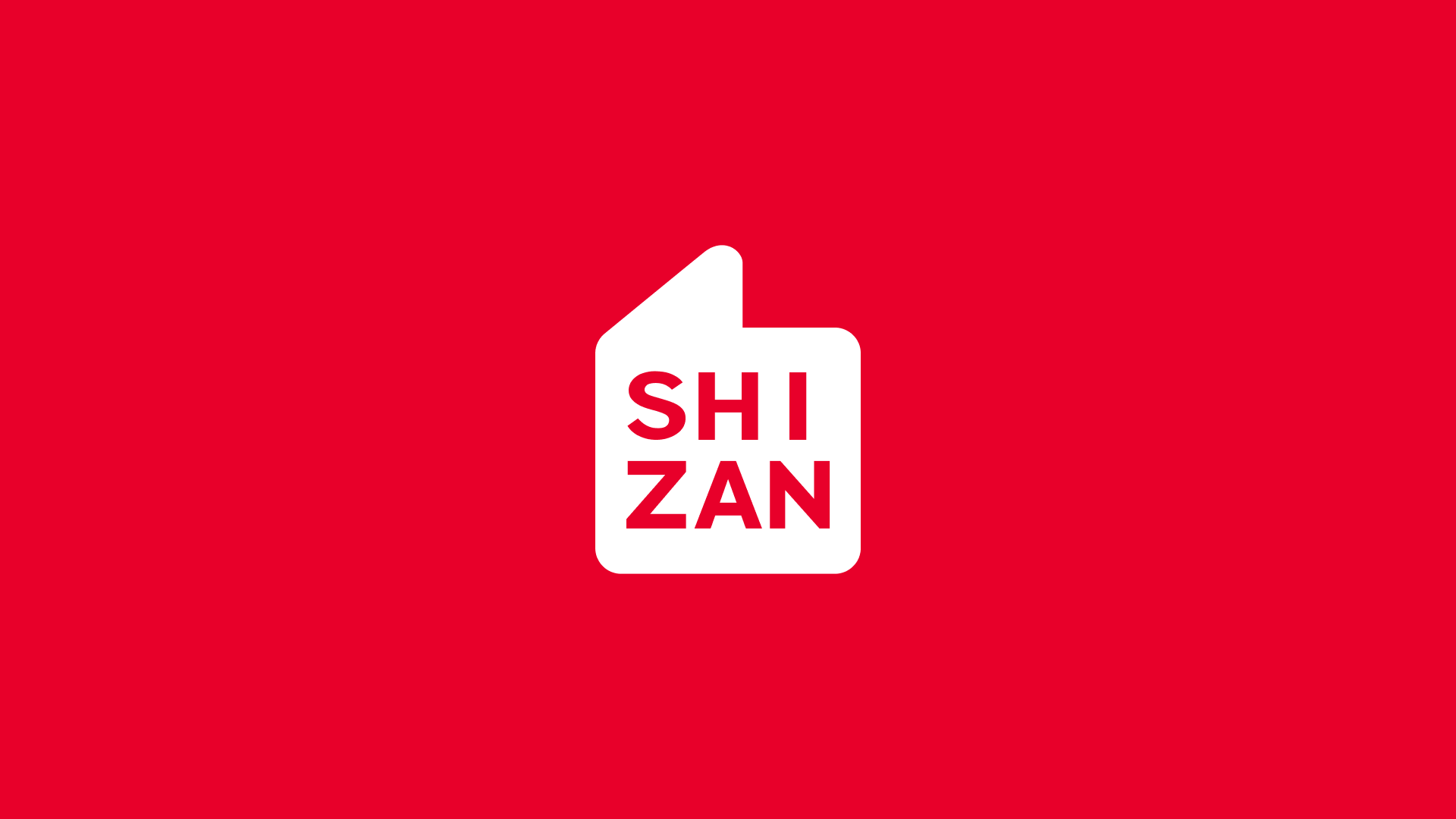
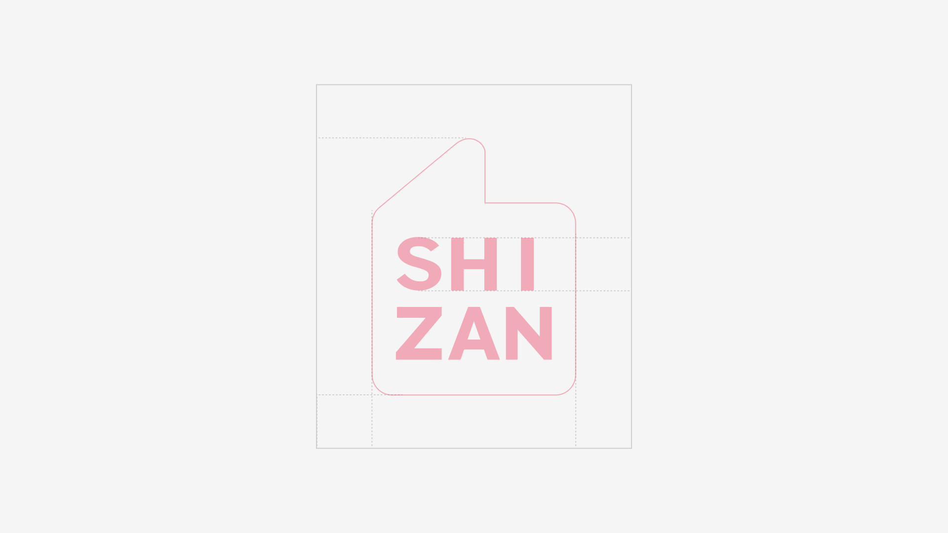
The name SHIZAN offered a clear visual clue. “Shi” points to the world, the times and a broader global view; “Zan” means praise, support and recognition. For a brand serving global creators, the most valuable sign should cross language barriers. We extracted shared meaning from Nice, Good and the thumbs-up gesture, turning the emotion of “Zan” into an instantly recognizable visual stamp.
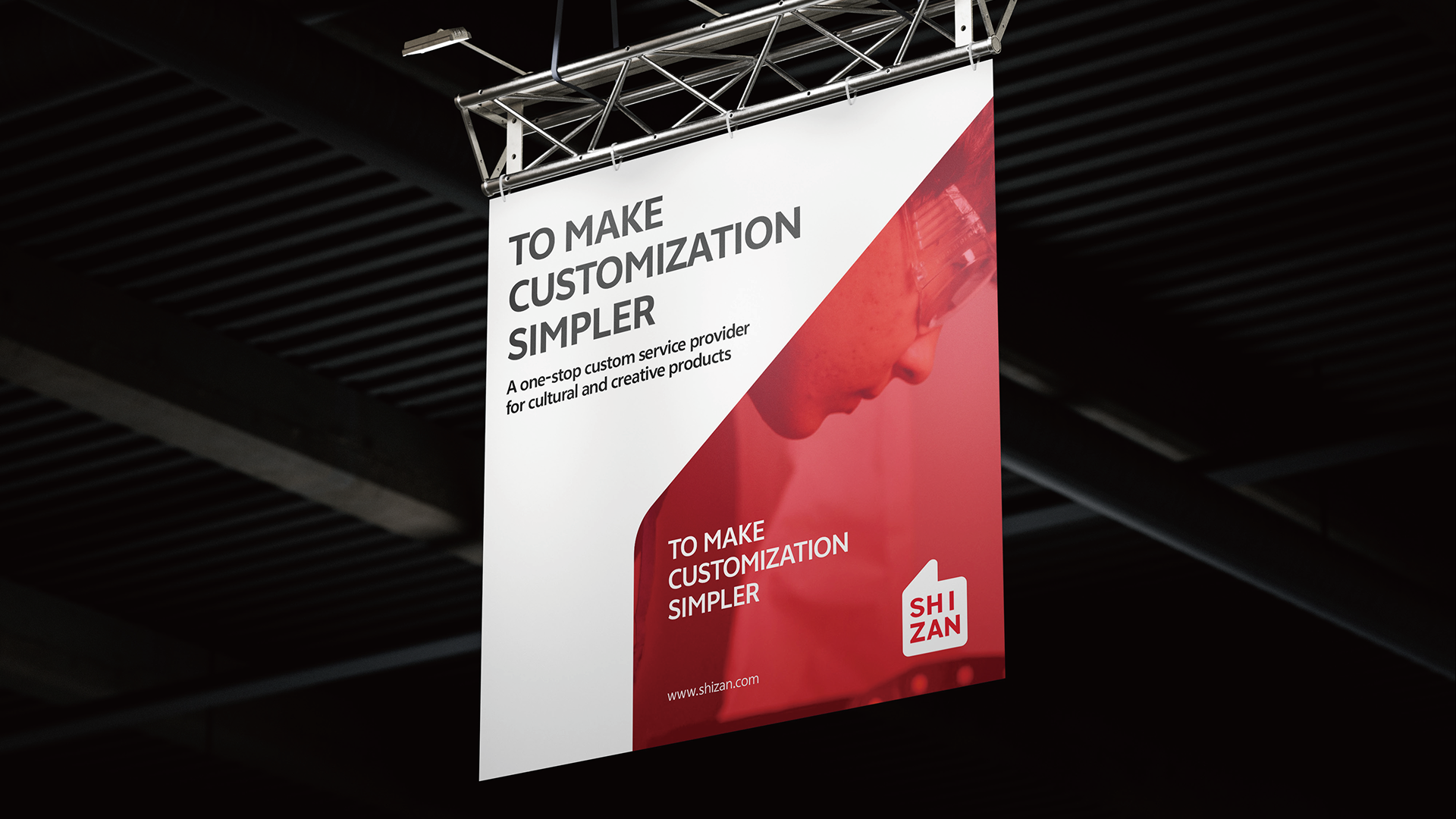
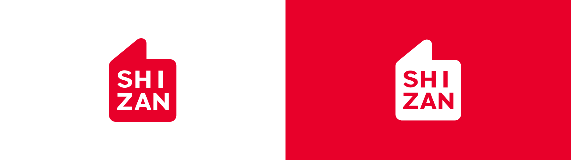
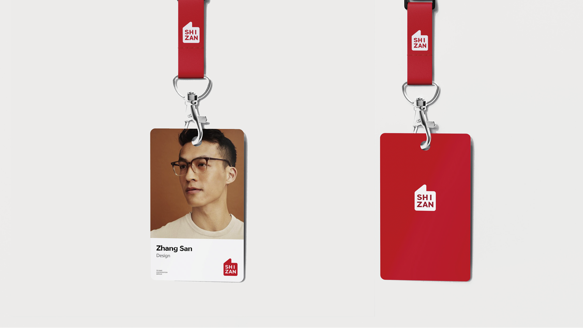
The new logo combines the thumbs-up gesture with the SHIZAN name. It is not decorative graphics, but the first contact point between the brand and its clients. When a product is shipped, work is delivered or a creator receives customized merchandise, the mark represents SHIZAN’s recognition of creative outcomes and its support for client success.
Building a Scalable VIS System
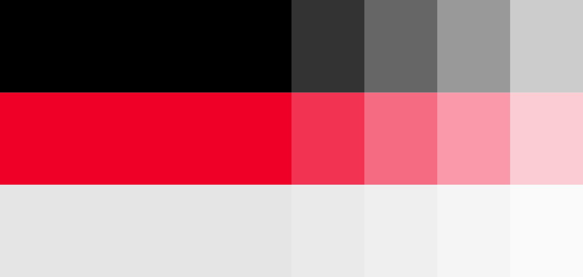
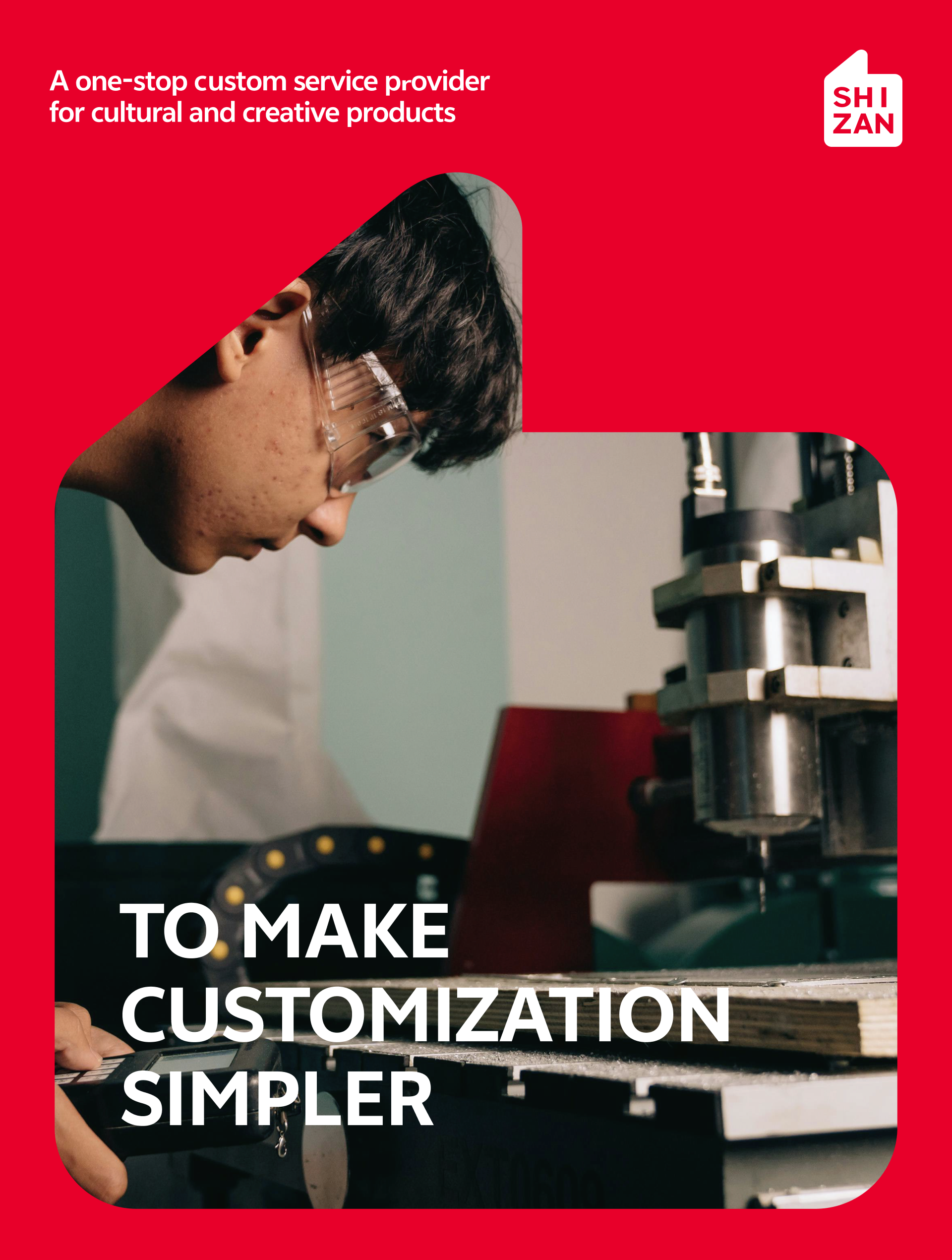
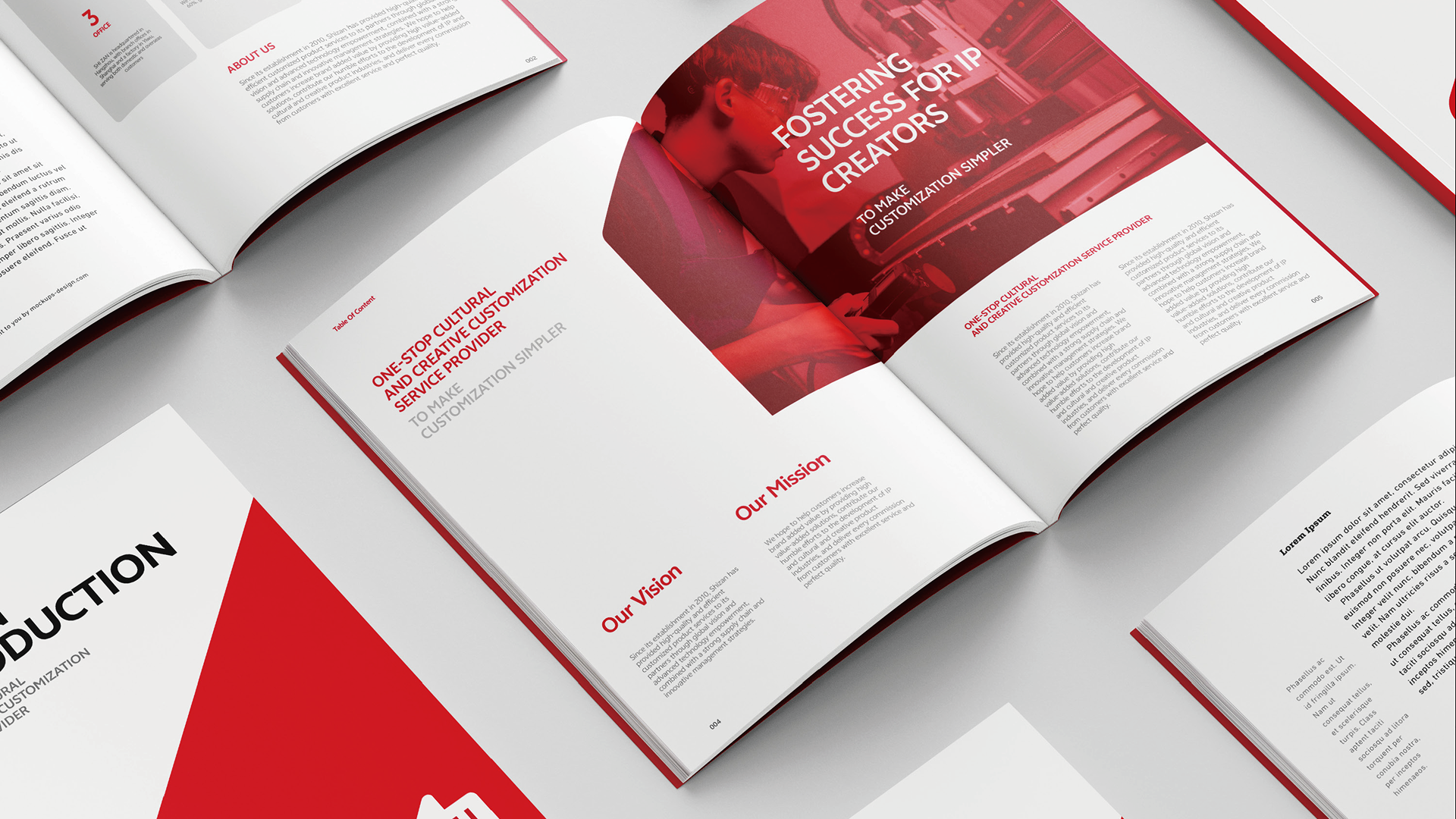
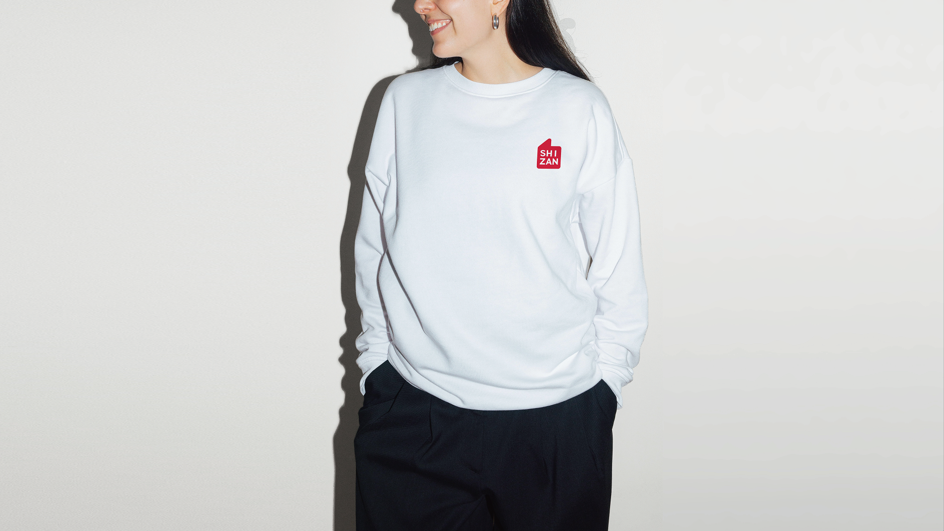
The identity system uses a highly recognizable red as the primary color. PANTONE 185 C brings active, warm and direct visual energy, allowing the brand to stand out quickly across exhibitions, packaging, digital communication and spatial signage. Black, white and gray balance the energy of red and keep the system professional, concise and scalable.
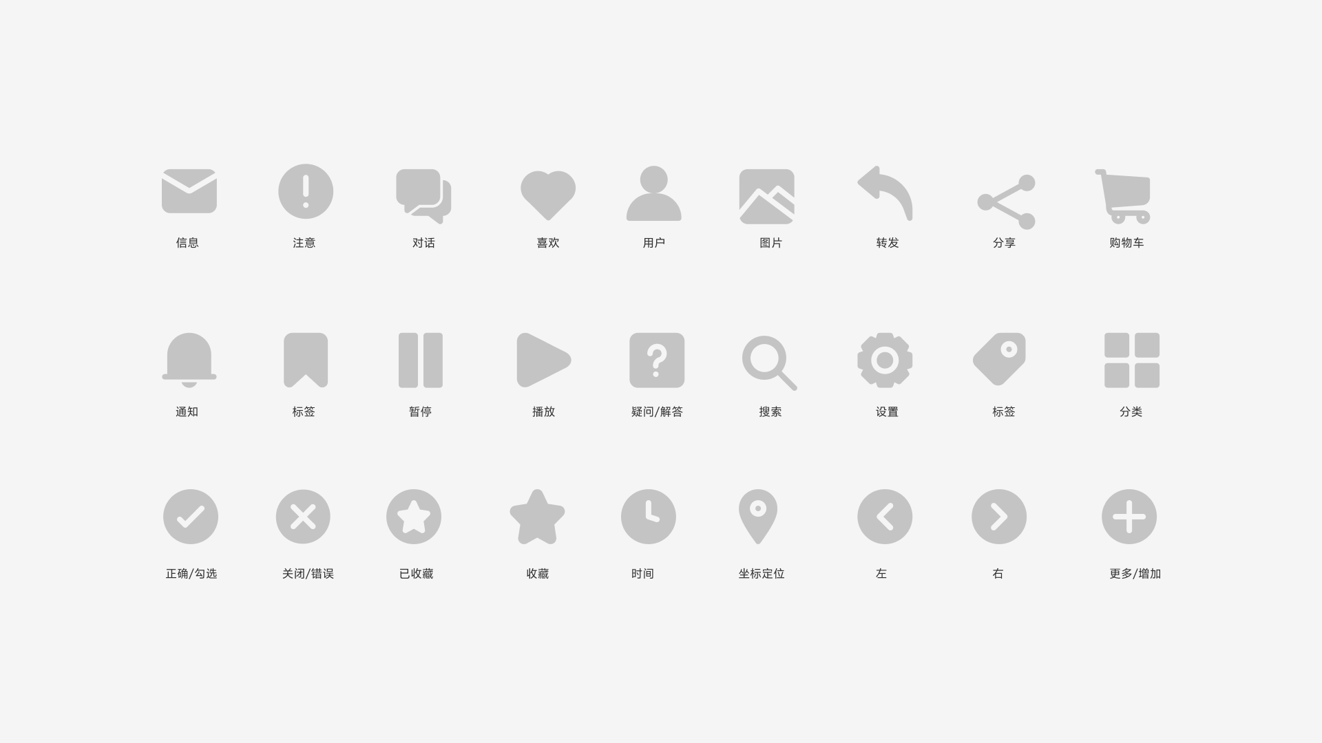
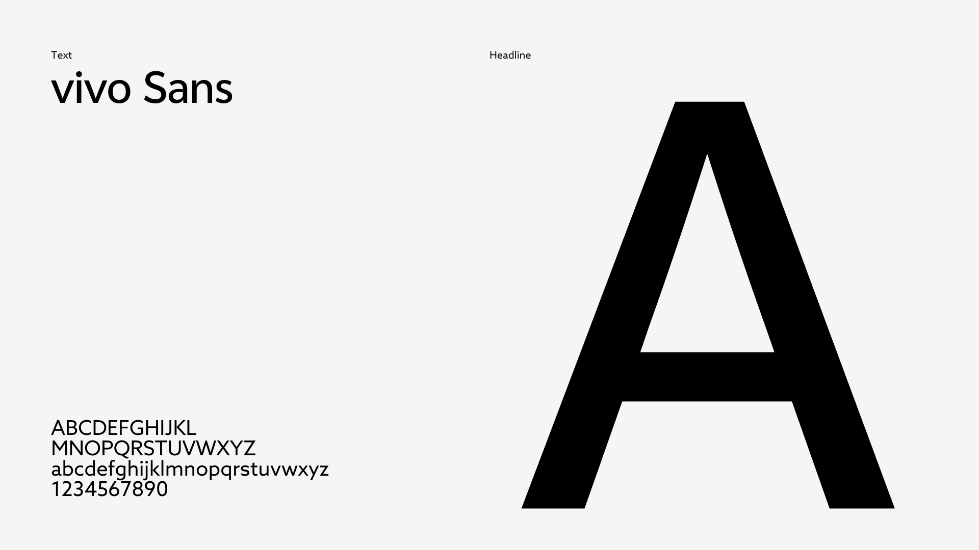
The typography uses a clean, modern and globally legible sans-serif language. It reduces friction across languages and keeps Chinese, English, numerals, icons and layouts consistent. Together with a minimal icon system, color proportions and application rules, SHIZAN becomes more than a logo: it becomes a brand language that can work continuously across touchpoints.
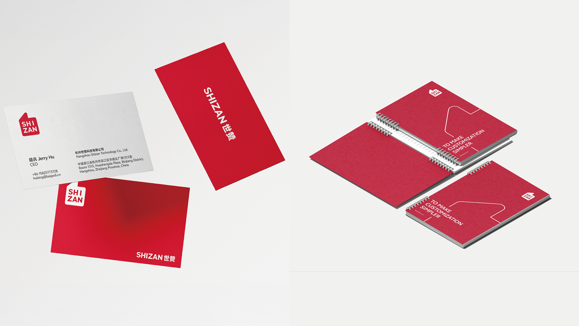
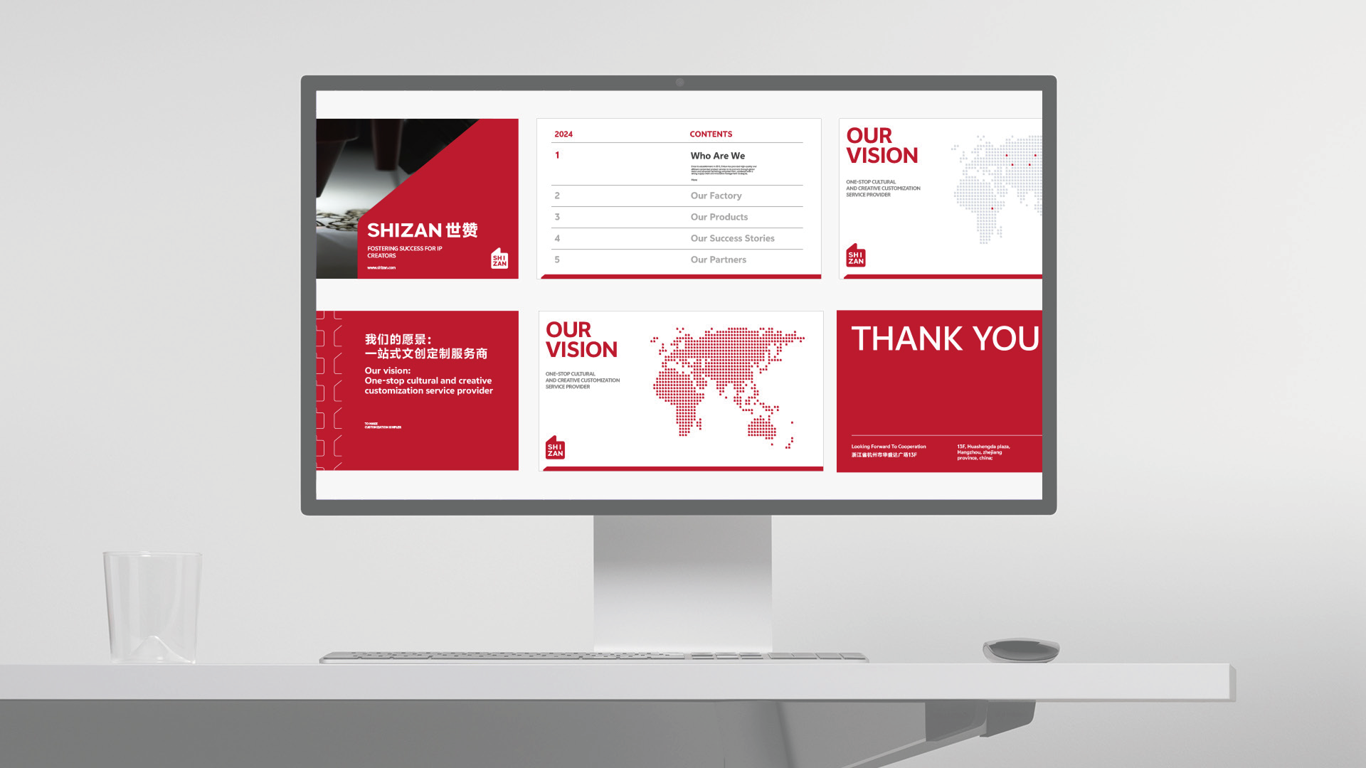
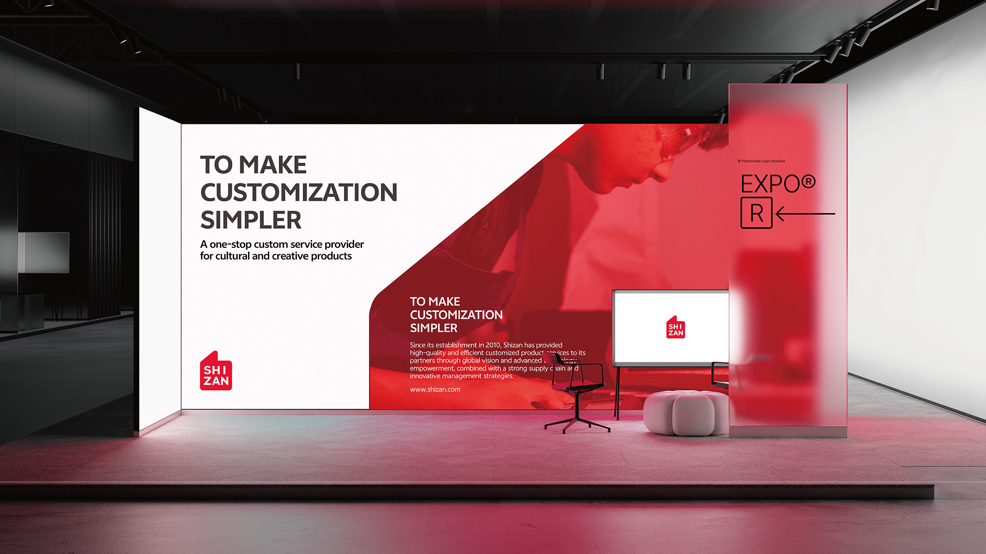
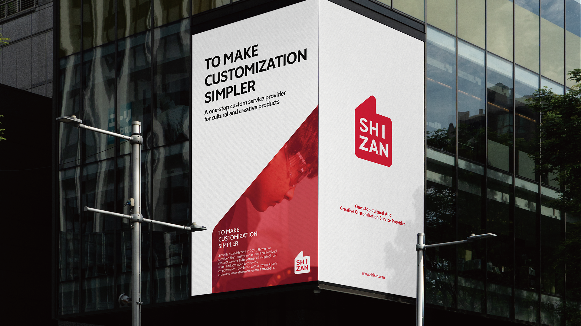
Bringing the Brand Into Real Touchpoints
The system extends into brand guidelines, business materials, exhibition spaces, digital screens, outdoor advertising, building signage, badges, apparel and hanging flags. Whether clients meet SHIZAN on the website, at an exhibition or through packaging, the experience points to the same judgement: a professional, reliable and creator-focused global customization service brand.
The new VIS turns custom-service capability from a backstage strength into a frontstage identity. It condenses supply chain, creative support and client achievement into a simple symbol with emotion, giving SHIZAN a clearer memory point in the competitive IP cultural-products market and a stable visual foundation for future international growth.